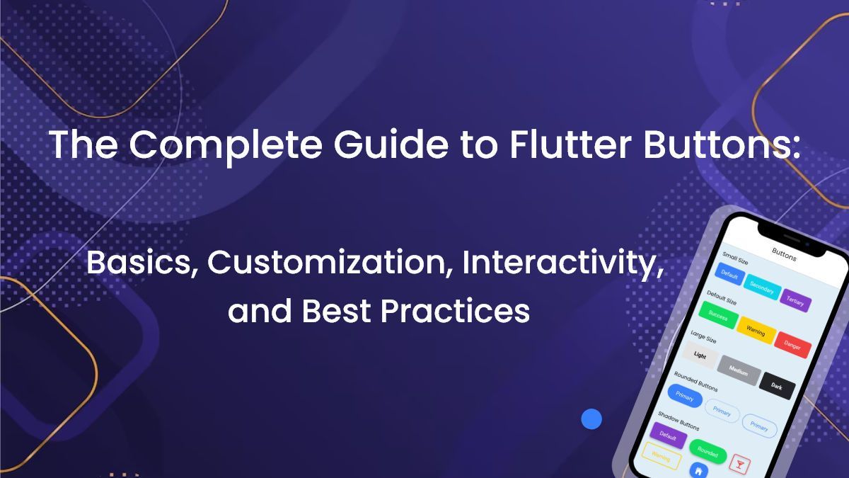
The Complete Guide to Flutter Buttons: Basics, Customization, Interactivity, and Best Practices
Flutter is an open-source framework for building high-quality, cross-platform mobile applications. It was developed by Google and has gained a lot of popularity among mobile app developers due to its ease of use, flexibility, and powerful features.
Buttons are an essential part of any mobile app as they enable users to interact with the app and perform various actions such as submitting forms, navigating between screens, and triggering events. As a result, having a good understanding of how to create and customize buttons in Flutter is crucial for developers.
The purpose of this guide is to provide a comprehensive overview of Flutter buttons, including basic syntax, customization options, interactivity, advanced techniques, and best practices for using buttons in mobile app development. Whether you’re a beginner or an experienced developer, this guide will help you create high-quality, user-friendly buttons for your Flutter apps.
Button Basics in Flutter
Explanation of MaterialButton and FlatButton
Different types of buttons available in Flutter
Basic syntax for creating buttons
Flutter provides two basic button widgets – MaterialButton and FlatButton.
Explanation of MaterialButton and FlatButton:
MaterialButton is a widget that follows the Material Design guidelines and provides a raised or elevated button style with shadows. It can be customized to have different colors, shapes, and sizes.
FlatButton, on the other hand, is a widget that provides a flat button style without any shadows. It can be customized to have different colors and sizes.
Different types of buttons available in Flutter:
In addition to these two basic button widgets, Flutter provides a variety of other button widgets, including IconButton, OutlineButton, DropdownButton, RoundedSolidButton, ElevatedButton, FloatingActionButton, and more.
Basic syntax for creating buttons:
The basic syntax for creating a button in Flutter is as follows:
   MaterialButton(
  onPressed: () {
    // action to be performed when button is pressed
  },
  child: Text('Button Text'),
)
In this example, onPressed is a required property that defines the action to be performed when the button is pressed. The child property is used to define the text or widget that is displayed on the button. Additional properties can be added to customize the button’s appearance, such as color, textColor, shape, and more.
Customizing Buttons in Flutter
Changing button text color, background color, and shape
Adding icons and images to buttons
Creating a custom button style
Flutter provides a range of customization options for buttons. Here are some of the most common ways to customize buttons in Flutter:
Changing button text color, background color, and shape:
To change the background color of a button, set the color property. To change the text color of a button, set the textColor property. To change the shape of a button, set the shape property to a BorderRadius or ShapeBorder widget.
  MaterialButton(
  onPressed: () {},
  color: Colors.blue,
  textColor: Colors.white,
  shape: RoundedRectangleBorder(
    borderRadius: BorderRadius.circular(10.0),
  ),
  child: Text('Button Text'),
  )
Adding icons and images to buttons:
To add an icon to a button, use the Icon widget and set it as the child property of the button. To add an image to a button, use the Image widget and set it as the child property of the button.
 MaterialButton(
  onPressed: () {},
  child: Row(
    mainAxisAlignment: MainAxisAlignment.center,
    children: [
      Icon(Icons.add),
      SizedBox(width: 5),
      Text('Add'),
    ],
  ),
)
Creating a custom button style:
To create a custom button style, define a new ButtonStyle widget and set its properties as desired. Then, pass the ButtonStyle widget to the style property of the button.
ButtonStyle customButtonStyle = ButtonStyle( backgroundColor: MaterialStateProperty.all(Colors.blue), foregroundColor: MaterialStateProperty.all (Colors.white), shape: MaterialStateProperty.all ( RoundedRectangleBorder( borderRadius: BorderRadius.circular(10.0), ), ), ); MaterialButton( onPressed: () {}, style: customButtonStyle, child: Text('Button Text'), ) With these customization options, you can create buttons that fit the style and branding of your app.
Button Interactivity in Flutter
Adding click listeners to buttons
Button state management
Creating disabled buttons
Flutter provides several ways to manage button interactivity. Here are some of the most common techniques:
Adding click listeners to buttons:
To add a click listener to a button, set the onPressed property to a function that will be executed when the button is clicked.
MaterialButton(
  onPressed: () {
    // Function to execute when button is clicked
  },
  child: Text('Button Text'),
)
Button state management:
Buttons can have different states, such as enabled, disabled, pressed, and focused. To manage button states, you can use the MaterialButton or FlatButton widgets, which handle state changes automatically. You can also create your own custom button widgets and manage state changes manually.
// Example of disabling a button
MaterialButton(
  onPressed: isButtonEnabled ? () {} : null,
  child: Text('Button Text'),
)
// Example of changing button text based on state
MaterialButton(
  onPressed: () {},
  child: Text(
    isButtonPressed ? 'Button Pressed' : 'Button Text',
  ),
)
Creating disabled buttons:
To create a disabled button, set the onPressed property to null. You can also change the button style to indicate that it is disabled, such as changing the text color or adding a disabled icon.
MaterialButton(
  onPressed: null,
  disabledTextColor: Colors.grey,
  child: Text('Button Text'),
)
// Example of adding a disabled icon
MaterialButton(
  onPressed: null,
  child: Row(
    mainAxisAlignment: MainAxisAlignment.center,
    children: [
      Icon(Icons.lock),
      SizedBox(width: 5),
      Text('Locked Button'),
    ],
  ),
)
By using these techniques, you can create buttons that respond to user interaction and provide feedback on their state.
Advanced Button Techniques in Flutter
Creating gradient buttons
Animating buttons
Creating toggle buttons
Flutter also offers more advanced techniques for creating buttons. Here are a few examples:
Creating gradient buttons:
To create a gradient button, set the color property to a LinearGradient widget that defines the colors and stops of the gradient.
MaterialButton(
  onPressed: () {},
  textColor: Colors.white,
  shape: RoundedRectangleBorder(
    borderRadius: BorderRadius.circular(10.0),
  ),
  padding: EdgeInsets.all(0),
  child: Ink(
    decoration: BoxDecoration(
      gradient: LinearGradient(
        colors: [Colors.blue, Colors.green],
        begin: Alignment.topLeft,
        end: Alignment.bottomRight,
      ),
      borderRadius: BorderRadius.circular(10.0),
    ),
    child: Container(
      padding: EdgeInsets.symmetric(vertical: 10, horizontal: 20),
      child: Text('Gradient Button'),
    ),
  ),
)
Animating buttons:
Buttons can be animated to provide visual feedback or to create more engaging user interfaces. To animate a button, use the AnimatedContainer, AnimatedOpacity, or AnimatedCrossFade widgets to animate the button’s properties.
AnimatedContainer(
  duration: Duration(milliseconds: 500),
  curve: Curves.easeInOut,
  width: isButtonExpanded ? 200.0 : 100.0,
  child: MaterialButton(
    onPressed: () {
      setState(() {
        isButtonExpanded = !isButtonExpanded;
      });
    },
    child: Text('Animated Button'),
  ),
)
Creating toggle buttons:
Toggle buttons allow users to select one or more options from a group of buttons. To create a toggle button, use the ToggleButton widget and define the options and their corresponding values.
Listoptions = ['Option 1', 'Option 2', 'Option 3']; List values = [false, true, false]; ToggleButtons( children: [ for (int i = 0; i < options.length; i++) Text(options[i]), ], isSelected: values, onPressed: (index) { setState(() { values[index] = !values[index]; }); }, ) By using these advanced techniques, you can create buttons that are more engaging and provide more functionality for your users.
Best Practices for Using Buttons in Flutter
Proper button placement in mobile apps
Consistent button design
Ensuring button accessibility
When it comes to using buttons in Flutter, there are some best practices that you should follow to ensure a great user experience. Here are a few of them:
Proper button placement in mobile apps:
- Buttons should be placed where users can easily find them and access them.
- Common button placement includes placing primary action buttons at the bottom of the screen, and secondary action buttons at the top or bottom of the screen.
- Buttons should also be grouped logically, so that users can understand their purpose.
Consistent button design:
- Buttons should have a consistent design throughout the app.
- Consistency includes using the same button shape, size, and color throughout the app.
- This ensures that users can quickly recognize and use the buttons without confusion.
Ensuring button accessibility:
- Buttons should be accessible to all users, including those with disabilities.
- This includes making sure that buttons are large enough and have enough contrast to be seen and used by users with visual impairments.
- You should also make sure that buttons are labeled clearly and can be used with assistive technologies like screen readers.
- By following these best practices, you can create mobile apps that are easy to use and accessible to all users.
Conclusion
Recap of button basics, customization, interactivity, and advanced techniques Final thoughts on using buttons in Flutter.
In this guide, we have covered the basics of creating buttons in Flutter, including MaterialButton and FlatButton, and the different types of buttons available. We also explored how to customize buttons by changing text color, background color, and shape, adding icons and images, and creating a custom button style. Furthermore, we discussed button interactivity by adding click listeners, managing button state, and creating disabled buttons. We then delved into more advanced button techniques such as creating gradient buttons, animating buttons, and creating toggle buttons. Finally, we talked about best practices for using buttons in mobile apps, including proper button placement, consistent button design, and ensuring button accessibility.
Buttons are an essential part of mobile app development, and Flutter provides an easy and flexible way to create them. By mastering the different techniques and best practices covered in this guide, you can create buttons that are not only functional but also engaging and accessible to all users. With Flutter's rich set of widgets and tools, you have the power to create amazing mobile app interfaces that users will love to interact with.
Getwidget:
Are you a Flutter developer looking to save time and simplify your UI design process? Look no further than GetWidget– the ultimate Flutter UI framework. Our pre-built, clean UI widget components can reduce your app development time by up to 40%. With over 3000 hours invested in building this library, we're confident that our widgets will make your life easier and your apps look amazing. Plus, our widget code is compatible with web and desktop app development. Don't waste any more time on UI design – check out GetWidget today and see how we can streamline your Flutter app development process.
Review Get Widget on DesignRush

I’m Navin Sharma, a passionate Full Stack Developer with over 20 years of experience in the tech industry. Throughout my career, I’ve had the privilege of working on a variety of exciting projects, developing everything from dynamic web applications to complex back-end systems. My expertise spans both front-end and back-end technologies, and I thrive on building solutions that are not only functional but also scalable and user-friendly.
Beyond my hands-on development work, I’ve contributed to several well-respected tech and startup blogs, where I share my insights on the latest trends, development strategies, and best practices in the world of web development. I also have a strong background in app analysis, where I’ve helped companies optimize their products for better performance and enhanced user experience.
Whether I’m working on a challenging coding problem or mentoring fellow developers, I’m always eager to learn, innovate, and push the boundaries of what’s possible with technology.