How to Create Custom Flutter Alert dialog box popup with Example Code
Design a custom Flutter Alert Box in your application with custom properties to create Full-width, Rounded Alert popup to notify users in the app.

Flutter Alert Dialog Widget
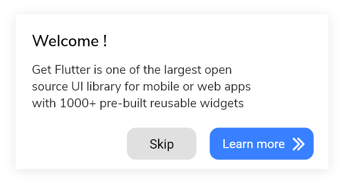
Flutter Alert Widget is a simple component that is used to alert the user of the application. It means it allows the creation of a dialog box with an important message that helps the users to take appropriate action. It is a popup in the middle of the screen which places an overlay over the background. It does not fill the entire screen. It is normally used for events that require users to take any action before they can proceed further.
Now here I am going to discuss, How we build that alert system in the Flutter widget using of GetWidget UI Library.
Now you wondering what is GetWidget UI Library and Why this? Here a short introduction about GetWidget and why this?
GetWidget is an open-source UI Library for Flutter App Development. It has 1000+ pre-built Flutter Widgets that help you to build a fully customizable Flutter widget in your app. Since it has been recognized as one of the largest and best UI libraries by the Flutter dev community. For more details you can check out our GitHub repository:
Why use GetWidget for Flutter Alert Widget?
It allows you to speed up your Flutter app development by 20-30%. The GetWidget has almost all widget that allows you to enhance your Flutter UI design and speed up flutter development with fully customizable features.
Now here is I am going to talk about what is GetWidget Alert widget is and how we implement this on the Flutter app to build an awesome Flutter Alert widget for an app.
Also Read: Flutter Notification Badge Widget
Flutter AlertDialog Box
Flutter AlertDialog Widget is an alert component that allows building a Flutter alert widget in your Flutter applications to allows users to take any action with the important message. It helps users to understand while taking an important action while using your application.
GFAlert should be wrapped inside the GFFloating Widget. The child of the GFFloating Widget takes GFAlert as its argument and the body takes any kind of widgets.

Flutter Alert with multiple buttons
GF Alert can have multiple buttons at the bottom bar of the alert widget.
Generally we categories the alert dialog into different types, Some of them I am listing below:
Basic Flutter AlertDailog
A basic alert dialog widget will come with the basic feature. It generally uses to notify the users regarding new information like any changes that happen in apps, Some new features added to your app, an important required situation or field that has to be acknowledged, or show a confirmation notification based on user action taken.
Flutter Confirmation AlertDialog
This Alert Dialog widget helps to notify users to confirm a particular choice or action before go further in your application. eg. Delete, Update, etc.
Flutter Select AlertDialog
It shows/displays the list/types of alert dialog to the users. If users will take any option then it will take immediate action based on user selection from the list of AlertDialog.
Flutter TextField AlertDialog
This alert dialog helps to build an alert that will take the user's input.
GF Flutter Alert with Basic, Rounded, FullWidth type
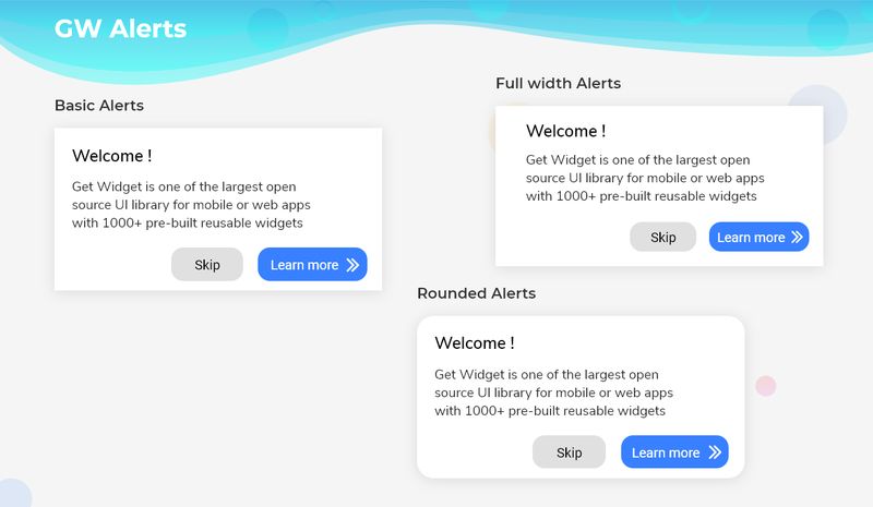
GF Alert is of three types. The Basic alert is known as the default alert. By using the type property of Alert Widget we can have Rounded and Fullwidth Alert accordingly. In Rounded Alert, the border will have a radius around it whereas in Fullwidth Alert the alert will take the full width of the screen.
How to Get Started
Getting started will guide you on how to start building a beautiful flutter application with the GetWidget UI library. You have to install the package from pub.dev, import the package in your Flutter project.
Install Package from pub.dev :
https://pub.dev/packages/getwidget
Import full package:
import 'package:getwidget/getwidget.dart';
Note: dependencies: getwidget: ^4.0.0
Keep playing with the pre-built UI components.
Flutter AlertDialog With multiple Button Example code

import 'package:getwidget/getwidget.dart';

return Scaffold(
      body: GFFloatingWidget(
          body: Text("body or any kind of widget here.."),
          child: GFAlert(
            title: 'Welcome !',
            content:
                'Get Flutter is one of the largest Flutter open-source UI library for mobile or web apps with  1000+ pre- built reusable widgets.',
            bottombar: Row(
              mainAxisAlignment: MainAxisAlignment.end,
              children: <Widget>[
                GFButton(
                    onPressed: () {
                      setState(() {
                        showalert = false;
                      });
                    },
                    shape: GFButtonShape.pills,
                    child: Text('Skip', style: TextStyle(color: Colors.black))),
                SizedBox(width: 5),
                GFButton(
                  onPressed: () {
                    setState(() {
                      showalert = false;
                    });
                  },
                  shape: GFButtonShape.pills,
                  icon: Icon(
                    Icons.keyboard_arrow_right,
                    color: GFColors.WHITE,
                  ),
                  position: GFPosition.end,
                  text: 'Learn More',
                )
              ],
            ),
          )),
    );
Flutter AlertDialog With Multiple Button option Code example
Example of Flutter Alert types in GFAlert
import 'package:getwidget/getwidget.dart';

return Scaffold(
        body: GFFloatingWidget(
            body: Text('body or any kind of widget here..'),
            child: GFAlert(
              title: 'Welcome !',
              content:
                  'Get Flutter is one of the largest Flutter open-source UI library for mobile or web apps with  1000+ pre-built reusable widgets.',
              type: GFAlertType.rounded,
              bottombar: Row(
                mainAxisAlignment: MainAxisAlignment.end,
                children: <Widget>[
                  GFButton(
                      onPressed: () {
                        setState(() {
                          showalert = false;
                        });
                      },
                      shape: GFButtonShape.pills,
                      child:
                          Text('Skip', style: TextStyle(color: Colors.black))),
                  SizedBox(width: 5),
                  GFButton(
                    onPressed: () {
                      setState(() {
                        showalert = false;
                      });
                    },
                    shape: GFButtonShape.pills,
                    icon: Icon(
                      Icons.keyboard_arrow_right,
                      color: GFColors.WHITE,
                    ),
                    position: GFPosition.end,
                    text: 'Learn More',
                  )
                ],
              ),
            )));
Example of GF Flutter Alert positioning
import 'package:getwidget/getwidget.dart';

body:GFFloatingWidget(
    horizontalPosition:40.0,
    verticalPosition:20.0,
    child:GFAlert(
    title: 'Welcome!',
  ),
 body:Text('body or any kind of widget here..')
)
If you are looking for more customization in the Flutter alert bar then check out Custom Properties of the GetWidget Alert widget.
Follow our docs to develop Flutter Alert Widget with our GetWidget app

Custom Properties for Flutter GFAlert Widget
| child | child of type [Widget] which is alternative to title. title will get priority over child |
| contentChild | contentchild of type [Widget] which is alternative to content. content will get priority over contentchild |
| titleTextStyle | changes the style of the title not for the child |
| backgroundColor | used to change the backgroundColor of the GFAlert |
| contentTextStyle | changes the style of the content not for the contentChild |
| width | used to control the width of the Alert |
| alignment | used to align the title or content to desired position |
How to create Custom Flutter AlertDialog Widget?
Flutter AlertDialog is used to show any kind of message on the screen and waits for the user action to continue using the respective screen. It usually appears on the center of the screen that makes an overlay and the other UI on the screen cannot be used. Hence there will be user action to dismiss the alert and continue the interaction with the app.
Flutter Basic Alert/Popup example code
Basic Alert is just a default AlertDialog box that can be placed on the desired location on the screen by the positioning property.
The below Example shows the Simple alert.
import 'package:getwidget/getwidget.dart';

 return Scaffold(
        body: GFFloatingWidget(
      horizontalPosition: 40.0,
      verticalPosition: 20.0,
      child: GFAlert(
        title: 'Welcome!',
      ),
      body: Container(
          margin: const EdgeInsets.only(top: 20),
          child: Column(
            mainAxisAlignment: MainAxisAlignment.end,
            children: <Widget>[
              GFButton(
                  text: 'Tap to View',
                  onPressed: () {
                    setState(() {
                      showblur = true;
                      alertWidget = GFAlert(
                        backgroundColor: Colors.white,
                        title: 'Welcome!',
                        content:
                            'Lorem ipsum dolor sit amet, consectetur adipiscing elit, sed do eiusmod tempor incididunt ut labore et dolore magna aliqua. Ut enim ad minim veniam',
                        bottombar: Row(
                          mainAxisAlignment: MainAxisAlignment.end,
                          children: <Widget>[
                            GFButton(
                              onPressed: () {
                                setState(() {
                                  alertWidget = null;
                                  showblur = false;
                                });
                              },
                              shape: GFButtonShape.pills,
                              color: GFColors.LIGHT,
                              type: GFButtonType.outline2x,
                              child: const Text(
                                'Skip',
                                style: TextStyle(color: Colors.black),
                              ),
                            ),
                            const SizedBox(
                              width: 5,
                            ),
                            GFButton(
                              onPressed: () {
                                setState(() {
                                  alertWidget = null;
                                  showblur = false;
                                });
                              },
                              shape: GFButtonShape.pills,
                              icon: Icon(
                                Icons.keyboard_arrow_right,
                                color: GFColors.WHITE,
                              ),
                              position: GFPosition.end,
                              text: 'Learn More',
                            )
                          ],
                        ),
                      );
                    });
                  }),
            ],
          )),
    ));
Flutter Rounded Alert/Popup Example Code
Rounded Alert is like a default AlertDialog box that can be placed on the desired location on the screen wherein the border has a slight radius around it. The below example shows the rounded alert.
import 'package:getwidget/getwidget.dart';

    return Scaffold(
        body: GFFloatingWidget(
      horizontalPosition: 40.0,
      verticalPosition: 20.0,
      child: GFAlert(
        title: 'Welcome!',
      ),
      body: Container(
          margin: const EdgeInsets.only(top: 20),
          child: Column(
            mainAxisAlignment: MainAxisAlignment.end,
            children: <Widget>[
              GFButton(
                  text: 'Tap to View',
                  onPressed: () {
                    setState(() {
                      showblur = true;
                      alertWidget = GFAlert(
                        backgroundColor: Colors.white,
                        title: 'Welcome!',
                        content:
                            'Lorem ipsum dolor sit amet, consectetur adipiscing elit, sed do eiusmod tempor incididunt ut labore et dolore magna aliqua. Ut enim ad minim veniam',
                        type: GFAlertType.rounded,
                        bottombar: Row(
                          mainAxisAlignment: MainAxisAlignment.end,
                          children: <Widget>[
                            GFButton(
                              onPressed: () {
                                setState(() {
                                  alertWidget = null;
                                  showblur = false;
                                });
                              },
                              shape: GFButtonShape.pills,
                              color: GFColors.LIGHT,
                              type: GFButtonType.outline2x,
                              child: const Text(
                                'Skip',
                                style: TextStyle(color: Colors.black),
                              ),
                            ),
                            const SizedBox(
                              width: 5,
                            ),
                            GFButton(
                              onPressed: () {
                                setState(() {
                                  alertWidget = null;
                                  showblur = false;
                                });
                              },
                              shape: GFButtonShape.pills,
                              icon: Icon(
                                Icons.keyboard_arrow_right,
                                color: GFColors.WHITE,
                              ),
                              position: GFPosition.end,
                              text: 'Learn More',
                            )
                          ],
                        ),
                      );
                    });
                  }),
            ],
          )),
    ));
Flutter FullWidth AlertDialog Popop example Code
FullWidth Alert is like a default AlertDialog box that can be placed on the desired location on the screen wherein the width of the alert will take the full width of the screen. The below example shows the fullwidth alert.
import 'package:getwidget/getwidget.dart';

    return Scaffold(
        body: GFFloatingWidget(
      horizontalPosition: 40.0,
      verticalPosition: 20.0,
      child: GFAlert(
        title: 'Welcome!',
      ),
      body: Container(
          margin: const EdgeInsets.only(top: 20),
          child: Column(
            mainAxisAlignment: MainAxisAlignment.end,
            children: <Widget>[
              GFButton(
                  text: 'Tap to View',
                  onPressed: () {
                    setState(() {
                      showblur = true;
                      alertWidget = GFAlert(
                        backgroundColor: Colors.white,
                        title: 'Welcome!',
                        content:
                            'Lorem ipsum dolor sit amet, consectetur adipiscing elit, sed do eiusmod tempor incididunt ut labore et dolore magna aliqua. Ut enim ad minim veniam',
                        type: GFAlertType.fullWidth,
                        bottombar: Row(
                          mainAxisAlignment: MainAxisAlignment.end,
                          children: <Widget>[
                            GFButton(
                              onPressed: () {
                                setState(() {
                                  alertWidget = null;
                                  showblur = false;
                                });
                              },
                              shape: GFButtonShape.pills,
                              color: GFColors.LIGHT,
                              type: GFButtonType.outline2x,
                              child: const Text(
                                'Skip',
                                style: TextStyle(color: Colors.black),
                              ),
                            ),
                            const SizedBox(
                              width: 5,
                            ),
                            GFButton(
                              onPressed: () {
                                setState(() {
                                  alertWidget = null;
                                  showblur = false;
                                });
                              },
                              shape: GFButtonShape.pills,
                              icon: Icon(
                                Icons.keyboard_arrow_right,
                                color: GFColors.WHITE,
                              ),
                              position: GFPosition.end,
                              text: 'Learn More',
                            )
                          ],
                        ),
                      );
                    });
                  }),
            ],
          )),
    ));
What are the customizable properties used?
The customizable properties include the types of GF Alert, basically, here we can change the border radius and we can also control the size, color of the Alert component. Hence customizable properties are fully flexible. You can check out all custom properties components on GetWidget Alert Widget Properties.

GitHub Repository: Please do appreciate our work through Github start
Conclusion:
Here we discuss, what Flutter Alert Widget is? And how we can use and implement it into our Flutter app through the GetWidget Alert component. Here, there are options to customize and use other types of Alert and to position the Alert wherever needed on the screen.
About Our Team:
We have been working on Flutter since Flutter launched in beta version in 2017. And our team have been putting hundreds and hundreds of hour to experiment and implementation of Flutter. As well as After successfully delivering enterprise and SAAS applications that have been used by more than 500+ businesses around 119+ countries. Now we are in love with Flutter development and we are very passionate about Flutter development. Now it is something we trying to give a small contribution to the Flutter Dev Community.

