
Flutter Border is an outline widget that covers the entire container on all four sides: top, right, bottom, left. Flutter uses borders to identify one component’s coverage area. We can customize the border by using its border property.
In Flutter, we can define the border of widgets inside the scaffold. Therefore before adding a border of a widget we need to define a Scaffold. When we creating a sample flutter app, it comes with the default scaffold.
So, are you ready to make use of this widget package in the Flutter application? If so, then let’s quickly jump into the usage and the ways a border can be modified and used to make user-friendly apps. Here I am going to use an open-source UI Library known as GetWidget to build this border widget in Flutter.
Border Widget for Flutter
It allows you to speed up your Flutter app development by 20-30%. It has almost all widget that allows you to enhance your Flutter UI design and speed up flutter development with fully customizable features.
Now here is i am going to talk about what is GetWidget Border widget and how we implement this on Flutter app to build awesome Flutter Border widget for an app.
How to Get Started
Now here is the guide about how we should start developing the GFBorder Widget with the use of the GetWidget UI Library.
First, Let go with Getting started, It will guide you on how to start building a beautiful Flutter template with the GetWidget UI library. Now, we have to install the GetWidget package from the pub.dev and use our 1000+ inbuilt Widget. To import the package in your Flutter project follow the below guide.
Install Package from pub.dev :
https://pub.dev/packages/getwidget – Check the details about GetWidget Package.
Import full package:
import ‘package:getwidget/getwidget.dart’;
Note: dependencies: getwidget: ^ 4.0.0
Keep playing with the pre-built UI components.
GetWidget Border is a simple solid line that acts as a surrounding line to any kind of widget. It is used as a wrapper that wraps the components inside it. GFBorder has many types in it and has customizable properties. Let us see one by one in the below sections.
Also Read – How to Choose the Right Flutter App Development Company: A Comprehensive Guide
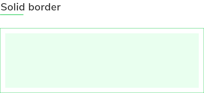
How to Add Flutter Solid Border in Any Widget
Flutter Solid Border is a simple type of border that has a solid line around the widget as shown in the below image. This is a basic border used for many components. The appearance of the GFBorder can be customized using the GFBorder properties. You can use Flutter Border in Container Widget, Button or Card, etc. We can use the below code to build the Flutter Solid Border Widget.
Container(
  margin: EdgeInsets.symmetric(
      horizontal: 15, vertical: 15),
  padding: EdgeInsets.symmetric(
      horizontal: 15, vertical: 15),
  child: GFBorder(
    color: Color(0xFF19CA4B),
    dashedLine: [2, 0],
    type: GFBorderType.rect,
    child: Text(
      'Lorem ipsum doren..',
    ),
  ),
),
Flutter Dashed Border Example
A Flutter dashed border is a customized type of border, that has a dashed line around the widget as shown in the below image.

Container(
margin: EdgeInsets.symmetric(
horizontal: 15, vertical: 15),
child: GFBorder(
dashedLine: [4, 6],
type: GFBorderType.rect,
color: Colors.black,
child: Image.asset(
'assets image here',
width: MediaQuery.of(context).size.width,
fit: BoxFit.fitWidth,
),
),
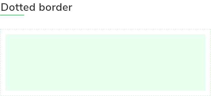
),Flutter Dotted Border Example
A Flutter dotted Border is one kind of border that has dotted lines around the components as shown in the below image.
Container(
  margin: EdgeInsets.symmetric(
      horizontal: 15, vertical: 15),
  padding: EdgeInsets.symmetric(
      horizontal: 15, vertical: 15),
  child: GFBorder(
    color: Color(0xFF19CA4B),
    dashedLine: [2, 1],
    type: GFBorderType.rect,
    child: Icon(
      Icons.home,
      size:30,
      color:Colors.black,
    ),
  ),
),GF Flutter Border Types
GFBorder has many types according to the parent widget. Some of them are rect, rRect, Oval, Circle. We can simply use them by assigning GFBorderType.rect or so.
GFBorderType.rect
It is one of the types of borders that gives a rectangle shape to the parent widget as shown in the below image. The below example codes give the rect border around the image.

Container(
  margin: EdgeInsets.symmetric(
      horizontal: 10, vertical: 10),
  child: GFBorder(
    color: Color(0xFF19CA4B),
    dashedLine: [2, 0],
    type: GFBorderType.rect,
    child: Container(
      height: 100,
      color: Colors.red,
    ),
  ),
),GFBorderType.rRect
GF Flutter Border has a property similar to the rectangle type of border. In this type, we will get a rounded-shaped corner as shown in the below image in the borders. The below code gives the rectangle border with slightly rounded corners.
Container(
  margin: EdgeInsets.symmetric(
      horizontal: 10, vertical: 10),
  child: GFBorder(
    radius: Radius.circular(30),
    color: Colors.blue,
    dashedLine: [2, 0],
    type: GFBorderType.rRect,
    child: Container(
      height: 100,
      color: Colors.green,
    ),
  ),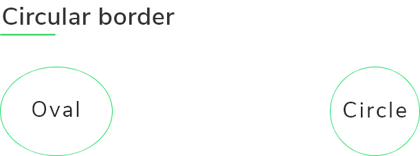
),GFBorderType.oval
GFBorder here will be an oval type as shown in the image. GFBorder property type takes GFBorderType.oval to display oval shape borders. The code for this is given below:
Container(
  width: 40,
  height: 50,
  child: GFBorder(
    type: GFBorderType.oval,
    dashedLine: [2, 0],
    color: Colors.black,
    strokeWidth: 2,
    child: Center(child: Text('Getwidget Oval Border')),
  ),
),GFBorderType.circle
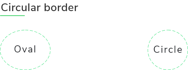
GF Flutter Border is also of type circle. This can be solid, dotted, and dashed. GFBorder property type takes GFBorderType.circle to display circular shape borders.
Below is the image of a dashed circular border with a child and the sample code:
Container(
  width: 110,
  height: 110,
  child: GFBorder(
    type: GFBorderType.circle,
    dashedLine: [4, 6],
    color: Colors.red,
    strokeWidth: 2,
    child: Center(
        child: Text(
      'Getwidget Circular Border',
      textAlign: TextAlign.center,
    )),
  ),
),GF Flutter Border Custom Properties
The look and feel of the GFBorder can be customized using the GFBorder properties.
| Name | Description |
|---|---|
| child | child of type [Widget] which can be any component or text, etc |
| padding | padding for [child] where in padding is given to the border types |
| strokeWidth | storkeWidth of type [double] which is used to define the thickness of the border |
| color | color of type [Color] or GFColor which is used to change the color of the border type |
| dashedLine | dashedLine of type [List] which is used for the linear and simple dashed line of border |
| type | type of [GFBorderType] which is used to define the different types of borders ie, circle, Rect, RRect and oval |
| radius | radius of type [Radius] used to give a curved border only when the border type is RRect, in other cases radius will not work |
What is the use of strokeWidth property here?
We mostly use the stroke width property to add thickness to the border.
What are the types of borders used?
The different shapes of borders used are circle, rect, rRect, and oval.
 getwidget
GitHub Repository: Please do appreciate our work through Github start
Conclusion:
Here we discuss, what Flutter Border Widget is? And how we can use and implement it into our Flutter app through the GetWidget Border component. Here, there are options to customize the Border and the different border types that can be used.
About Our Team:
We have been working on Flutter since Flutter launched in beta version in 2017. And our team have been putting hundreds and hundreds of hour to experiment and implementation of Flutter. As well as After successfully delivering enterprise and SAAS applications that have been used by more than 500+ businesses around 119+ countries. Now we are in love with Flutter development and we are very passionate about Flutter development. Now it is something we trying to give a small contribution to the Flutter Dev Community.

I’m Navin Sharma, a passionate Full Stack Developer with over 20 years of experience in the tech industry. Throughout my career, I’ve had the privilege of working on a variety of exciting projects, developing everything from dynamic web applications to complex back-end systems. My expertise spans both front-end and back-end technologies, and I thrive on building solutions that are not only functional but also scalable and user-friendly.
Beyond my hands-on development work, I’ve contributed to several well-respected tech and startup blogs, where I share my insights on the latest trends, development strategies, and best practices in the world of web development. I also have a strong background in app analysis, where I’ve helped companies optimize their products for better performance and enhanced user experience.
Whether I’m working on a challenging coding problem or mentoring fellow developers, I’m always eager to learn, innovate, and push the boundaries of what’s possible with technology.