Linear Progress Indicator In Flutter
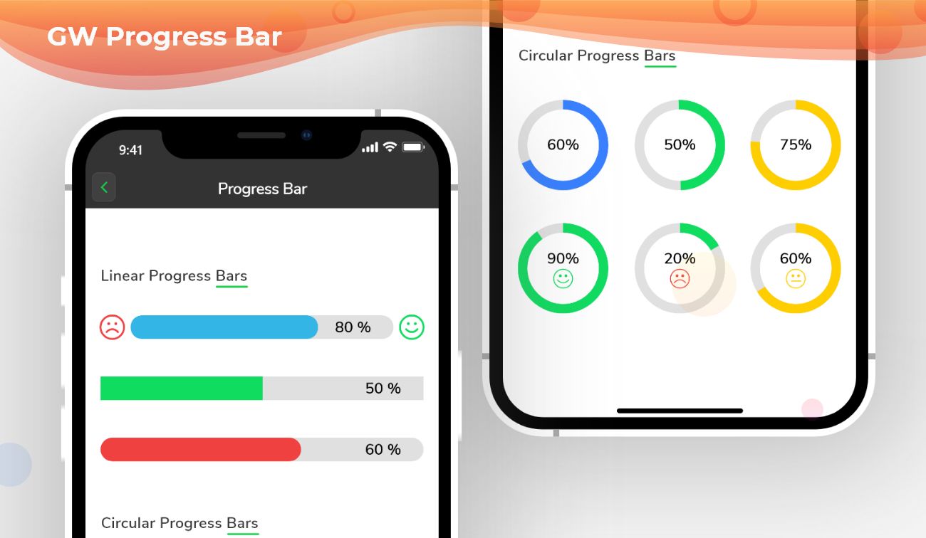
Flutter Progress Bar - A widget that graphically controls the component which shows the progress of a task
What is a Linear Progress Indicator?
Linear Progress Indicator is predefined in the flutter using which we can make the user aware that some task is being executed by the application and once it finishes they will have the output or result. It can also be used for loading time so that users don’t have to see the blank screen.
Types:
Indeterminate: Indeterminate progress indicator just used to show that the app is running and performing some tasks. However, a user won’t have any clue when that background process will finish. For creating an indeterminate progress bar we set the value property null.
Determinate: It is a type of indicator some set time has been calculated for the execution of tasks. It also indicates how much progress is completed. The value in the determinate progress indicator ranges from 0 to 1 where 0 indicates that progress is just started and 1 indicates that the progress is completed.
Flutter Progress Bar is a Flutter Progress Button that tells the percentage of progress of work that is been done in any given task or work.
Flutter Progress Bar Widget:
Flutter uses a progress bar to indicate the progress of a particular task such as downloading, uploading, file transfer, etc.
In Flutter, we can define the progress bar of widgets inside the scaffold. Therefore before adding a progress bar of a widget we need to define a Scaffold. When we create a sample flutter app, it comes with the default scaffold.
So, are you ready to make use of this widget package in the Flutter application? This Flutter widget visualizes the work done percentage in graphically. If so, then let's quickly jump into the usage and the ways a Progress Bar can be modified and used to make user-friendly apps. Here I am going to use an open-source UI Library known as GetWidget to build this Progress Bar widget in Flutter.
GetWidget Progress Bar Widget for Flutter:
It allows you to speed up your Flutter app development by 20-30%. It has almost all widget that allows you to enhance your Flutter UI design and speed up flutter development with fully customizable features.
Now here is i am going to talk about what is GetWidget Progress Bar widget and how we implement this on Flutter app to build awesome Flutter Progress Bar widget for an app.
How to Start:
Now here is the guide about how we should start developing the GFProgressBar Widget with the help of the GetWidget UI Library.
First, Let go with Getting started, It will guide you on how to start building a beautiful flutter application UI with the GetWidget UI library. Now, we have to install the GetWidget package from the pub.dev and use our 1000+ inbuilt Widget. To import the package in your Flutter project follow the below guide.
Install Package from pub.dev :
https://pub.dev/packages/getwidget - Check the details about GetWidget Package.
Import full package:
import 'package:getwidget/getwidget.dart';
Note: dependencies: getwidget: ^ 4.0.0
Keep playing with the pre-built UI components.
GetWidget progress bar shows us the amount of work done by a component that shows in a percentage form.
It can be of two types: Linear Progress Bar and Circular Progress Bar.
Also Read - How to Choose the Right Flutter App Development Company: A Comprehensive Guide
Linear Flutter Progress Bar Indicator With Percentage
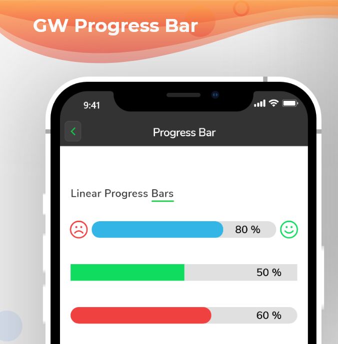
Linear GFProgressBar is straight and it will cover the screen width. we can use the below code to build the Flutter Progress Bar Widget with many custom properties.
 import 'package:getwidget/getwidget.dart';

 GFProgressBar(
     percentage: 0.9,
     backgroundColor : Colors.pink,
     progressBarColor: Colors.red,
)
Linear Flutter Progress Bar indicator Example Code
Flutter Circular Progress Bar Indicator with Getwidget
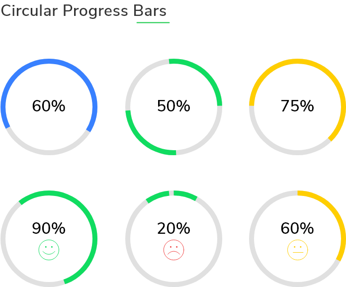
A circular Flutter progressbar is of a circular structure. Here we use width and radius properties to make it circular.
we can use the below code to build the Circular Flutter Progress Bar indicator with Percentage Widget.
 import 'package:getwidget/getwidget.dart';

 GFProgressBar(
     percentage: 0.6,
     width:150,
     radius: 100,
     backgroundColor : Colors.black38,
     progressBarColor: Colors.green,
)
Flutter Circular Progress bar indicator
Flutter Custom ProgressBar with child property
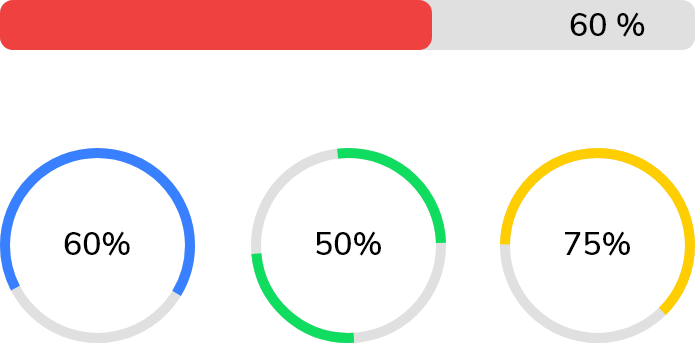
The Flutter Custom progress bar can be customized to show the percentage of work completed. By using the child property we can graphically add some enhancements to it. We can use the below code to build the GFProgressBar with child property.
import 'package:getwidget/getwidget.dart';

GFProgressBar(
    percentage: 0.4,
    lineHeight: 30,
    child: const Padding(
        padding: EdgeInsets.only(right: 5),
        child: Text('40%', textAlign: TextAlign.end,
                    style: TextStyle(fontSize: 17, color: Colors.white),
               ),
        ),
     backgroundColor: Colors.black26,
     progressBarColor: Colors.green,
)
Flutter Custom Progress bar
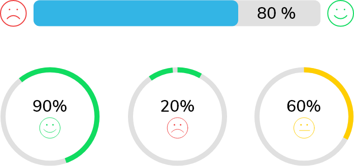
GF Flutter ProgressBar with leading and trailing icons
The GFProgress bar can be customized to show the percentage of processes completed. By using the leading and trailing property we can identify the percentage of work done. we can use the below code to build the custom GFProgressBar.
import 'package:getwidget/getwidget.dart';

GFProgressBar(
     percentage: 0.7,
     lineHeight: 30,
     alignment: MainAxisAlignment.spaceBetween,
     child: const Text('70%', textAlign: TextAlign.end,
                  style: TextStyle(fontSize: 18, color: Colors.white),
                  ),
     leading  : Icon( Icons.sentiment_dissatisfied, color: Colors.red),
     trailing: Icon( Icons.sentiment_satisfied, color: Colors.green),
     backgroundColor: Colors.black12,
     progressBarColor: Colors.blue,
)
Flutter Progress bar with icon and percentage
GF ProgressBar Custom Properties
The Look and feel of GFProgressBar can be customized using the following properties:
| Name | Description |
|---|---|
| percentage | type of double which should be from 0 to 1 to indicate the progress percentage |
| radius | type of double used to show the radius of the Circular Progress Bar |
| width | defines the width of the progress bar |
| type | type of [GFProgressType] which changes the shape of progress bar ie , linear or circular |
| lineHeight | defines the height of the progress bar |
| circleWidth | defines the thickness of the circle's arc in Circular Progress bar |
| circleStartAngle | defines the angle on which the circle starts to progress in degrees.(ie 0.0, 45.0, 90.0 etc) |
| animation | type of bool which allows the progress line to animate when the percentage value is changed, default is false |
| animationDuration | duration of animation in milliseconds , applicable only if animation is true |
| alignment | used to align the leading and trailing widget which the progress bar evenly |
| padding | defines the padding of the progress bar |
| animateFromLastPercentage | type of bool which is used to animate the progress bar from the last percentage value set |
| linearGradient | linear gardient colors given to the progress line color |
| autoLive | set to false if you don't want to preserve the state of the widget , default is true |
| fromRightToLeft | set to true if you want to animate the linear progress bar from right to left |
| mask | Creates a mask filter that takes the progress shape being drawn and blurs it |
| clipLinearGradient | set to true if you want to display only a part of [linearGradient] based on percentage value, |
| progressHeadType | type of [GFProgressHeadType] which changes the shape of the progress head ie , circular or sqaure |
| reverse | type to bool which is used to display the progress in reverse direction |
How can I fix the height of the GFProgressBar?
By using the lineHeight property we can fix a height to the progress bar.
Can we use animation in the progress bar?
Yes we can use animation here. There are many properties like animation, animationDuration, etc. to customize it.
Are there any specified child components to use in it?
No, there isn't any specification of child components that we use here. We can use text, icons, images, etc.
How can we use linear-gradient in the progress bar?
Yes, we can add linear gradient by using the linearGradient property which gives gradient to the progress line. We also have a clipLinearGradient property to show a particular part of the linear gradient. For that, we have to set true to clipLinearGradient.
What is the use of mask property?
Mask property will create a filter that makes the progress shape being drawn and blurs it.

GitHub Repository: Please do appreciate our work through Github start
Conclusion:
Here we discuss, what Flutter ProgressBar Widget is? And how we can use and implement it into our Flutter app through the GetWidget ProgressBar component. Here, there are options to customize and use other types of ProgressBar.
About Our Team:
We have been working on Flutter since Flutter launched in beta version in 2017. And our team have been putting hundreds and hundreds of hour to experiment and implementation of Flutter. As well as after successful delivery of enterprise and SAAS applications that have been used by more than 500+ businesses around the 119+ countries. Now we are in love with Flutter development and we are very passionate about Flutter development. Now it is something we are trying to give a small contribution to the Flutter Dev Community. If you need assistance for your next app development project you can hire flutter app developer from the GetWidget team

