Flutter Typography - A widget that includes textual style, appearance, and structure
A step-by-step guide to customize fonts properly like Regular, Medium, Bold font with opacity, and many other ready-to-use widgets.

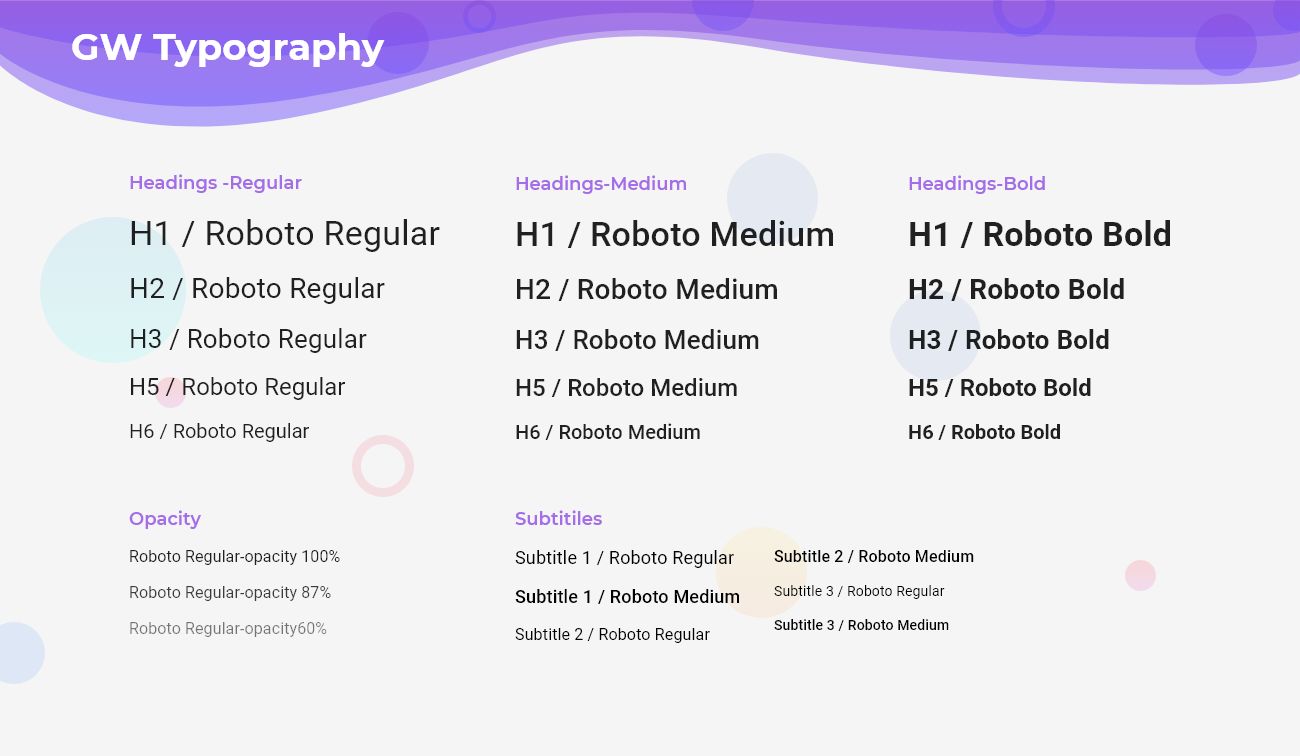
Flutter Typography is the art of segregating the text and letters in such a manner that makes the text decipherable and clear. This also rejuvenates the content.
Flutter Typography Widget
Flutter Typography is basically the arrangement of text and letters in order to make a clean styling. This enhances the look of the UI and makes it more responsive. Typography improves the textual style, appearance, and structure.
If you are choosing typography then you are simply choosing lovely textual styles. It is a crucial part of UI design. Typography upgrades readability, availability and can guarantee a magnificent client experience.
So, are you ready to make use of this widget package in the Flutter application? It surely adds some sparkles to your designing skills. This Flutter widget also enhances the look of the widgets. If so, then let's quickly jump into the usage and the ways a Typography can be modified and used to make user-friendly apps.
Here I am going to use an open-source UI Library known as GetWidget to build this Typography widget in Flutter.
GetWidget Typography
GFTypography is a Flutter Typography that mainly focuses on the position of the content. It can add to the look and feel of the widget. It has customization options which is an easy way to handle it as per the application and its requirement.
How to Get Started
Now here is the guide about how we should start developing the GFTypography Widget with the use of the GetWidget UI Library.
First, Let's go with Getting started, It will guide you on how to start building a beautiful Flutter UI Kit with the GetWidget UI library. Now, we have to install the GetWidget package from the pub.dev and use our 1000+ inbuilt Widget. To import the package in your Flutter project follow the below guide.
Install Package from pub.dev :
https://pub.dev/packages/getwidget - Check the details about GetWidget Package.
Import full package:
import 'package:getwidget/getwidget.dart';
Note: dependencies: getwidget: ^ 4.0.0
Keep playing with the pre-built UI components.
Flutter Typography
GFTypography is a widget that arranges the texts in a clean pattern with the styling. We can add textColor property to make it more promising. The basic GFTypography example is given below:
Flutter Typography with Font Size
GFTypography is having different types that vary from Typo1 to Typo6. The font size decreases from Typo1 to Typo6 respectively. Below code shows the example of GFTypography with different font sizes:
import 'package:getwidget/getwidget.dart';

GFTypography(
  text: 'GFTypography Typo1',
  type: GFTypographyType.typo1,
),

GFTypography(
  text: 'GFTypography Typo2',
  type: GFTypographyType.typo2,
),

GFTypography(
  text: 'GFTypography Typo3',
  type: GFTypographyType.typo3,
),

GFTypography(
  text: 'GFTypography Typo4',
  type: GFTypographyType.typo4,
),

GFTypography(
  text: 'GFTypography Typo5',
  type: GFTypographyType.typo5,
),

GFTypography(
  text: 'GFTypography Typo6',
  type: GFTypographyType.typo6,
),
Flutter Fonts Widget Example Widget
Flutter Typography with Icon
GFTypography comes with different properties. In the icon property, we can use any kind of icon here. Below is a small example of GFTypography with an icon:

import 'package:getwidget/getwidget.dart';

 GFTypography(
   text: 'GFTypography Typo1',
   type: GFTypographyType.typo1,
   icon: Icon(Icons.home,color:Colors.blue),
 ),
Flutter Icon Font Widget Code Example
Flutter Typography on Background Image
GFTypography can have a background image on it and all the text or icon properties will come over it. The below code shows the GFTypography on BackgroundImage.

import 'package:getwidget/getwidget.dart';

GFTypography(
  text: 'GFTypography Typo1',
  type: GFTypographyType.typo1,
  icon: Icon(Icons.home),
  backgroundImage: AssetImage('image asset here'),
),
Flutter Text Font on Image example
Typography Custom Properties
We can change the visualization of GFTypography by customizing it. The look and feel can be customized using GFTypography properties.
| Name | Description |
|---|---|
| child | child of type Widget alternative to text Key |
| dividerColor | defines the color of the divider |
| textColor | defines the color of the text |
| dividerBorderRadius | the border radius of the divider |
| dividerAlignment | the alignment of the divider to start, center or end |
| showDivider | bool value to hide or show divider , defaults to true |
| dividerWidth | the width of the divider |
| backgroundImagecolorFilter | colorFilter of background image only when background image is available |
Can we add any style property to the text?
Yes, we can customize the look of a text widget. For example by using textColor and type property.
How can we add an image or an icon in the prefix part of GFTypography?
By using the icon property we can add any kind of assets we want.
Is there any specification in the widget which we can use here?
No, there isn't any specification of widgets that we can use here.
What is the use of the divider in this widget?
We mostly underline our headings to highlight it. Just like that, we use a divider here.
Can we customize the divider in Typography? How?
Yes, we can customize the divider by using the dividerColor, dividerRadius, and dividerAlignment property. In dividerColor and dividerRadius property, we can update the respective color and radius of the widget but in the case of dividerAlignment we can add a specific position for the divider. For example the start, center or end position.
 getwidget
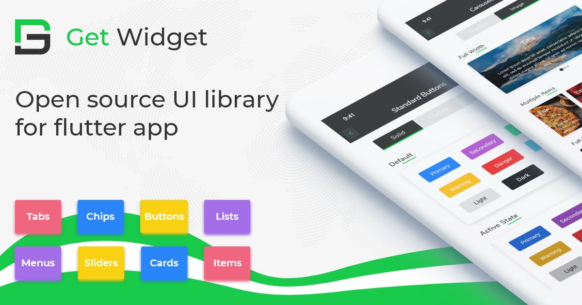
GitHub Repository: Please do appreciate our work through Github start
Also Read - Top 10 Best Flutter Typography Widget List
Conclusion:
Here we discuss, what Flutter Typography Widget is? And how we can use and implement it into our Flutter app through the GetWidget Typography component. Here, there are options to customize the Typography.
About Our Team:
We have been working on Flutter since Flutter launched in beta version in 2017. And our team have been putting hundreds and hundreds of hour to experiment and implementation of Flutter. As well as After successfully delivering enterprise and SAAS applications that have been used by more than 500+ businesses around 119+ countries. Now we are in love with Flutter development and we are very passionate about Flutter development. Now it is something we trying to give a small contribution to the Flutter Dev Community.