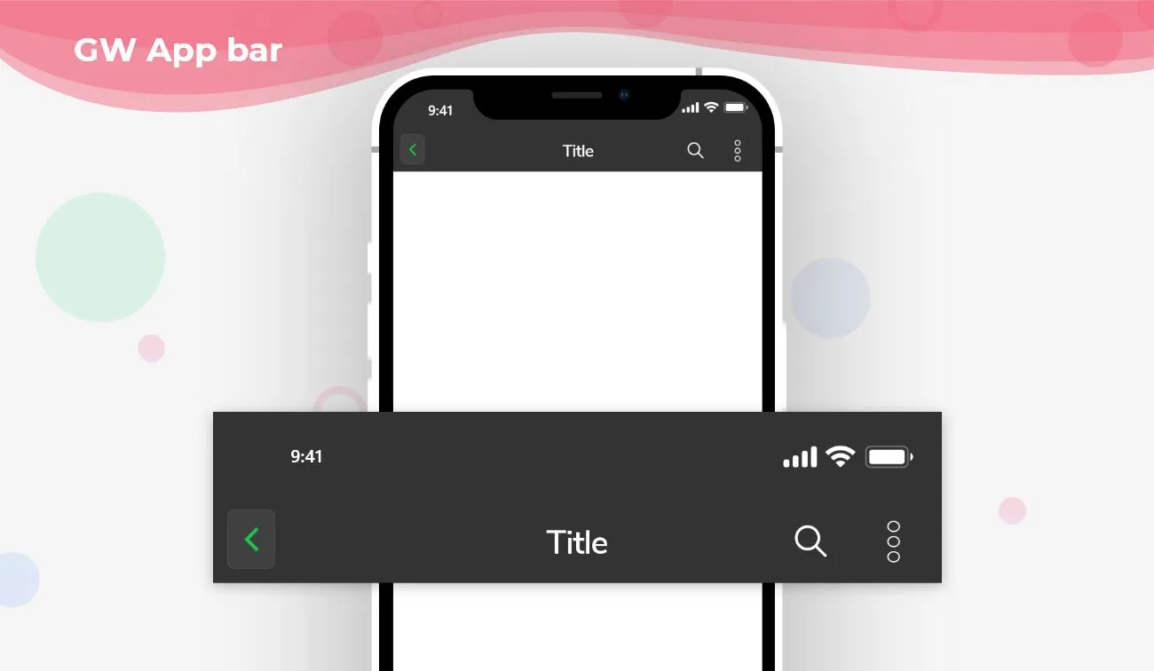
Flutter AppBar is an action button that is placed on the top of the screen and is fixed on top. It has a toolbar and other widgets that can also be used inside the Flutter Appbar. The app bar is widely used as a header to define the page headers so that it will be user-friendly and easy for the users to identify the pages. The Appbar contains a title, action buttons wherein it can be a notification button on the homepage, and so on.
So, are you ready to make use of this widget package in the Flutter application? If so, then let’s quickly jump into the usage and the ways an AppBar can be modified and used to make user-friendly apps. Here I am going to use an open-source UI Library known as GetWidget to build this AppBar widget in Flutter.
Flutter Appbar Widget using GetWidget
Appbar is a Widget in Flutter that is at the top of the screen with a menu icon and action buttons in it. Flutter AppBar is an action button that is placed at the top and is fixed there. The AppBar Widget that is a appbar design in flutter contains basically a toolbar and other potential widgets.
AppBar is a most used Flutter Component that is used in all the screens of an application. It gives the name of the screen that is active which tells the user about the screen by just looking at the Appbar. App Bar Icons hold the notification, cart icons that are useful in all e-commerce applications. AppBar nests all these icons in it and hence it’s one of the most used Flutter Component.
The Custom Widget of the AppBar can be created using GF AppBar Component that is a custom appbar Flutter. GFAppBar is a Flutter Appbar that is fixed on the top of the screen. It has a leading button that can be customized and a list of widgets can be added to the actions button in a linear sequence. The title of the AppBar gives the name of the screen to make the application user-friendly. The Background Color of the Appbar can be changed according to the need of the application. The Flutter Appbar provides flexible space for any widgets.
A SliverAppbar is a Flutter Appbar that gives the AppBar a certain height that will be scrollable and after some extend of scrolling, the appbar will be fixed at the topmost section in your mobile applications.
How to Start building AppBar Menu in Flutter:
Now, here is the guide about how we should you can start developing Flutter AppBAr Widget with the help of GetWidget UI Library.
First, Let go with Getwidget Flutter docs, It will guide you on how to start building a beautiful flutter application UI with the GetWidget UI library. Now, we have to install the GetWidget package from the pub.dev and use our 1000+ inbuilt Widget. To import the package in your Flutter project follow the below guide.
Install Package from pub.dev :
https://pub.dev/packages/getwidget – Check the details about GetWidget Package.
Import full package:
import ‘package:getwidget/getwidget.dart’;
Note: dependencies: getwidget: ^4.0.0
Keep playing with the pre-built UI components.
The GFAppBar basically displays the toolbar widgets, leading, title, and actions buttons. The Leading button will be at the top left corner of the appbar.
The below image shows a simple appbar menu with a flutter appbar back button on the leading parameter that is used to go back to the previous page. The action button is on the right side showing a heart icon.

import 'package:getwidget/getwidget.dart';
GFAppBar(
  leading:  GFIconButton(
    icon: Icon(
      Icons.message,
      color: Colors.white,
    ),
    onPressed: () {},
    type: GFButtonType.transparent,
  ),
  title: Text("GF Appbar"),
  actions: [
    GFIconButton(
      icon: Icon(
        Icons.favorite,
        color: Colors.white,
      ),
      onPressed: () {},
      type: GFButtonType.transparent,
    ),
  ],
),
How to add a search bar icon in Flutter Appbar?
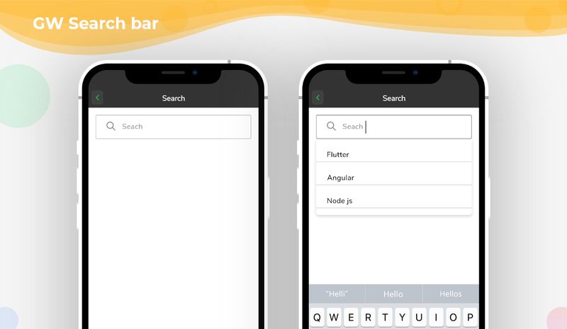
We can manually place a search icon in the action button of the appbar menu but, GFAppbar makes the work easier by having a parameter calledsearchBarwherein it is a boolean variable. The searchBar is used to search the item given in the list. If the search bar is truethen it displays a search bar text field with leading, trailing options.
The below code shows the example of how to pass the search parameter.

import 'package:getwidget/getwidget.dart';
GFAppBar(
  leading:  GFIconButton(
    icon: Icon(
      Icons.message,
      color: Colors.white,
    ),
    onPressed: () {},
    type: GFButtonType.transparent,
  ),
  searchBar: true,
  title: Text("GF Appbar"),
  actions: [
    GFIconButton(
      icon: Icon(
        Icons.favorite,
        color: Colors.white,
      ),
      onPressed: () {},
      type: GFButtonType.transparent,
    ),
  ],
),
Flutter Appbar with Segmented Tabs Example Code
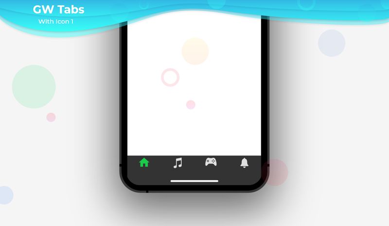
GFAppbar can be used as SegmentedTabs. The SegmentedTab renders the page according to the tab selected. SegmentedTab can be used by defining its code in the title field of the Appbar. The below code shows a simple segmented tab inside the Appbar menu.

import 'package:getwidget/getwidget.dart';
late TabController tabController;
  @override
  void initState() {
    super.initState();
    tabController = TabController(length: 3, vsync: this);
  }
  @override
  void dispose() {
    tabController.dispose();
    super.dispose();
  }
  return Scaffold(
      appBar: GFAppBar(
        backgroundColor: GFColors.getGFColor(GFColor.dark),
        title:   GFSegmentTabs(
          tabController: tabController,
          tabBarColor: GFColors.getGFColor(GFColor.light),
          labelColor: GFColors.getGFColor(GFColor.white),
          unselectedLabelColor: GFColors.getGFColor(GFColor.dark),
          indicator: BoxDecoration(
            color: GFColors.getGFColor(GFColor.dark),
          ),
          indicatorPadding: EdgeInsets.all(8.0),
          indicatorWeight: 2.0,
          border: Border.all(color: Colors.white, width: 1.0),
             length: 3,
              tabs: [
                Text(
                  "Tab1",
                ),
                Text(
                  "Tab2",
                ),
                Text(
                  "Tab3",
                ),
              ],
            ),
          ),
 body: GFTabBarView(controller: tabController, children: [
   Center(
     child: Text('Tab 1'),
   ),
   Center(
     child: Text('Tab 2'),
   ),
   Center(
     child: Text('Tab 3'),
   ),
 ]),
);
GF Flutter Search Bar Custom Properties:
The look and feel of the GFAppbar search bar can be customized using the following properties.
GF Flutter Appbar Custom Properties
The look and feel of the GF Flutter Appbar can be customized using the GFAppbar properties.
How to create a Custom Appbar in flutter?
GFAppBar’s title gives the name of the screen or it can be any title with respect to the screen. The AppBar can be extended to any preferred size. The background color can be changed according to the need. The AppBar can be extended to any desired height that combines a list of widgets accordingly to the requirement.
The SliverAppBar is such a boon in doing this. Flutter SliverAppbar provides a certain height for the appbar which will be scrollable and after some extend of scrolling the appbar will be static at the top like a normal appbar.
For more customization options of AppBar, Head to our official documents.
How to create a PreferredSize AppBar in Flutter?
Appbar can have a leading customized icon wherein the default icon can be customized and can be replaced accordingly. The action buttons can be a set of icons or buttons that will be in a linear fashion which does any kind of actions required. The Title can have a one-line text or more than one line to tell the brand’s name or its subtitle in the same title field and it can be centrally placed inside the appbar.
The Back Button in the appbar represents the call to action for the previous page. It re-directs the current screen to the last viewed screen. The back button icon comes with the default appbar, in which the icon can be customized and placed in the leading space of the appbar.
AppBar is fixed at the top but its height can be determined by the user according to the need. For this purpose, we use the PreferredSize widget to make use of its properties to get the desired height that will be needed by the application.
In this section, we will use GetWidget library to show the example of the appbar, the appbar with the preferred size widget, and the customization options of the appbar.
First and foremost we will go through the example of a simple Appbar which consists of an icon on the leading space, a title, and some action buttons on the right side. Let us look at the below example.
import 'package:getwidget/getwidget.dart';
GFAppBar(
  leading:  GFIconButton(
    icon: Icon(
      Icons.home,
      color: Colors.white,
    ),
    onPressed: () {},
    type: GFButtonType.transparent,
  ),
  title: Text("GF Appbar"),
  actions: [
    GFIconButton(
      icon: Icon(
        Icons.favorite,
        color: Colors.white,
      ),
      onPressed: () {},
      type: GFButtonType.transparent,
    ), GFIconButton(
      icon: Icon(
        Icons.send,
        color: Colors.white,
      ),
      onPressed: () {},
      type: GFButtonType.transparent,
    ), ], ),
The above example explains a simple appbar with a home icon on the left side ie, on the leading space, a title, and two icons in the action buttons space on the right side.
GFAppBar has many customization options. A searchBar can be added in GFAppbar in the place of title space and even segmented tabs can also be added to it. To see more examples of these please head to our official Getwidget documentation
Now let us see how to use the preferred size widget inside the appbar. The Preferred Size widget is used to extend the height of the appbar whenever the need arises. By extending the height we can place a background image, more text or icons, and even buttons. Any kind of widgets can be placed on the side of the appbar and by using the preferred size widget the space will be more to fit any other kind of components. The functionality of the appbar remains the same whereas we are just extending the height of the appbar. With the default appbar, the height cannot be increased and hence we are making use of the widget called preferred Size Widget.
Let us see a simple example of how to use this widget to get the desired height of the appbar in the below code.
The Below example gives the appbar an extended height of 150 and the height can be extended or decreased according to the need of the application.
import 'package:getwidget/getwidget.dart';
appBar:PreferredSize(preferreSize:Size.fromHeight(150.0),child:GFAppBar(
  leading:  GFIconButton(
    icon: Icon(
      Icons.message,
      color: Colors.white,
    ),
    onPressed: () {},
    type: GFButtonType.transparent,
  ),
  title: Text("GF Appbar"),
  actions: [
    GFIconButton(
      icon: Icon(
        Icons.favorite,
        color: Colors.white,
      ),
      onPressed: () {},
      type: GFButtonType.transparent,
    ),
  ],
),)
How to create a Gradient AppBar in Flutter?
The SearchBar, Segmented tabs in the appbar can be customized fully, and to see the properties please head to our official Getwidget documentation.
Now let us see how to make the appbar a gradient appbar. Gradient AppBar is an appbar that has a combination of colors as the background color for the appbar. It gives the AppBar a nice background color and will look attractive to the user.
Let us design an AppBar with a Gradient color and the code for the same is given below.
import 'package:getwidget/getwidget.dart';
GFAppBar(
      centerTitle: true,
        title: Text('Gradient AppBar'),
        flexibleSpace: Container(
          decoration: BoxDecoration(
            gradient: LinearGradient(
              begin: Alignment.topLeft,
                end: Alignment.bottomRight,
                colors: [
              Colors.green,
              Colors.orange
            ])
         ),
     ),
),Here we have used two colors as gradients and set that as the background color for the Appabr. For more options on customization visit our official documentation.
GitHub Repository: Please do appreciate our work through Github start
How to change the height of the Appbar?
We can use PreferredSize Widget to change the height of the AppBar according to the need.
How to remove the leading button space in AppBar?
To Remove the leading button, there is a property called automaticallyImplyLeading, that has to be set.
Can the customized icons be used in Appbar Leading Space?
Yes, any type of customized icon can be used.

