Flutter ListTile with text and icons
What is the Flutter ListTile Widget?
The Flutter ListTile Widget is a UI element in the Flutter framework that is used to display structured lists of items. It follows the List specification from Material Design. The ListTile widget can contain one to three lines of text, which can be accompanied by icons or other widgets such as checkboxes. It provides a streamlined layout with a title, subtitle, and optional leading or trailing icons, radio buttons, images, avatar, etc. The prefix and suffix icons or any other widgets are defined through the leading and trailing parameters.
By default, Flutter ListTile can show two lines of text. The title and the subtitle. As the first line of text is not optional but the second line of text or the subtitle i.e. optional. The texture of the leading and trailing widgets can be modified according to the properties given.
So, are you ready to make use of this widget package in the Flutter application? If so, then let’s quickly jump into the usage and the ways a ListTile can be modified and used to make user-friendly apps. Here I am going to use an open-source UI Library known as GetWidget to build this ListTile widget in Flutter.
GetWidget Flutter ListTile
GFListtile is a Flutter ListTile. In this widget, we can design a title, subtitle and trailing icon widgets, etc. It has customization options which is an easy way to handle it as per the application and its requirements. The GetWidget ListTile displays the list of items in a card fashion.
How to Start:
Now here is the guide about how we should start developing the GFListTile Widget with the use of the GetWidget UI Library.
Getting started will guide you on how to start building a beautiful flutter application with the GetWidget UI library. You have to install the package from pub.dev, import the package in your Flutter project.
Install Package from pub.dev :
https://pub.dev/packages/getwidget
Import full package:
import ‘package:getwidget/getwidget.dart’;
Note: dependencies: getwidget: ^ 4.0.0
Keep playing with the pre-built UI components.
GFListTile is a Flutter ListTile that is a material widget used to populate a ListView in an application. It basically has a title, and one to three lines of description or subtitle, and a trailing icon.
The GFListTile has many types of presenting the title, subtitle. All the types are different in one or another way. Let us now see the different types and their example code in the below sections.
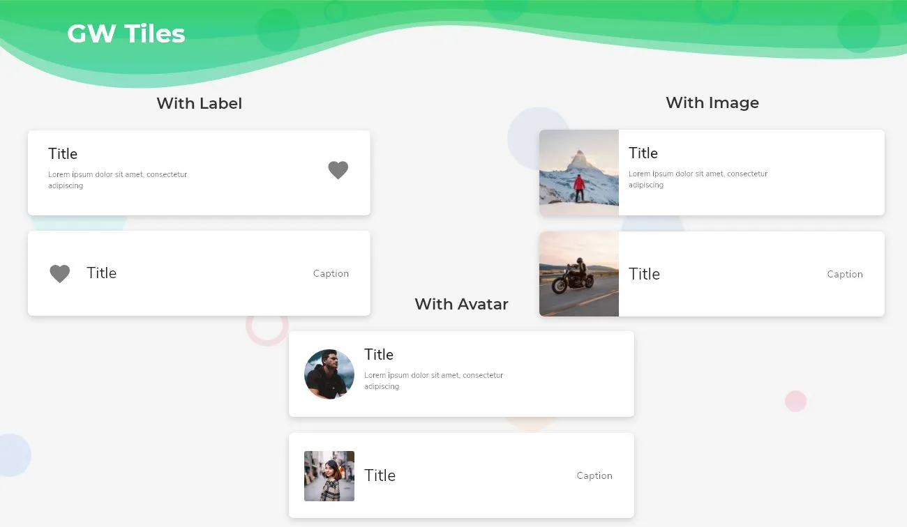
GF Flutter ListTile with Label
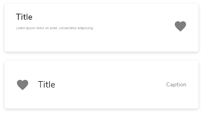
GF Flutter ListTile with a label is nothing but a row of titles, icons, subtitles, and sometimes descriptions. The title is nothing but a label and an optional subtitle or description about the tile.
The below image shows the GFListTile with label and the code below defines a simple title with fewer lines of code.
import 'package:getwidget/getwidget.dart';
GFListTile(
  titleText:'GetWidget Library',
  subTitleText:'This is a open source UI library.',
  icon: Icon(Icons.favorite,color:Colors.red)
),
GF Flutter ListTile with Image:
GFListTile with Image is nothing but having an image in the tile to represent the tile, in-depth with the help of images. The images can be any kind of image(asset, network images) to make the user interface nice and clean.
If you want to learn how Flutter image can handle using GFimage Widget can check our Blog or official docs for GfWidget.
The below image shows the GFListTile with Images and the code below defines a simple title with fewer lines of code.
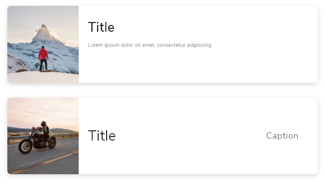
import 'package:getwidget/getwidget.dart';
GFListTile(
  avatar:Image.asset('your image assets here',width:60,height:60),
  titleText:'GetWidget Library',
  subTitleText:'This is a open source UI library.',
  icon: Icon(Icons.favorite,color:Colors.red)
),
GFListTile with Avatar:
GFListTile with Avatar is used to show any kind of avatar or the profile picture of the person, brand, or product. We can use our library image or Flutter avatar widgets in GFListTile. Avatar is nothing but just a background image or a profile image.
The below code shows the GFListTile with Avatar with fewer lines of code.
import 'package:getwidget/getwidget.dart';
GFListTile(
  avatar:GFAvatar(),
  titleText:'GetWidget Library',
  subTitleText:'This is a open source UI library.',
  icon: Icon(Icons.favorite,color:Colors.red)
),
GFListTile Custom Properties.
GFListTile has some of its custom properties to enhance the look and feel of the application. The below table shows the custom properties:
| color | The GFListTile’s background color. Can be given [Color] or [GFColors] |
| description | The description to display inside the [GFListTile]. see [Text] |
| padding | defines the padding of GFListTile |
| margin | defines the margin of GFListTile |
| titleText | type of [String] used to pass text, alternative to title property and gets higher priority than the title |
| subTitleText | type of [String] used to pass text, alternative to subtitle property and gets higher priority than the subtitle |
| avatar | type of [Widget] or [GFAvatar] used to create a rounded user profile |
| title | The title to display inside the [GFListTile]. see [Text] |
| subTitle | The subtitle to display inside the [GFListTile]. see [Text] |
| icon | The icon to display inside the [GFListTile]. see [Icon] |
| enabled | Whether this list tile is interactive. If false, this list tile is styled with the disabled color from the current [Theme] and the [onTap] and [onLongPress] callbacks are inoperative. |
| onTap | Called when the user taps this list tile. Inoperative if [enabled] is false. |
| onLongPress | Called when the user long-presses on this list tile. Inoperative if [enabled] is false. |
| selected | If this tile is also [enabled] then icons and text are rendered with the same color. By default the selected color is the theme’s primary color. The selected color can be overridden with a [ListTileTheme]. |
| focusColor | The color for the tile’s [Material] when it has the input focus. |
| hoverColor | The color for the tile’s [Material] when a pointer is hovering over it. |
| focusNode | Defines the keyboard focus for this widget. |
| autofocus | On true state, it should focus itself if nothing else is already focused. Defaults to false |
What are the specific widgets we can use in listTile?
There are no certain widgets that we can use in ListTile here. It can be any widget that is to be used to make it more beautiful.
Also Read: How to Design Custom Flutter Buttons
Can the padding be removed from the tile?
Yes, the default padding can be removed by applying the padding to zero in the code like the below one.
import 'package:getwidget/getwidget.dart';
GFListTile(
   titleText:'Title',
  subTitleText:'Sub Title',
  icon: Icon(Icons.home,color:Colors.red),
  padding:EdgeInsets.zero,
),
Can the margin be removed from the tile?
Yes, the default margin can be removed by applying the margin to zero in the code like the below one.
import 'package:getwidget/getwidget.dart';
GFListTile(
   titleText:'Title',
  subTitleText:'Sub Title',
  icon: Icon(Icons.home,color:Colors.red),
  padding:EdgeInsets.zero,
),
How to create a Flutter ListTile?
Flutter ListTile is a row of information about any things and it populated the lists in a listView manner. It has basically a title, icon, and subtitle is optional.
Here to demonstrate the tile we will be using the Flutter Widgets and its GFListTile component which has many types and options to customize them. Let us see all of them in the below section.
GFListTile is a Flutter ListTile that basically has a title, one to three lines of subtitle, description field, and a trailing icon. It can be used with any other widgets and it populates the list in a listView manner. It is widely used when the design is the same but has a lot of data and information in them. Let us see its types in the below blocks.
GFListTile with Label:
GFListTile with a label is a row of titles, icons, subtitles, avatar and sometimes descriptions in them. The title is nothing but a label and an optional subtitle or description about the tile to give brief data about the title.
The below code shows the simple GFListTile with the label where it has an icon in the trailing part. The icon is also optional depending on the requirement.
import 'package:getwidget/getwidget.dart';
GFListTile(
  titleText:'GetWidget Library',
  subTitleText:'This is a open source UI library.',
  icon: Icon(Icons.favorite,color:Colors.red)
),
GFListTile with GFImage widget
GFListTile with Image is nothing but having an image in the leading space of the tile that means on the starting point of the tile to represent the tile, in-depth with the help of images. The images can be any kind of image(asset, network images) to make the user interface nice and clean.
The below code shows the simple GFListTile with the Image where it has an icon in the trailing part. The icon is also optional depending on the requirement.
import 'package:getwidget/getwidget.dart';
GFListTile(
  avatar:Image.asset('your image assets here',width:60,height:60),
  titleText:'GetWidget Library',
  subTitleText:'This is a open source UI library.',
  description:('GetWidget Library is a Flutter based component library'),
  icon: Icon(Icons.favorite,color:Colors.red)
),
GFListTile with GFAvatar Widget
GFListTile with Avatar is used to show any kind of avatar or the profile picture of the person, brand, or product. We can use our library image or avatar widgets in GFListTile. Avatar is nothing but just a background image or a profile image.
The below code shows the GFListTile with Avatar with fewer lines of code.
import 'package:getwidget/getwidget.dart';
GFListTile(
  avatar:GFAvatar(),
  titleText:'GetWidget Library',
  subTitleText:'This is a open source UI library.',
  description:('GetWidget Library is a Flutter based component library'),
  icon: Icon(Icons.favorite,color:Colors.red)
),
GFListTile has more customization options and properties. To view them and use them in your application head to the official GF Flutter ListTile documentation in GetWidget Library here
Also Read: How to Create Flutter Custom Card
How to design a Custom Flutter ListTile?
Flutter ListTile is used to populate the lists in a listView manner. It has basically a title, icon, and subtitle, and the description is optional.
Here, we will be using the GetWidget library and its GFListTile component which has many types and options to customize them. Let us see all of them one by one in the below section.
GFListTile is a Flutter ListTile that fundamentally has a heading, one to three lines of subheading or subtitle, description field, and a trailing icon. It can be used with any other widgets and it populates the list in a listView manner. It is widely used to repeat the design structure with different data in it. Let us see its types in the below blocks.
import 'package:getwidget/getwidget.dart';
GFListTile(
  titleText:'Title',
  subTitleText:'Sub Title',
  icon: Icon(Icons.home,color:Colors.red),
  padding:EdgeInsets.zero,
  margin:EdgeInsets.zero
),import 'package:getwidget/getwidget.dart';
GFListTile(
avatar:Image.asset('your image assets here',width:60,height:60),
titleText:'Title',
subTitleText:'Sub Title',
icon: Icon(Icons.home,color:Colors.red),
padding:EdgeInsets.zero,
margin:EdgeInsets.zero
),import 'package:getwidget/getwidget.dart';
GFListTile(
avatar:GFAvatar(),
titleText:'Title',
subTitleText:'Sub Title',
icon: Icon(Icons.home,color:Colors.red),
padding:EdgeInsets.zero,
margin:EdgeInsets.zero
),GFListTile has more customization options and properties. To view them and use them in your application head to the official GFListTile documentation.
How to change the background color of the ListTile in Flutter
The ListTile in Flutter is a simple material widget that has a row of data that consists of the title or the heading, an optional subtitle and a description to describe the title, and a trailing icon to give more details to the tile.
GFListTile is a Flutter ListTile has can be used to achieve the same design of a row of information that has all the properties as flutter ListTile. It can be used to represent the same design with the data being changed in a ListView manner.
We will use the GetWidget Library to make use of its component called GFListTile that has many customization options to use for the need of the application.
The GFListTile has many variants in it, we will see one by one in the below sections.
GFListTile with Label and changing background-color
GFListTile with a label is a row of titles, icons, subtitles, and sometimes descriptions in them with the background being changed. The title is nothing but a label and an optional subtitle or description about the tile to give brief data about the title.
The below code shows the simple GFListTile with the label where it has an icon in the trailing part. and the background color can be set to any desired color according to the need. The icon is also optional depending on the requirement. In the below code we have removed the default padding and margin and added the background-color property
import 'package:getwidget/getwidget.dart';
GFListTile(
  titleText:'Title',
  subTitleText:'Sub Title',
  icon: Icon(Icons.home,color:Colors.red),
  padding:EdgeInsets.zero,
  margin:EdgeInsets.zero,
  backgroundColor:Colors.green
),
GFListTile with Image with changing background-color
GFListTile with Image is having an image in the leading space of the tile that means on the left point of the tile to represent the tile, in-depth with the help of images like profile pictures of the author or the brands. The images can be any kind of image(asset, network images) to make the user interface nice and clean. We will specify the height and width of the image also to make it more precise and look better with the tile.
The below code shows the simple GFListTile with the Image where it has an icon in the trailing part. and the background color can be set to any desired color according to the need. The icon is also optional depending on the requirement. In the below code we have removed the default padding and margin and added the background-color property.
import 'package:getwidget/getwidget.dart';
GFListTile(
  avatar:Image.asset('your image assets here',width:60,height:60),
   titleText:'Title',
  subTitleText:'Sub Title',
  icon: Icon(Icons.home,color:Colors.red),
  padding:EdgeInsets.zero,
  margin:EdgeInsets.zero,
  backgroundColor:Colors.orange
),
GFListTile with Avatar Widget
GFListTile with Avatar is used to show any kind of avatar or the profile picture of the person, brand, or product. We can use our library image or avatar widgets in GFListTile. Avatar is nothing but just a background image or a profile image. It can represent the author’s image or the brand’s logo and even the product’s image that gives more precise information about the title.
The below code shows the simple GFListTile with the Avatar where it has an icon in the trailing part. and the background color can be set to any desired color according to the need. The icon is also optional depending on the requirement. In the below code we have removed the default padding and margin and added the background-color property.
import 'package:getwidget/getwidget.dart';
GFListTile(
  avatar:GFAvatar(),
  titleText:'Title',
  subTitleText:'Sub Title',
  icon: Icon(Icons.home,color:Colors.red),
  padding:EdgeInsets.zero,
  margin:EdgeInsets.zero,
  backgroundColor:Colors.blue
),
GFListTile has more customization options and properties. To view them and use them in your application head to the official GFListTile documentation.

GitHub Repository: Please do appreciate our work through Github stars.
Conclusion:
Here we discussed, what Flutter ListTile Widget is? And how it is easy and powerful to use in any application through the GetWidget ListTile component for Flutter apps. Here, there are options to customize and use the ListTile.
About Our Team:
We have been working on Flutter since Flutter launched in beta version in 2017. And our team have been putting hundreds and hundreds of hour to the experiment and implementation of Flutter. As well as After successfully delivering enterprise and SAAS applications that have been used by more than 500+ businesses around 119+ countries. Now we are in love with Flutter app development and we are very passionate about Flutter development. Now it is something we trying to give a small contribution to the Flutter Dev Community.

I’m Navin Sharma, a passionate Full Stack Developer with over 20 years of experience in the tech industry. Throughout my career, I’ve had the privilege of working on a variety of exciting projects, developing everything from dynamic web applications to complex back-end systems. My expertise spans both front-end and back-end technologies, and I thrive on building solutions that are not only functional but also scalable and user-friendly.
Beyond my hands-on development work, I’ve contributed to several well-respected tech and startup blogs, where I share my insights on the latest trends, development strategies, and best practices in the world of web development. I also have a strong background in app analysis, where I’ve helped companies optimize their products for better performance and enhanced user experience.
Whether I’m working on a challenging coding problem or mentoring fellow developers, I’m always eager to learn, innovate, and push the boundaries of what’s possible with technology.

