Top 10 Best Flutter AppBar Widgets: SliverAppBar, M3 Variants and Migration (2026)
Top 10 Flutter AppBar widgets to build sticky top toolbars — title styling, action buttons, theming, and GetWidget's GFAppBar with code examples.
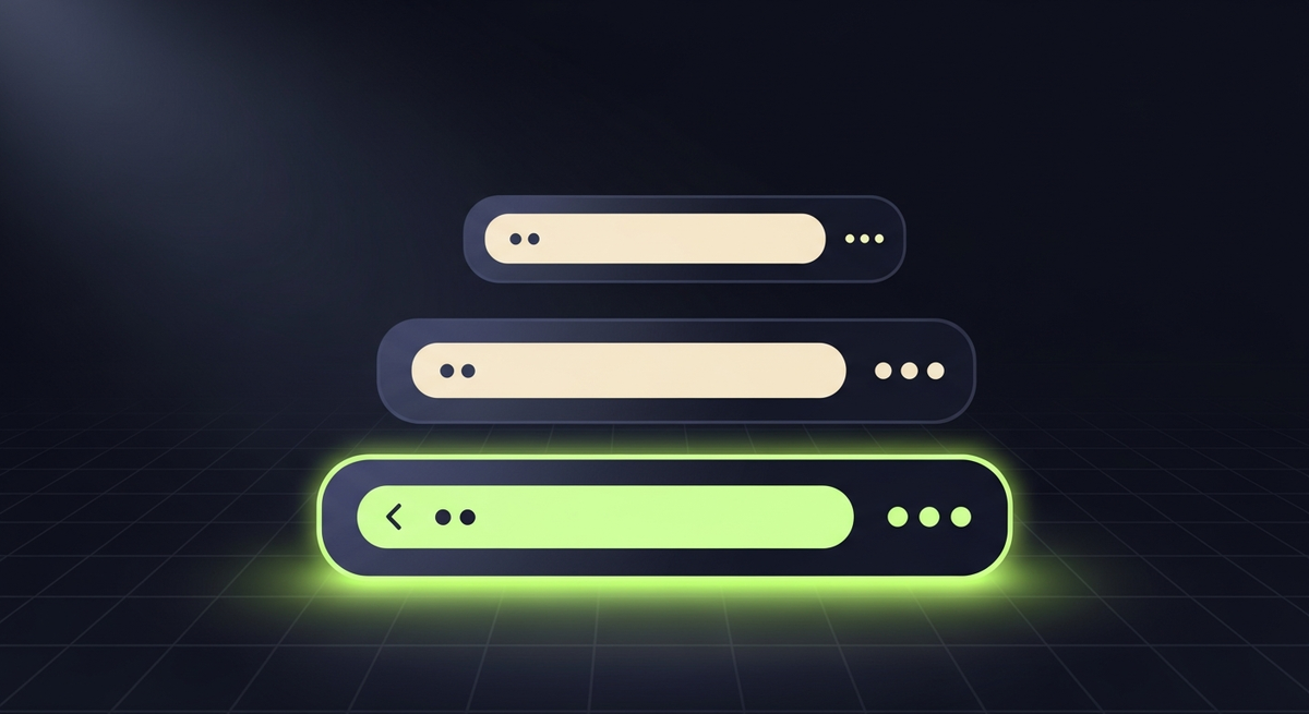
Across the ten industries we ship Flutter in, the AppBar is the screen surface every user touches first. The choice between the standard AppBar, SliverAppBar (with its M3 medium and large variants), a custom PreferredSizeWidget, or one of the community packages on pub.dev looks small at design time and turns into a scroll-jank, theming, or accessibility problem once the app hits real users. This guide walks through the top flutter appbar widgets we reach for, the Material 3 defaults that shifted under teams who upgraded blindly, and the production-grade patterns most AppBar tutorials skip.
Two framing notes. Pub.dev currently lists 30-plus appbar-adjacent packages. Most replicate scroll-collapse behavior the framework now ships in SliverAppBar.medium and SliverAppBar.large under M3. The patterns worth knowing solve something built-in cannot: nested scroll coordination across multiple sections, an M3 SearchBar embedded in the bar, sticky tabs across page transitions, or a fully bespoke shape the PreferredSizeWidget contract was designed for. Second: M3 changed centerTitle defaults on Android (the M2 platform-specific behavior gave way to a consistent left-aligned rule), and that one flip shifts every screen visibly. Read the M3 section before you bump useMaterial3 to true on an existing app.
When AppBar is the right primitive (and when SliverAppBar wins)
AppBar ships with Flutter as a PreferredSizeWidget. Drop it in Scaffold.appBar, give it a title and optional actions, and you get the right tap targets, the right Material ripple on actions, the right Semantics on the back arrow, and the right system overlay (status bar color, light or dark icons) without writing a single line of platform code. For 70% of screens this is the right answer. The reason to escape to SliverAppBar or a custom PreferredSizeWidget is almost always one of three needs: collapse-on-scroll behavior, a hero image or large title region above the toolbar, or an AppBar shape the standard rectangle cannot model.
The bug we see most often in code review: a custom PreferredSizeWidget that hand-codes the back arrow with a plain IconButton. The hand-coded version loses the Hero animation on push and pop, drops the system tooltip on long-press, and breaks the screen-reader contract that ships free with AppBar.leading. Two minutes of saved theming work, hours of accessibility regression. Match the contract or use AppBar directly.
| Need | Use | Why |
|---|---|---|
| Standard screen (back arrow, title, 1-3 actions) | AppBar | Right contract for free: Hero anim, tooltips, Semantics, system overlay |
| Collapse-on-scroll behavior (any kind) | SliverAppBar | Built-in pinned/snap/floating combo; coordinates with CustomScrollView |
| M3 large or medium title that collapses on scroll | SliverAppBar.medium or .large | Right M3 metrics (112/152dp expanded; 64dp collapsed) and animation curve |
| Hero image header that fades into a toolbar | SliverAppBar with FlexibleSpaceBar | FlexibleSpaceBar handles parallax, fade, and title placement |
| TabBar pinned under the title | AppBar with bottom: TabBar | Built-in slot, correct height math (toolbarHeight + 48) |
| Embedded M3 SearchBar | AppBar title: SearchBar or SearchAnchor | M3 component, full a11y, suggestions overlay handled |
| Bespoke shape (curved bottom edge, beveled corners) | Custom PreferredSizeWidget | PreferredSize gives the framework height info; you draw the shape |
Material 3 changed these AppBar defaults — check before you flip the flag
Setting useMaterial3: true on a ThemeData built around the M2 AppBar contract will shift every screen visibly. Six things change. First, centerTitle is no longer iOS-only by default; M3 hands you left-aligned titles on every platform unless you set centerTitle: true explicitly. Second, surfaceTintColor activates by default — the M3 elevation tint paints a faint primary-tinted overlay under the AppBar background, visible on light theme. Third, scrolledUnderElevation kicks in when content scrolls beneath the bar (4dp default elevation tint plus a faint surface tint), so a bar that was flat in M2 will visibly tint under scroll.
ThemeData(
  useMaterial3: true,
  appBarTheme: AppBarTheme(
    backgroundColor: Colors.transparent,
    surfaceTintColor: Colors.transparent,    // disable M3 tint if your design is flat
    scrolledUnderElevation: 0,               // disable scroll-under tint
    centerTitle: false,                       // explicit; M3 default is false anyway
    titleTextStyle: const TextStyle(fontSize: 22, fontWeight: FontWeight.w400),
    toolbarTextStyle: const TextStyle(fontSize: 14),
    iconTheme: const IconThemeData(size: 24, color: Colors.black87),
    actionsIconTheme: const IconThemeData(size: 24, color: Colors.black87),
    systemOverlayStyle: SystemUiOverlayStyle.dark,
  ),
);
Three more shifts that catch teams. Default titleSpacing changed from 16dp to NavigationToolbar.kMiddleSpacing (16dp still, but inherited differently — affects custom leading widths). Default toolbarHeight stays 56dp, but the bottom-edge divider is gone in M3 (was 1px in M2). And the systemOverlayStyle now derives from ThemeData.brightness via the M3 color tokens rather than the explicit AppBar.systemOverlayStyle override M2 apps relied on. Translation: status bar icons may invert when you flip the flag. Verify on iOS and Android before merging.
Top 10 best flutter appbar widget patterns we ship in production
The patterns and packages below are what we reach for on real client builds. Order reflects how often each one earns its place across the Flutter apps we ship in healthcare and fintech plus the other eight industries on our books. Maintenance status reflects pub.dev as of May 2026.
1. AppBar (built-in): the default for 70% of screens
Built-in AppBar plus an AppBarTheme is the highest-impact pattern in this list. It ships with the right back-arrow Hero animation, the right action button ripple, the right Semantics, and the right system overlay handling. The one rule we enforce: if a screen has a custom PreferredSizeWidget instead of AppBar, justify in the PR description what the standard could not give you. Most of the time, the answer turns out to be 'nothing actually'.
2. SliverAppBar: the right collapse-on-scroll primitive
SliverAppBar lives inside a CustomScrollView and coordinates with the scroll position so the bar can pin, float, snap, or scroll away entirely. The three flag combinations cover every real-world pattern. pinned: true keeps the toolbar visible while the expanded region scrolls out. floating: true brings the bar back on any upward scroll without needing to scroll all the way to the top. snap: true (with floating) snaps the bar fully in or out rather than partially showing. The mistake we see most often: setting all three to true and wondering why the bar feels jumpy — pinned and snap are mutually exclusive in spirit.
3. SliverAppBar.medium: the M3 medium top app bar
SliverAppBar.medium ships the M3 medium top app bar pattern — expanded height of 112dp with a 28sp title that collapses to a 22sp title in a standard 64dp toolbar. We use it on content surfaces where the screen has a clear name (a contact's profile, a single order detail, a settings sub-section) and the user benefits from seeing the name large on first load. No package needed, fully themed via AppBarTheme.
4. SliverAppBar.large: the M3 flagship pattern
SliverAppBar.large goes to 152dp expanded with a 36sp display-style title that collapses on scroll. The M3 spec calls this out for top-level destination screens (a Home tab, a Library, a Discover surface). Two production tips: the expanded title takes meaningful vertical space, so do not stack heavy content above the fold (the user will only see ~480dp of content on a 800dp screen at first load); and the collapsed toolbar inherits AppBarTheme.titleTextStyle, not the display style, so style both for a smooth animation.
5. AppBar.bottom + TabBar: the canonical tabbed-screen pattern
AppBar.bottom takes any PreferredSizeWidget, and TabBar fits the slot natively. The framework handles the height math (toolbarHeight + tabBar.preferredSize.height), the indicator animation, and the Semantics that announces the active tab to a screen reader. We pair this with TabBarView in the body and use DefaultTabController as the wrapper for stateless screens. For screens with state, hoist TabController to a StatefulWidget so the active tab survives parent rebuilds.
6. AppBar with embedded M3 SearchBar / SearchAnchor
M3 introduced SearchBar and SearchAnchor as first-class components. Drop SearchAnchor into AppBar.title (or as the body of a transparent AppBar) and you get the M3 search experience for free: tap to expand into a full-screen suggestion overlay, type-ahead, dismiss back to the bar. We use this on every screen where 'search' is a primary action rather than a secondary one buried under an icon. The legacy pattern of a magnifying glass IconButton that pushes a new route is still fine for tertiary search.
7. GFAppBar (GetWidget): themed default for apps already on GetWidget
GFAppBar is part of the open-source GetWidget UI Kit we maintain (4,811 stars on GitHub, 23K monthly pub.dev downloads). It exposes a search slot, a side-drawer icon, and size presets consistent with the rest of GetWidget. Pull it in when you are already using GetWidget components elsewhere in the app. For one-off AppBar work in a non-GetWidget codebase, built-in AppBar plus an AppBarTheme is the lower-overhead choice.
8. FlexibleSpaceBar inside SliverAppBar: hero image headers
When the design calls for a hero image that parallaxes as the user scrolls and fades into a solid-color toolbar, FlexibleSpaceBar inside SliverAppBar.flexibleSpace is the right tool. The framework handles the parallax math, the fade-on-collapse, and the title-position interpolation. The single gotcha: setting collapseMode: CollapseMode.parallax requires the image to be taller than the expanded height by at least 20% to avoid a hard edge at the top of scroll.
9. NestedScrollView + SliverAppBar: coordinated nested scrolling
Pinterest-style screens with a header that collapses while a TabBarView swaps body content underneath need NestedScrollView. The headerSliverBuilder takes a list of slivers (typically a SliverOverlapAbsorber wrapping a SliverAppBar with bottom: TabBar) and the body holds your TabBarView. Two production tips: every child of the TabBarView must wrap its scroll view in SliverOverlapInjector or the body and header will fight for scroll ownership; and the floatHeaderSlivers: true flag makes the header reappear on any upward scroll inside the inner scrollables.
10. Custom PreferredSizeWidget: when shape demands it
When the design needs a curved bottom edge, a beveled corner, or a content shape AppBar cannot model, build a PreferredSizeWidget. Implement preferredSize to declare your height to Scaffold, draw your shape with ClipPath or a Stack, and wrap interactive elements in Material with the right InkWell to keep the ripple. The one trap to avoid: forgetting that systemOverlayStyle is your responsibility outside AppBar — use AnnotatedRegion<SystemUiOverlayStyle> to set status bar contrast or you will ship a screen where the time and battery icons are invisible.
Picking pinned, floating, and snap: a SliverAppBar decision matrix
The three SliverAppBar flag combinations cover every real-world scroll behavior. The mistake we see in code review: teams set every combo to true hoping for the best, then can't explain why the bar feels jumpy on aggressive flicks. The matrix below is how we pick the combo in design review.
| Behavior wanted | pinned only | floating only | pinned + floating | floating + snap | no flags |
|---|---|---|---|---|---|
| Bar stays visible always, expanded region scrolls away | Yes: best fit | No | No | No | No |
| Bar scrolls away with content, reappears on any upward swipe | No | Yes: best fit | Variant | With snap if you want full snap | No |
| Bar stays visible, expanded region returns on upward swipe | No | No | Yes: best fit | No | No |
| Bar snaps fully in or out (no partial states) | No | No | No | Yes: best fit | No |
| Bar scrolls away with content and stays gone until scroll-to-top | No | No | No | No | Yes: best fit |
AppBarTheme: getting consistent styling without per-screen overrides
Almost every AppBar property has a corresponding AppBarTheme entry. Set them once in ThemeData.appBarTheme and every Scaffold-mounted AppBar in the app inherits — including the AppBars that ship inside Drawer headers and showModalBottomSheet wrappers. The biggest gain: when design tweaks the toolbar background or the action icon color, you change one line in the theme rather than every screen.
ThemeData(
  useMaterial3: true,
  colorScheme: ColorScheme.fromSeed(seedColor: Colors.deepPurple),
  appBarTheme: AppBarTheme(
    backgroundColor: Colors.white,
    foregroundColor: Colors.black87,
    surfaceTintColor: Colors.transparent,
    scrolledUnderElevation: 0.5,
    elevation: 0,
    centerTitle: false,
    titleTextStyle: const TextStyle(
      fontSize: 20,
      fontWeight: FontWeight.w500,
      color: Colors.black87,
    ),
    iconTheme: const IconThemeData(size: 22),
    actionsIconTheme: const IconThemeData(size: 22),
    shape: const RoundedRectangleBorder(
      borderRadius: BorderRadius.vertical(bottom: Radius.circular(0)),
    ),
  ),
);
Performance: where AppBar makes Flutter apps jank under scroll
Accessibility: what AppBar gives you for free and what it doesn't
| Gap | Symptom | Fix |
|---|---|---|
| Action icons announced by file name | Screen reader says 'IconButton, more_vert' rather than 'More options' | Set tooltip on every IconButton in actions; tooltip drives Semantics |
| Title not announced as a heading | Screen reader reads title as inline text, missing the section context | Wrap title in Semantics(header: true, child: ...) |
| Back arrow tooltip missing | Screen reader on Android says 'Back button' instead of 'Back to {previous screen}' | Override AppBar.leading with IconButton(icon, tooltip: 'Back to ${prev}') |
| Status bar contrast on custom bars | On a colored AppBar, status bar icons may be invisible | Use AnnotatedRegion or set systemOverlayStyle in AppBarTheme |
The five AppBar bugs we see in code review every month
| Bug | Symptom | Fix |
|---|---|---|
| Custom PreferredSizeWidget without Hero | Back arrow on push/pop loses the iOS-style fade transition | Use AppBar; or wrap your custom widget in Hero with the correct tag |
| TabBar + scrolled-under elevation visible glitch | Faint line under the tabs at scroll-under threshold on light theme | Set scrolledUnderElevation: 0 in AppBarTheme when using TabBar |
| SliverAppBar pin+snap together | Bar feels jumpy on aggressive flick | Pick one: pin-only for fixed bar, float+snap for snap-in-out |
| IconButton actions without tooltip | Screen reader inaccessible; UX writers blocked on labels | Always set tooltip on action icons (drives Semantics label too) |
| NestedScrollView body without SliverOverlapInjector | Inner list scrolls under the AppBar instead of being clipped | Wrap each child scroll view in CustomScrollView + SliverOverlapInjector |
Migrating from Material 2 AppBar to Material 3
| M2 pattern | M3 replacement | Notes |
|---|---|---|
| centerTitle implicit (iOS true, Android false) | Explicit centerTitle in AppBarTheme | M3 default is false on all platforms |
| elevation: 4 with hard shadow | scrolledUnderElevation + surfaceTint | M3 uses tint not shadow; set to 0 for a flat look |
| Single-color background | backgroundColor + surfaceTintColor | Pick one or both; surfaceTintColor: transparent disables tint |
| AppBar with large hard-coded toolbarHeight | SliverAppBar.medium or .large | Right M3 metrics, free collapse-on-scroll |
| IconTheme inherited from primaryIconTheme | iconTheme + actionsIconTheme on AppBarTheme | M3 drops primaryIconTheme in favor of explicit |
| Magnifying-glass icon pushes /search route | SearchAnchor in AppBar.title | M3 first-class search component |
For TabBar patterns that almost always sit under AppBar.bottom, see our guide to flutter tabbar widget. For how the AppBar fits into the rest of a production Flutter app (state plus navigation plus performance and CI/CD) our Flutter mobile app development field guide covers the practices we apply on every build.
Common questions about the Flutter AppBar widget
What is the flutter appbar widget used for?
AppBar is the top-of-screen Material primitive that holds a title, an optional leading widget (usually a back arrow or drawer icon), and up to three trailing actions. It ships with the right Hero animation across push and pop, the right tooltip on the back arrow, the right Semantics, and the right system overlay (status bar contrast). For 70% of screens the standard AppBar is the right choice.
When should I use SliverAppBar instead of AppBar?
Use SliverAppBar whenever you need any collapse-on-scroll behavior: a pinned bar over a scrolling list, a floating bar that reappears on upward swipe, or a hero image that parallaxes into a solid-color toolbar. SliverAppBar lives inside a CustomScrollView and coordinates with the scroll position natively. Standard AppBar sits in Scaffold.appBar and does not move.
What is SliverAppBar.medium and SliverAppBar.large?
Material 3 introduced two collapsing top-app-bar variants. SliverAppBar.medium expands to 112dp with a 28sp title and collapses to a 64dp toolbar. SliverAppBar.large expands to 152dp with a 36sp display-style title and collapses to 64dp. Use medium for content-detail surfaces (a profile, a single order); use large for top-level destinations (Home, Library, Discover).
How do I make AppBar transparent?
Set backgroundColor: Colors.transparent and elevation: 0 on the AppBar or in AppBarTheme. Under M3, also set surfaceTintColor: Colors.transparent and scrolledUnderElevation: 0 to disable the elevation tint that paints over a transparent background. Without those two extras the AppBar will still show a faint tint under the M3 default theme.
What changed in Material 3 for AppBar?
Six things: centerTitle defaults to false on all platforms (was iOS-only true in M2), surfaceTintColor and scrolledUnderElevation activate by default, the bottom divider is gone, titleSpacing inherits via NavigationToolbar, primaryIconTheme is dropped in favor of explicit iconTheme and actionsIconTheme, and SearchAnchor / SearchBar are now first-class M3 components that fit AppBar.title natively. Read these before flipping useMaterial3 to true on an existing app.
How do I add a search bar to AppBar?
Under M3, put a SearchAnchor as AppBar.title. Tapping it expands a full-screen overlay with suggestions and a back button to dismiss. For older M2 patterns or non-M3 apps, an IconButton in actions that pushes a dedicated /search route is still the right choice — that pattern keeps the AppBar simple and lets the search screen own its own state.
How do I add a TabBar under AppBar?
Pass TabBar as AppBar.bottom. The framework handles the height math (toolbarHeight + tabBar.preferredSize.height), the indicator animation, and the Semantics that announces the active tab. Use DefaultTabController as the outer wrapper for stateless screens, or hoist a TabController to a StatefulWidget when the active tab needs to survive parent rebuilds.
Why is my AppBar tinted under scroll?
Material 3 activates scrolledUnderElevation by default. When content scrolls under the bar, M3 paints a faint primary-tinted overlay on top of backgroundColor (4dp elevation by default). Set scrolledUnderElevation: 0 and surfaceTintColor: Colors.transparent in AppBarTheme to disable the tint if your design is flat. This is the most common 'why does my bar look wrong after upgrading to M3' issue we see.
What is the difference between AppBar and GFAppBar?
AppBar ships with Flutter — no dependency, no bundle cost, and the right Material contract. GFAppBar is part of the open-source GetWidget UI Kit and adds a search slot, side-drawer icon shortcuts, and size presets consistent with the rest of GetWidget. Pick GFAppBar when you are already using GetWidget components elsewhere; pick built-in AppBar when the top bar is an isolated need.

Flutter TabBar Widget in 2026: TabBar, TabBarView, TabController, and the Material 3 Primary vs Secondary Distinction
Build a Flutter TabBar widget to navigate between pages in a single view. Customize indicators, handle controllers, and pair with GetWidget's GFTabs.
Flutter Mobile App Development: A 2026 Production Field Guide
How we structure Flutter projects at GetWidget in 2026: feature-first layout, Riverpod defaults, Dart 3 records and sealed classes, Material 3 theming, the 200-line widget rule, performance diagnosis, CI/CD pipelines, and the production pitfalls that bite teams after launch.

Best Flutter Drawer Widgets in 2026: Drawer, NavigationDrawer, and the Packages Still Worth Using
Top 10 Flutter drawer widgets for slide-out side menus: customization patterns, code examples, and how to integrate GetWidget's GFDrawer into your app.
Top 10 Best Flutter List Tile Widgets: Patterns, Variants and M3 Migration (2026)
Top 10 Flutter ListTile widgets for clean rows with leading and trailing icons, titles, and subtitles — with code examples and GetWidget's GFListTile.