Flutter TabBar is a TabBarView that consists of a page view that displays the currently selected tab. It has many custom properties by using which we can create different tab patterns.
Flutter Tab Widget
Flutter Tab widget is used to navigate to different pages in a single page view. The Flutter Tabbar typically displays a horizontal list of tabs. The tabs can be of any number. It shows the selected page to make the UI more interactive to users.
Flutter Tabs are used to navigate different pages by using its routing. To create tabs we mostly follow the material designs so it includes tabs layout as a part of the material library. In Flutter, we can define tabs of widgets inside the scaffold. Therefore before adding a tab of a widget we need to define a Scaffold.
GF Flutter Tabbar
GF Flutter Tab is a combination of the Tabbar and TabBarView controlled by the tab controller. GFTab is a Flutter Tab that has a horizontal list of pages that are navigated through the Tabbar. The Tabbar will contain the tab that can be icon, text, or a combination of icons, and text upon clicking takes to the respective pages.
Now here is I am going to talk about what is GetWidget Tab widget is and how we implement this on the Flutter app to build an awesome Flutter Tab widget for an app.
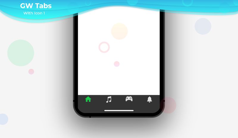
So, are you ready to make use of this type of Tab widget in your application? If so, then let’s quickly jump into the usage and the ways a Tab can be modified and used to make user-friendly apps. Here I am going to use an open-source UI Library known as GetWidget to build this widget.
How to Start:
Now here is the guide about how we should start developing the GFTabs Widget with the use of the GetWidget Flutter UI Library.
Getting started will guide you on how to start building a beautiful flutter application with the GetWidget UI library. You have to install the package from pub.dev, import the package in your Flutter project.
Install Package from pub.dev :
https://pub.dev/packages/getwidget
Import full package:
import ‘package:getwidget/getwidget.dart’;
Note: dependencies: getwidget: ^ 4.0.0
Keep playing with the pre-built UI components.
GF Flutter TabBar Example
GFTab is a combined feature of the Tabbar and TabBarView that is controlled by the tab controller. Whereas GFTabBar contains tab buttons that navigate to a particular tabBarView page in GFTabBarView.
The Tabs are designed by using the tabbar widget. A tabbar must be assigned a tabController to communicate with tab bar view widget.

The example shown below tells how to initialize a tabController in Flutter
late TabController tabController;
@override
void initState() {
  super.initState();
  tabController = TabController(length: 2, vsync: this);
}
@override
void dispose() {
  tabController.dispose();
  super.dispose();
}We can use the below code to build the Flutter TabBar Widget with many custom properties.
The below code gives, default GFTabBar with 2 children, children can be any type of widget.
import 'package:getwidget/getwidget.dart';
GFTabBar(
  length: 2,
  controller: tabController,
  tabs: [
    Tab(
      icon: Icon(Icons.home),
      child: Text(
        "Home",
       ),
    ),
    Tab(
      icon: Icon(Icons.access_time_sharp),
      child: Text(
        "History",
      ),
    ),
     ],
),GF Flutter TabBarView
A page view that displays the content by a selection of the corresponding tab is known as TabBarView. This widget is typically used in conjunction with a GFTabBar and must provide TabBarController. When a tab is selected, it shows some content. We can create tabs by using the TabBar widget. The length of the tab controller must be equal to the children of the tab.
The below Example code shows how a flutter tab bar view is initialized:
import 'package:getwidget/getwidget.dart';

GFTabBarView(
  controller: tabController,
  children: [
    Container(color: Colors.red,child:Center(child:Text('Home Page'))),
    Container(color: Colors.green,child:Center(child:Text('History Page'))),
    Container(color: Colors.blue,child:Center(child:Text('Profile Page')))
  ]
),GF Flutter Tabs Example Code
GFTabs widget is the combination of GFTabBar and GFTabBarView. It has a default controller to control the page view which response to the currently selected tab. we can use the below code to build the Flutter Tabs Widget.
import 'package:getwidget/getwidget.dart';

GFTabs(
  length: 2,
  tabs: [
    Tab(
      icon: Icon(Icons.home),
      child: Text(
        "Home",
      ),
     ),
     Tab(
       icon: Icon(Icons.account_circle),
       child: Text(
         "Profile",
       ),
      ),
   ],
   tabBarView: GFTabBarView(
     children: [
       Container(child: Icon(Icons.home), color: Colors.red,),
       Container(child: Icon(Icons.account_circle), color: Colors.green,),
     ],
    ),
),GF Flutter Segmented Tabs
Tabs organize and allow routing between groups of components that are co-related and are at the same level of hierarchy. Segmented tabs are the linear set of tabs that are mostly used to display different views. GFSegmentedTabs is the best alternative to tabs. we can use the given code to display segmented tabs.

Flutter Bottom Navigation Bar with GFTabBar
GFTabBar can be used as a bottom navigation bar. The basic code is given below.
import 'package:getwidget/getwidget.dart';
Scaffold(
      appBar: GFAppBar(
        title: const Text('UI Kit'),
      ),
      body: GFTabBarView(controller: tabController, children: [
        Container(color: Colors.red),
        Container(color: Colors.green),
        Container(color: Colors.blue)
      ]),
      bottomNavigationBar: GFTabBar(
       length: 2,
        controller: tabController,
        tabs: [
                    Tab(
            icon: Icon(Icons.directions_bus),
            child: const Text(
              'Tab2',
            ),
          ),
          Tab(
            icon: Icon(Icons.directions_railway),
            child: const Text(
              'Tab3',
            ),
          ),
        ],
      ),
)GF Flutter TabBar Custom Properties
The look and feel of the GFTabBar can be customized using the GFTabBar properties.
| Name | Description |
|---|---|
| length | total number of tabs. Typically greater than one. Must match [TabBar.tabs]’s and [TabBarView.children]’s length |
| tabBarHeight | sets [GFTabBar] height |
| tabBarColor | sets [TabBar] color using GFColor or material color [Color] |
| tabs | typically a list of two or more [Tab] widgets. The length of this list must match the [controller]’s [TabController.length] and the length of the [TabBarView.children] list |
| controller | controls widget’s selection and animation state. Must provide [TabController] |
| indicatorColor | color of the line that appears below the selected tab. If this parameter is null, then the value of the Theme’s indicatorColor property is used. |
| indicatorWeight | thickness of the line that appears below the selected tab. The value of this parameter must be greater than zero and its default value is 2.0. |
| indicatorPadding | horizontal padding for the line that appears below the selected tab. |
| indicator | defines the appearance of the selected tab indicator. |
| indicatorSize | defines how the selected tab indicator’s size is computed. |
| labelColor | color of selected tab labels. |
| unselectedLabelColor | color of unselected tab labels. |
| labelStyle | text style of the selected tab labels. |
| unselectedLabelStyle | text style of the unselected tab labels. |
| labelPadding | padding added to each of the tab labels. |
| shape | defines the shape of tabBar |
| isScrollable | If [isScrollable] is true, then each tab is as wide as needed for its label and the entire [TabBar] is scrollable. Otherwise each tab gets an equal share of the available space. |
GF Flutter TabBarView Custom Properties
| Name | Description |
|---|---|
| controller | controls widget’s selection and animation state. Must provide [TabController] |
| children | one widget per tab. Its length must match the length of the [GFTabBar.tabs] list, as well as the [controller]’s [TabController.length]. |
| height | GFTabBarView height can be fixed |
How to create a Tab in Flutter?
Tabs in Flutter is a horizontal list of items upon clicking them will render respective pages that are coordinated with the tabs. The Tabs can be icons or texts that represent the names of the pages to be rendered. We can either click on the tab icons or the scrolling will also yield the same as clicking the icon ie, it gives the respective page. The Tabs function in such a way that the rendered pages will be only in one single page and just the view of the pages changes accordingly.
First of all, we will see how to set up the tabs code in the GFTabs component that will be used to render the pages upon clicking.
import 'package:getwidget/getwidget.dart';
GFTabBar(
  length: 2,
  controller: tabController,
  tabs: [
    Tab(
      icon: Icon(Icons.directions_bike),
      child: Text(
        "Tab1",
       ),
    ),
    Tab(
      icon: Icon(Icons.directions_bus),
      child: Text(
        "Tab2",
      ),
    ),

  ],
),The above code gives two tabs in length and we have the tab controller in the tab code. The tab controller is used to control the functions between the tab and its contents. So in the next step, we will initialize the tab controller.
late TabController tabController;
@override
void initState() {
  super.initState();
  tabController = TabController(length: 2, vsync: this);
}
@override
void dispose() {
  tabController.dispose();
  super.dispose();
}
So, the above code tells us that the tab controller has been initialized to use the tabs. Next, we should have the pages to display upon clicking the tab icons, this is called the TabBar View, now we need to show the code for the tab bar view so that when the tabs are clicked the respective pages will show up.
In the below code we will see the TabBarView of the tabs:
GFTabBarView(
  controller: tabController,
  children: [
    Container(color: Colors.orange),
    Container(color: Colors.green),

  ]
),
now we have all the bits and pieces of the tabs, tab controller, and its view, we have to put that together to build a simple appbar using GFAppBar component.
Let us see the full example in the below code.
late TabController? tabController;
  @override
  void initState() {
    super.initState();
    tabController = TabController(length: 3, vsync: this);
  }
  @override
  void dispose() {
    tabController!.dispose();
    super.dispose();
  }
body:ListView(
          children: [
            GFTabBar(
              length: 3,
              controller: tabController,
              tabs: [
                Icon(
                  Icons.home,
                ),
                Icon(
                  Icons.music_note,
                ),
                Icon(
                  Icons.games,
                ),

              ],

            ),
            Container(
              height: MediaQuery.of(context).size.height
              child: GFTabBarView(
                controller: tabController,
                children: [
                  Center(
                    child: Icon(
                      Icons.home,
                      size: 150,
                      color: Colors.grey.withOpacity(0.44),
                    ),
                  ),
                  Center(
                    child: Icon(
                      Icons.music_note,
                      size: 150,
                      color: Colors.grey.withOpacity(0.44),
                    ),
                  ),
                  Center(
                    child: Icon(
                      Icons.games,
                      size: 150,
                      color: Colors.grey.withOpacity(0.44),
                    ),
                  ),

                ],
              ),
            )
          ],
        ),
How to create a Custom TabBar in Flutter
GFTabs has more variants in it for the tabs like only icon tab, text tab, or a combination of both icon and text tabs. The tabs can be customized according to the need. The only icon tab should have a proper and reasonable icon so that the user will understand for what page the user is been navigating. The text icon will simply be the name of the page so the user will understand by just seeing the name of the tab.

We can customize the above tab bar with many options and to view those properties visit GetWidget official documentation.
Also Read – Flutter Progress Bar – A widget that graphically controls the component which shows the progress of a task
How to create Flutter Bottom TabBar?
GFTabs can be used as Bottom Tabs with the same functionality that will be used for the default GFTabs. The difference is that the tabs will be placed at the bottom of the screen. We have Segmented Tabs in GFTabs wherein the tabs will be placed at the top with acts like a segment for every tab we declare and the customization option is vast.
GFTabs can be used as the bottom tab bar as said earlier. It is a simple tab that will be placed at the bottom of the screen with the same functions and the customization of the default tabs.
The below code shows the example of bottom tabs.
import 'package:getwidget/getwidget.dart';
Scaffold(
      appBar: GFAppBar(
        title: const Text('Bottom Tabs'),
      ),
      body: GFTabBarView(controller: tabController, children: [
        Container(color: Colors.orange),
        Container(color: Colors.blue),
        Container(color: Colors.black)
      ]),
      bottomNavigationBar: GFTabBar(
       length: 3,
        controller: tabController,
        tabs: [
          Tab(
            icon: Icon(Icons.help),
            child: const Text(
              'HELP',
            ),
          ),
          Tab(
            icon: Icon(Icons.settings),
            child: const Text(
              'SETTINGS',
            ),
          ),
          Tab(
            icon: Icon(Icons.home),
            child: const Text(
              'HOME',
            ),
          ),
        ],
      ),
    )
The GFTabs and the bottom tabs have many customization options that can be useful according to the need of the application and design. For more properties on the Tabs head to GetWidget official documentation.

What is the use of a controller here?
GFTabBar and GFTabBarView don’t have any conjunction between them. To co-relate them, we are using a TabController here to manage the controls.
Are there any specified child components to use in it?
No, there isn’t any specification of child components that we use here. We can use all components in tabs.
What if the no. of Tabs and TabBarView would be the same?
The no. of tabs and its view should be the same because the widget displays the view corresponds to its tabs. If it won’t be the same then it will throw errors.
Conclusion:
Here we discuss what GFTabs is? And how we can use it in our Flutter app development through GetWidget TabBar, Tabs, TabBarView & SegmentedTabs components.

I’m Navin Sharma, a passionate Full Stack Developer with over 20 years of experience in the tech industry. Throughout my career, I’ve had the privilege of working on a variety of exciting projects, developing everything from dynamic web applications to complex back-end systems. My expertise spans both front-end and back-end technologies, and I thrive on building solutions that are not only functional but also scalable and user-friendly.
Beyond my hands-on development work, I’ve contributed to several well-respected tech and startup blogs, where I share my insights on the latest trends, development strategies, and best practices in the world of web development. I also have a strong background in app analysis, where I’ve helped companies optimize their products for better performance and enhanced user experience.
Whether I’m working on a challenging coding problem or mentoring fellow developers, I’m always eager to learn, innovate, and push the boundaries of what’s possible with technology.


