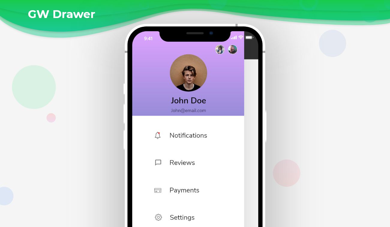
Flutter Drawer – A sliding widget that generally contains important links of the application.
Flutter Drawer is a side screen widget that is invisible to your mobile app. Generally, it might occupy half of the screen when displayed.
Flutter Drawer Widget:
Flutter uses a drawer widget to create a slide-able left menu. We can customize the menu layout by using its property. Nowadays tabs are consuming more space, that’s the reason people are becoming more familiar with drawers and it also become the primary navigation method.
In Flutter, we can define a drawer inside a scaffold. Therefore before adding a navigation drawer, we need to define a Scaffold. When we create a sample flutter app, it comes with the default scaffold.
GetWidget Drawer Widget for Flutter:
It allows you to speed up your Flutter app development by 20-30%. It has almost all the widget that allows you to enhance your Flutter UI design and speed up Flutter development with fully customizable features.
Now here is i am going to talk about what is GetWidget Drawer widget and how we implement this on Flutter app to build awesome Flutter Drawer widget for an app.
GetWidget Drawer is not only a simple sidebar. we can customize it according to us.
Basic GFDrawer:
Basic GFDrawer will slide in and out with a container body.The appearance of the GFDrawer can be customized using the GFDrawer properties. we can use the below code to build the Flutter Drawer Widget.
import 'package:getwidget/getwidget.dart';
GFDrawer(
  child: ListView(
    padding: EdgeInsets.zero,
    children: [
      ListTile(
        title: Text('Item 1'),
        onTap: null,
      ),
      ListTile(
         title: Text('Item 2'),
         onTap: null,
      ),
    ],
  ),
),
GFDrawer Header:
Header is a simple widget where we can use any component to display and modify according to us. The given code of a basic GFDrawerHeader with GFDrawer is as shown below that help you to build a Flutter Drawer Header Widget.
import 'package:getwidget/getwidget.dart';
      GFDrawer(
        child: ListView(
          padding: EdgeInsets.zero,
          children: [
            GFDrawerHeader(
              currentAccountPicture: GFAvatar(
                radius: 80.0,
                backgroundImage: NetworkImage("https://cdn.pixabay.com/photo/2017/12/03/18/04/christmas-balls-2995437_960_720.jpg"),
              ),
              otherAccountsPictures: [
                Image(
                  image: NetworkImage("https://cdn.pixabay.com/photo/2019/12/20/00/03/road-4707345_960_720.jpg"),
                  fit: BoxFit.cover,
                ),
                GFAvatar(
                  child: Text("ab"),
                )
              ],
              child: Column(
                mainAxisAlignment: MainAxisAlignment.start,
                crossAxisAlignment: CrossAxisAlignment.start,
                children: [
                  Text('user name'),
                  Text('[email protected]'),
                ],
              ),
            ),
            ListTile(
              title: Text('Item 1'),
              onTap: null,
            ),
            ListTile(
              title: Text('Item 2'),
              onTap: null,
            ),
          ],
        ),
      ),
How to Start:
Now here is the guide about how we should start developing GFDrawer Widget with the use of GetWidget UI Library.
Getting started will guide you how to start building a beautiful flutter application with GetWidget UI library. You have to install the package from pub.dev, import the package in your Flutter project.
Install Package from pub.dev :
https://pub.dev/packages/getwidget
Import full package:
import ‘package:getwidget/getwidget.dart’;
Note: dependencies: getwidget: ^ 4.0.0
Keep playing with the pre-built UI components.
When to use a navigation drawer
A navigation drawer, also known as a side menu or hamburger menu, is a UI component commonly used in mobile applications and websites. It provides an organized way to access different sections or features of an application. Here are some scenarios in which you might consider using a navigation drawer:
Large applications:
If your application has multiple sections or features that need to be accessed frequently, a navigation drawer can help you organize them and provide easy navigation. It allows users to quickly switch between different sections without cluttering the main screen.
Complex navigation hierarchy:
When your application has a deep navigation hierarchy, a navigation drawer can simplify the user experience. It allows users to navigate directly to a specific section without going through multiple screens.
Limited screen space:
If you have limited screen space, especially on mobile devices, a navigation drawer can be an effective way to save space. It allows you to hide less frequently used features or options behind a menu, making more room for the main content.
Consistent navigation across platforms:
If you are developing a cross-platform application that needs to provide a consistent user experience on different devices, a navigation drawer can be a good choice. It is a widely recognized and used UI pattern across various platforms, making it familiar to users.
Customizable options:
A navigation drawer allows you to provide customizable options or settings to users. You can include features like user preferences, account settings, or theme selection within the navigation drawer, making it easily accessible.
Prioritizing content:
If you want to prioritize the main content or focus on a specific task, a navigation drawer can help you hide secondary options or features. By placing them in the navigation drawer, you can keep the main screen clean and uncluttered.
Conclusion:
Here we discuss what GFDrawer is? And how we can use it in our Flutter app through the GetWidget Drawer component.
FAQ’s:
Q. What are the customizable properties used?
Ans. The customizable properties include the color, gradient, background image, color filter, and elevation of the Drawer component. Hence customizable properties are fully flexible. You can check out all custom properties on GetWidget Drawer Widget Properties.
Q. Can we resize the width of GFDrawer?
Ans: Yes, we can give the size of the drawer according to us.

I’m Navin Sharma, a passionate Full Stack Developer with over 20 years of experience in the tech industry. Throughout my career, I’ve had the privilege of working on a variety of exciting projects, developing everything from dynamic web applications to complex back-end systems. My expertise spans both front-end and back-end technologies, and I thrive on building solutions that are not only functional but also scalable and user-friendly.
Beyond my hands-on development work, I’ve contributed to several well-respected tech and startup blogs, where I share my insights on the latest trends, development strategies, and best practices in the world of web development. I also have a strong background in app analysis, where I’ve helped companies optimize their products for better performance and enhanced user experience.
Whether I’m working on a challenging coding problem or mentoring fellow developers, I’m always eager to learn, innovate, and push the boundaries of what’s possible with technology.


