Flutter showModalBottomSheet: Production Patterns and Gotchas
BottomSheet vs showModalBottomSheet vs DraggableScrollableSheet. The isScrollControlled trap, theming, accessibility, and when GFBottomSheet saves time.

The Flutter SDK ships three distinct bottom sheet patterns: the raw BottomSheet widget, the showModalBottomSheet function, and DraggableScrollableSheet. Most developers who have used Flutter for more than a week have called showModalBottomSheet at least once. Fewer have hit the isScrollControlled trap that silently caps the sheet at half-screen height. Even fewer have thought through the a11y implications of a sheet with no drag handle semantics.
Our team at GetWidget has shipped bottom sheet patterns across healthcare, fintech, ecommerce, and legal apps. We built GFBottomSheet as part of the open-source GetWidget Flutter UI Kit (4,811 GitHub stars, 23K monthly pub.dev downloads) because we kept writing the same boilerplate on every project. This guide documents what we learned: the correct mental model, the production bugs, and the decision framework for choosing between a bottom sheet, a dialog, and a Cupertino pattern.
Anatomy: BottomSheet vs showModalBottomSheet vs DraggableScrollableSheet
These three are not interchangeable. BottomSheet is the raw widget. You rarely construct it directly; the Scaffold and showModalBottomSheet do that for you. showModalBottomSheet is the function that pushes a new modal route and wraps your builder in a BottomSheet. DraggableScrollableSheet is an entirely separate widget that handles height negotiation and drag behavior. You compose it inside showModalBottomSheet when you need variable height.
| API | Blocking? | Height control | Dismissable by drag? |
|---|---|---|---|
The persistent variant (Scaffold.showBottomSheet) is genuinely underused. It stays on screen while the user interacts with content behind it. Think of a music player scrubber that stays docked while the user browses a track list. The modal variant, showModalBottomSheet, is an alternative to an AlertDialog when the content is richer than a few lines and two buttons. The DraggableScrollableSheet pattern is for variable-height detail panels, filter drawers, and anything where the user should be able to expand the sheet by pulling.
Basic flutter showModalBottomSheet implementation
Here is a minimal correct call. Three parameters beyond context are worth setting by default on every sheet: shape for rounded corners, useSafeArea to avoid conflicts with the iPhone home indicator and Android gesture bar, and showDragHandle so users get the Material 3 handle affordance without extra code.
// Minimal correct showModalBottomSheet call
await showModalBottomSheet<void>(
  context: context,
  useSafeArea: true,       // avoids home indicator + gesture bar
  showDragHandle: true,    // Material 3 drag handle, free a11y semantics
  shape: const RoundedRectangleBorder(
    borderRadius: BorderRadius.vertical(top: Radius.circular(20)),
  ),
  builder: (BuildContext ctx) {
    return Padding(
      padding: const EdgeInsets.fromLTRB(16, 0, 16, 24),
      child: Column(
        mainAxisSize: MainAxisSize.min, // sheet height = content height
        crossAxisAlignment: CrossAxisAlignment.start,
        children: [
          const Text(
            'Share with',
            style: TextStyle(fontSize: 18, fontWeight: FontWeight.w600),
          ),
          const SizedBox(height: 12),
          ListTile(
            leading: const Icon(Icons.link),
            title: const Text('Copy link'),
            onTap: () => Navigator.pop(ctx),
          ),
          ListTile(
            leading: const Icon(Icons.mail_outline),
            title: const Text('Send via email'),
            onTap: () => Navigator.pop(ctx),
          ),
        ],
      ),
    );
  },
);
Custom shapes, borders, and theming in flutter modal bottom sheet
The shape parameter on showModalBottomSheet controls the sheet container's border. Set it once per call, or set it globally via BottomSheetThemeData in your ThemeData. The global approach is what our team uses. Every sheet in the app inherits the same corner radius and background color from the token system.
// Global BottomSheet theme — set once in MaterialApp
ThemeData(
  bottomSheetTheme: BottomSheetThemeData(
    shape: const RoundedRectangleBorder(
      borderRadius: BorderRadius.vertical(top: Radius.circular(24)),
    ),
    backgroundColor: colorScheme.surfaceContainerLow,
    surfaceTintColor: colorScheme.surfaceTint,
    dragHandleColor: colorScheme.onSurfaceVariant.withOpacity(0.4),
    dragHandleSize: const Size(32, 4),
    showDragHandle: true, // applies to ALL sheets unless overridden
    elevation: 1,
  ),
)
One thing we learned on a fintech project: setting clipBehavior: Clip.antiAlias on the sheet builder's root container is necessary when you have a gradient or image that should respect the rounded corner. Without it, the gradient bleeds outside the border radius, especially visible at the top corners.
Pass shape: RoundedRectangleBorder(borderRadius: ...) on every showModalBottomSheet call. Works, but one missed call produces a square-cornered sheet in production.
Set BottomSheetThemeData once in ThemeData. Every sheet inherits shape, background, drag handle color, and elevation. Override per-call only when a specific sheet genuinely diverges.
The isScrollControlled gotcha (the most common flutter bottomsheet bug)
isScrollControlled: false (the default) caps the sheet at roughly half the screen height. That cap is enforced by the underlying BottomSheet constraints, and it cannot be overridden by content height, DraggableScrollableSheet settings, or explicit SizedBox sizing inside the builder. If you put a DraggableScrollableSheet or a tall form inside a showModalBottomSheet without setting isScrollControlled: true, you will see content clipped at 50% regardless of your child size settings.
A secondary gotcha when isScrollControlled: true is set: the keyboard pushes the sheet up. On forms inside a bottom sheet, the sheet content can overlap the AppBar or even slide off screen. Fix this by wrapping your builder content in Padding(padding: EdgeInsets.only(bottom: MediaQuery.viewInsetsOf(context).bottom)) or by setting resizeToAvoidBottomInset: false at the Scaffold level if your sheet handles this itself.
// Keyboard-aware bottom sheet: handles soft keyboard without layout overflow
await showModalBottomSheet<void>(
  context: context,
  isScrollControlled: true,
  useSafeArea: true,
  showDragHandle: true,
  builder: (ctx) {
    return Padding(
      // Push content above keyboard when it appears
      padding: EdgeInsets.only(
        bottom: MediaQuery.viewInsetsOf(ctx).bottom,
      ),
      child: Column(
        mainAxisSize: MainAxisSize.min,
        children: [
          const TextField(
            decoration: InputDecoration(labelText: 'Add a note'),
          ),
          const SizedBox(height: 16),
          FilledButton(
            onPressed: () => Navigator.pop(ctx),
            child: const Text('Save'),
          ),
          const SizedBox(height: 16),
        ],
      ),
    );
  },
);
DraggableScrollableSheet: snap points, drag handle, and scroll coordination
A flutter draggable bottom sheet is the right tool for filter drawers, product detail panels, and any UI where the user should be able to drag the sheet between a collapsed preview and a full-detail view. Flutter's snap: true property (added in Flutter 3.3) gives you Google Maps-style snap points without a custom gesture detector.
// DraggableScrollableSheet with snap points — requires isScrollControlled: true
await showModalBottomSheet<void>(
  context: context,
  isScrollControlled: true, // REQUIRED
  useSafeArea: true,
  backgroundColor: Colors.transparent, // let DraggableScrollableSheet control bg
  builder: (ctx) {
    return DraggableScrollableSheet(
      initialChildSize: 0.4,  // starts at 40% of screen
      minChildSize: 0.25,     // user can drag down to 25%
      maxChildSize: 0.92,     // user can drag up to 92%
      expand: false,          // required inside a modal sheet
      snap: true,             // enables snap points (Flutter 3.3+)
      snapSizes: const [0.4, 0.7, 0.92], // snap to these positions
      builder: (_, scrollController) {
        return Container(
          decoration: const BoxDecoration(
            color: Colors.white,
            borderRadius: BorderRadius.vertical(top: Radius.circular(20)),
          ),
          child: CustomScrollView(
            controller: scrollController, // wire the controller
            slivers: [
              const SliverToBoxAdapter(
                child: _DragHandle(),
              ),
              SliverList(
                delegate: SliverChildBuilderDelegate(
                  (context, index) => ListTile(title: Text('Item $index')),
                  childCount: 30,
                ),
              ),
            ],
          ),
        );
      },
    );
  },
);
Wire the scrollController from DraggableScrollableSheet's builder into your scroll view. If you miss this, the scroll gesture gets consumed by the sheet drag handler instead of scrolling the list. The result: the user can expand the sheet by pulling, but cannot scroll the list once the sheet is at maxChildSize. We catch this in roughly one in three DraggableScrollableSheet implementations during code review.
BackdropFilter, useSafeArea, and hiding the drag handle
BackdropFilter applied to a bottom sheet's barrier gives you a frosted-glass background effect. Set backgroundColor: Colors.transparent on the showModalBottomSheet call and add a BackdropFilter with ImageFilter.blur inside the builder, outside the sheet's own container. The blur applies to everything behind the modal layer.
// Frosted-glass backdrop behind a bottom sheet
import 'dart:ui';

await showModalBottomSheet<void>(
  context: context,
  backgroundColor: Colors.transparent,
  barrierColor: Colors.black.withOpacity(0.2), // lighter scrim for glass effect
  useSafeArea: true,
  builder: (ctx) {
    return Stack(
      children: [
        // Blur layer covers the area behind the sheet
        BackdropFilter(
          filter: ImageFilter.blur(sigmaX: 8, sigmaY: 8),
          child: Container(color: Colors.transparent),
        ),
        // Actual sheet content
        Align(
          alignment: Alignment.bottomCenter,
          child: Container(
            decoration: BoxDecoration(
              color: Colors.white.withOpacity(0.85),
              borderRadius:
                  const BorderRadius.vertical(top: Radius.circular(24)),
            ),
            padding: const EdgeInsets.all(24),
            child: const Text('Sheet content here'),
          ),
        ),
      ],
    );
  },
);
useSafeArea: true is the correct default for 2026. It pads the sheet away from the iPhone home indicator and Android back-gesture zone. Without it, your sheet actions can overlap the system gesture hit target on iPhone 14 and later, causing tap-throughs on the bottom ListTiles. Note that useSafeArea only applies to the modal variant. The persistent Scaffold.showBottomSheet does not have this parameter; you handle safe area manually via SafeArea or MediaQuery.of(ctx).padding.bottom. For other widget types where safe area handling matters, the flutter accordion guide covers the same pattern for ExpansionTile.
Persistent BottomSheet via Scaffold.of(context).showBottomSheet
The persistent variant does not push a route and does not block user interaction with the main content. It anchors to the bottom of the Scaffold and the Scaffold reflows to push its body content up by the sheet height. Use it for things that should stay visible across interactions: a now-playing bar, a scrubber control, a contextual action tray that only shows when items are selected.
// Persistent BottomSheet — stays open while user interacts with the page
// Must be called from a widget with a Scaffold ancestor
PersistentBottomSheetController controller =
    Scaffold.of(context).showBottomSheet(
  (ctx) => Container(
    height: 80,
    padding: const EdgeInsets.symmetric(horizontal: 16),
    child: Row(
      children: [
        const Text('2 items selected'),
        const Spacer(),
        IconButton(
          icon: const Icon(Icons.delete_outline),
          onPressed: () {
            // perform delete
            controller.close(); // dismiss programmatically when done
          },
        ),
        IconButton(
          icon: const Icon(Icons.share),
          onPressed: () {},
        ),
      ],
    ),
  ),
  shape: const RoundedRectangleBorder(
    borderRadius: BorderRadius.vertical(top: Radius.circular(16)),
  ),
);
The PersistentBottomSheetController returned by showBottomSheet gives you a close() method and a closed Future. Listen to closed to know when the user dismisses the sheet, then update your selection state accordingly. Scaffold only supports one persistent sheet at a time. Calling showBottomSheet while one is already open dismisses the first one.
Accessibility and state management inside a flutter bottom sheet widget
showModalBottomSheet automatically applies Semantics(label: 'Bottom Sheet') and routes focus into the sheet when it opens. That is where the free a11y ends. You are responsible for the rest: logical focus order inside the sheet, announcing dynamic content changes, and providing semantic labels on the drag handle if showDragHandle: false and you render a custom one.
// Custom drag handle with proper Semantics
class _DragHandle extends StatelessWidget {
  const _DragHandle();

  @override
  Widget build(BuildContext context) {
    return Semantics(
      label: 'Drag handle. Swipe down to close.',
      child: GestureDetector(
        onTap: () => Navigator.pop(context), // tap-to-close for a11y
        child: Center(
          child: Container(
            margin: const EdgeInsets.symmetric(vertical: 12),
            width: 32,
            height: 4,
            decoration: BoxDecoration(
              color: Theme.of(context).colorScheme.onSurfaceVariant.withOpacity(0.4),
              borderRadius: BorderRadius.circular(2),
            ),
          ),
        ),
      ),
    );
  }
}
State inside a bottom sheet builder is ephemeral. The builder callback does not automatically re-run when your parent widget's state changes. For simple toggle or selection state inside the sheet, use StatefulBuilder. This is the correct pattern for a sheet with a checkbox list, a filter set, or any UI that the user modifies before submitting.
// StatefulBuilder for local state inside a bottom sheet
await showModalBottomSheet<List<String>>(
  context: context,
  isScrollControlled: true,
  useSafeArea: true,
  showDragHandle: true,
  builder: (ctx) {
    // StatefulBuilder gives us setSheetState without a separate widget class
    final selected = <String>{};
    return StatefulBuilder(
      builder: (context, setSheetState) {
        return Column(
          mainAxisSize: MainAxisSize.min,
          children: [
            const Padding(
              padding: EdgeInsets.fromLTRB(16, 0, 16, 8),
              child: Text(
                'Filter by category',
                style: TextStyle(fontSize: 16, fontWeight: FontWeight.w600),
              ),
            ),
            for (final label in ['Design', 'Engineering', 'Marketing'])
              CheckboxListTile(
                title: Text(label),
                value: selected.contains(label),
                onChanged: (v) {
                  setSheetState(() {
                    if (v == true) {
                      selected.add(label);
                    } else {
                      selected.remove(label);
                    }
                  });
                },
              ),
            Padding(
              padding: const EdgeInsets.fromLTRB(16, 8, 16, 24),
              child: FilledButton.tonal(
                onPressed: () => Navigator.pop(ctx, selected.toList()),
                child: const Text('Apply filters'),
              ),
            ),
          ],
        );
      },
    );
  },
);
Decision matrix: BottomSheet vs Dialog vs CupertinoModalPopup
The question we hear most in code review: when should I use a bottom sheet instead of a dialog? The answer depends on three variables: how much content you need to show, whether the user needs to interact with the screen behind it, and what platform conventions apply. Here is the framework our team uses.
| Scenario | Recommended widget | Why | |
|---|---|---|---|
| Confirm a destructive action (delete, revoke, deactivate) | AlertDialog | Short, two-button choice. Modal blocking is intentional. Bottom sheet feels too casual for a destructive confirm. | |
| Show product or item detail on tap within a list | showModalBottomSheet | More real estate for images, specs, and action buttons. Natural upward swipe gesture on mobile. Dialog feels cramped. | |
| Filter drawer or multi-select sort panel | showModalBottomSheet + DraggableScrollableSheet | Variable height is natural for filter lists. Snap points let user preview filters in a half-sheet before committing. | |
| Context menu or action sheet on iOS | CupertinoActionSheet via showCupertinoModalPopup | iOS HIG specifies action sheets for multi-option choices. CupertinoActionSheet matches system conventions; showModalBottomSheet does not. | |
| Persistent tray: media controls, selection actions | Scaffold.showBottomSheet (persistent) | Non-blocking. User keeps working. Modal sheet would force a dismiss before continuing. | |
| Quick one-field form (add note, rename item) | showModalBottomSheet with isScrollControlled: true | Sheet rises above keyboard naturally. AlertDialog + keyboard can produce cramped layout on small screens. | |
| Full multi-step form or onboarding flow | Dialog.fullscreen() or a separate route push | Bottom sheets are not designed for multi-step navigation. A full-screen dialog or a new route has a cleaner back-stack model. |
GFBottomSheet: when GetWidget's prebuilt flutter bottom sheet widget saves time
We built GFBottomSheet into the GetWidget Flutter UI Kit because the same 60-line BottomSheet setup (drag handle, header slot, footer action row, safe-area padding, keyboard offset) appeared in every project. GFBottomSheet encapsulates that setup. It accepts a contentBody list, optional header and footer widgets, and a GFBottomSheetController for programmatic open/close.
// GFBottomSheet from the GetWidget open-source Flutter UI Kit
import 'package:getwidget/getwidget.dart';

final GFBottomSheetController _controller = GFBottomSheetController();

// Somewhere in your widget tree (e.g. Scaffold body with a Stack):
GFBottomSheet(
  controller: _controller,
  minContentHeight: 80,
  maxContentHeight: 400,
  stickyHeaderHeight: 56,
  stickyHeader: Container(
    height: 56,
    padding: const EdgeInsets.symmetric(horizontal: 16),
    child: Row(
      children: [
        const Text(
          'Product details',
          style: TextStyle(fontSize: 16, fontWeight: FontWeight.w600),
        ),
        const Spacer(),
        IconButton(
          icon: const Icon(Icons.close),
          onPressed: _controller.hideBottomSheet,
        ),
      ],
    ),
  ),
  contentBody: [
    // any list of widgets
    const ListTile(title: Text('Spec 1'), trailing: Text('Value')),
    const ListTile(title: Text('Spec 2'), trailing: Text('Value')),
  ],
  stickyFooter: Padding(
    padding: const EdgeInsets.all(16),
    child: GFButton(
      onPressed: () {},
      text: 'Add to cart',
      fullWidthButton: true,
    ),
  ),
  stickyFooterHeight: 72,
);

// Open programmatically:
_controller.showBottomSheet();
GFBottomSheet is not a modal sheet. It is a persistent, stack-based panel that you include in your widget tree and toggle via the controller. If you need a proper modal bottom sheet (route-based, with a barrier), use showModalBottomSheet directly. GFBottomSheet is the right pick when you want programmatic control of a persistent tray from a parent widget without managing Scaffold state directly. For other GF components in the same family, our flutter alert dialog guide covers GFAlert and GFToast with the same detail.
FAQs
How do I return a value from showModalBottomSheet?
Pass the value to Navigator.pop(context, yourValue) inside the builder. The Future returned by showModalBottomSheet resolves to that value. Type the call as showModalBottomSheet<YourType>(...) and await the result. If the user dismisses by tapping the barrier or dragging the sheet down, the Future resolves to null.
Why does my bottom sheet only take up half the screen even with large content?
The default showModalBottomSheet caps height at roughly 50% of the viewport. Set isScrollControlled: true to remove this cap. Then either let the content determine height via MainAxisSize.min in a Column, or use DraggableScrollableSheet for variable height with drag-to-expand.
How do I prevent the bottom sheet from closing when the user taps outside?
Set isDismissible: false and enableDrag: false on showModalBottomSheet. isDismissible: false prevents barrier taps from closing the sheet. enableDrag: false prevents the swipe-down gesture from dismissing it. Use both when the sheet contains a form the user must explicitly submit or cancel.
How do I show a flutter bottom sheet with rounded corners?
Pass shape: RoundedRectangleBorder(borderRadius: BorderRadius.vertical(top: Radius.circular(20))) to showModalBottomSheet. To apply globally, set BottomSheetThemeData in your ThemeData with the same shape. Material 3 applies a default corner radius automatically when you use showDragHandle: true.
Can I use flutter showModalbottomsheet with Riverpod or Bloc?
Yes. The sheet's builder runs inside the same ProviderScope or BlocProvider ancestor as the rest of your widget tree. You can read providers or blocs directly inside the builder. For state that is local to the sheet (filter selections, toggle state), use StatefulBuilder inside the modal builder rather than lifting that state into a global provider.
What is the difference between showBottomSheet and showModalBottomSheet in Flutter?
showModalBottomSheet pushes a modal route, blocks interaction with the content behind it, and shows a scrim. showBottomSheet (Scaffold.of(context).showBottomSheet) opens a persistent sheet anchored to the Scaffold's bottom that does not block background interaction. Use modal for confirmations and detail panels; use persistent for trays and controls that should stay visible while the user interacts with the page.
How do I handle the keyboard inside a flutter modal bottom sheet?
Set isScrollControlled: true, then wrap your builder's root widget in Padding(padding: EdgeInsets.only(bottom: MediaQuery.viewInsetsOf(context).bottom)). This pushes the sheet content up by the keyboard height when the keyboard opens. Without isScrollControlled: true, the keyboard can overlap sheet content and there is no built-in mitigation.
Every flutter showModalBottomSheet production bug we've seen comes from one of three omissions: isScrollControlled not set, scrollController not wired, or useSafeArea left off. Set all three by default.

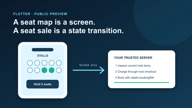
Add an Interactive Seat Map to Flutter: SDK, Holds, Checkout
Mount the public-preview SeatLayer SDK in Flutter, keep holds and payment server-side, and survive backgrounding, expiry, and 409 conflicts.
How Much Does It Cost to Hire a Flutter Developer in 2026? Rates, Salary Bands, and App Development Cost
How much does it cost to hire a Flutter developer? $15–$150/hr depending on region and seniority — breakdown by India, US, and Eastern Europe rates.
Top Flutter App Development Companies in 2026 — A Buyer's Shortlist (India + Global)
Top 10 Flutter app development companies in India (2026) — vetted by portfolio, scale, pricing, and Flutter delivery experience for production builds.

AI in Banking — Use Cases, Named Bank Precedents, and Eval Methodology (2026)
How AI is used in banking — fraud detection, credit scoring, customer service automation, RegTech, and the use cases banks are deploying right now.