
Flutter IntroScreen Widget:
A Flutter IntroScreen is a virtual unique interactive Slider that helps users get started with an application. It has many features that help to build custom-made introduction screen sliders. This widget presents informative screens to users with various possibilities in customisation. It can even be a login or signup page with a custom slider. It is basically a slider with a minimum of three screens where -the user will get a brief idea about the application. This widget can have as many slides as required. This Flutter IntroScreen acts as an pre-auth screens to the users which will tel the user about the application and its core purpose. This is also known as One-time Intro Screen or Splash Screen or Onboarding Screen widget.
So, are you ready to make use of this IntroScreen widget at the beginning of your application? If so, then let’s quickly jump into the usage and the ways a IntroScreen can be modified and used to make user friendly apps. Here I am going to use an open-source UI Library known as GetWidget to build this widget.
GetWidget Flutter IntroScreen Widget:

GetWidget Flutter IntroScreen Component is a component that gives the major features of your flutter application like creating a onetime screen or splash screen for your apps. It is very user friendly as it tells the users about the app in the first look itself. It has sliders by default as there will be at-least two or more slider to explain the user what the application purpose is and its main features. It can be an auto-scroll if there is only pieces of information or it can have login screens as well for the users to fill them up. In any of the ways this component can be used and it has a well desired options to customise according to the needs.
IntroScreen has two types in which it can be categorised into FullSized and HalfSized IntroScreens. Now let’s dive into the IntroScreen Widget and how it can be used.
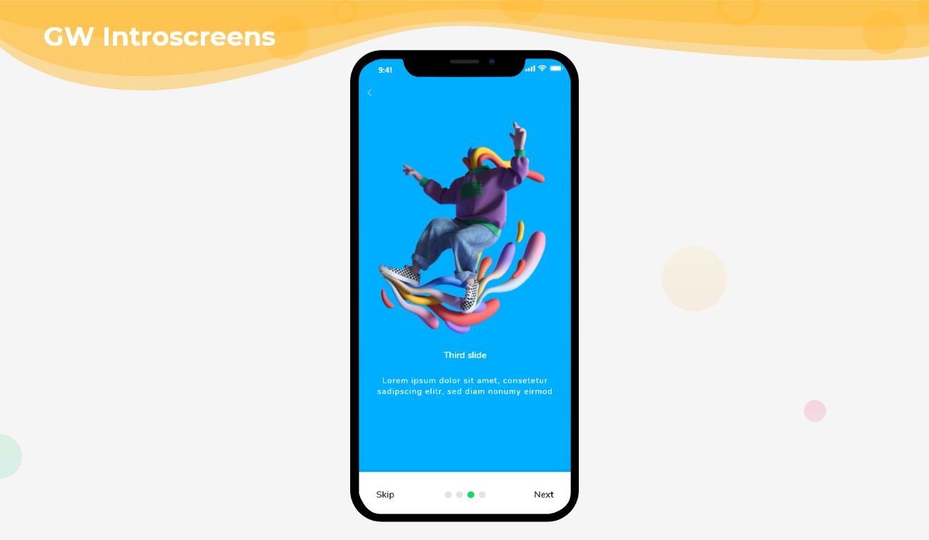
FullSized Flutter Intro Splash Screen:
Here, the slider will be of full-screen size in respective of the device’s size. The IntroScreen will take the full height of the device and fits perfectly to the screen. It can be customised with the action buttons and the indicators as well.

HalfSized IntroScreen:
Here, the slider will be half of the screen size. The IntroScreen will take the half-height of the device. It can be customised with the action buttons and the indicators as well.

How to Start:
Now, here is the guide about how we should you can start developing Flutter IntroScreen Widget with the help of GetWidget UI Library.
First, Let go with Getting started, It will guide you on how to start building a beautiful flutter application UI with GetWidget UI library. Now, we have to install the GetWidget package from pub.dev, To import the package in your Flutter project follow the below guide.
Install Package from pub.dev :
https://pub.dev/packages/getwidget – Check the details about GetWidget Package.
Import full package:
import ‘package:getwidget/getwidget.dart’;
Note: dependencies: getwidget: ^4.0.0
Keep playing with the pre-built UI components.
Example of FullSized Flutter IntroScreen:
  PageController _pageController;
  List slideList;
  int initialPage;
  @override
  void initState() {
    _pageController = PageController(initialPage: 2);
    initialPage = _pageController.initialPage;
    super.initState();
  }
  @override
  Widget build(BuildContext context) {
    return SafeArea(
      child: GFIntroScreen(
        color: Colors.blueGrey,
        slides: slides(),
        pageController: _pageController,
        currentIndex: null,
        pageCount: 5,
        introScreenBottomNavigationBar: GFIntroScreenBottomNavigationBar(
          pageController: _pageController,
          pageCount: slideList.length,
          currentIndex: initialPage,
          onForwardButtonTap: () {
            _pageController.nextPage(
                duration: const Duration(milliseconds: 500),
                curve: Curves.linear);
          },
          onBackButtonTap: () {
            _pageController.previousPage(
                duration: const Duration(milliseconds: 500),
                curve: Curves.linear);
          },
          navigationBarColor: Colors.white,
          showDivider: false,
          inactiveColor: Colors.grey[200],
          activeColor: GFColors.SUCCESS,
        ),
      ),
    );
  }
  List slides() {
    slideList = [
      Container(
        // color: Colors.teal,
        child: GFImageOverlay(
          width: MediaQuery.of(context).size.width,
          padding: EdgeInsets.all(16),
          child: Row(
            crossAxisAlignment: CrossAxisAlignment.start,
            children: [
              Padding(
                padding: const EdgeInsets.only(top: 70.0, left: 20),
                child: Text(
                  'Welcome!',
                  style: TextStyle(
                      color: Colors.white,
                      decoration: TextDecoration.none,
                      fontSize: 25),
                ),
              ),
            ],
          ),
          color: Colors.orange,
          image: const AssetImage('lib/assets/images/i1.png'),
          boxFit: BoxFit.cover,
          colorFilter:
              ColorFilter.mode(Colors.black.withOpacity(0.2), BlendMode.darken),
          borderRadius: BorderRadius.circular(5),
        ),
      ),
      Container(
        width: MediaQuery.of(context).size.width,
        height: MediaQuery.of(context).size.height,
        decoration: BoxDecoration(
            borderRadius: BorderRadius.circular(0),
            image: DecorationImage(
              image: AssetImage('lib/assets/images/i2.png'),
              fit: BoxFit.cover,
              colorFilter: ColorFilter.mode(
                  Colors.black.withOpacity(0.2), BlendMode.darken),
            )),
      ),
      Container(
        width: MediaQuery.of(context).size.width,
        height: MediaQuery.of(context).size.height,
        decoration: BoxDecoration(
            // color: Colors.tealAccent,
            borderRadius: BorderRadius.circular(0),
            image: DecorationImage(
              image: AssetImage('lib/assets/images/i3.png'),
              fit: BoxFit.cover,
              colorFilter: ColorFilter.mode(
                  Colors.black.withOpacity(0.2), BlendMode.darken),
            )),
      ),
      Container(
        width: MediaQuery.of(context).size.width,
        height: MediaQuery.of(context).size.height,
        decoration: BoxDecoration(
            borderRadius: BorderRadius.circular(0),
            image: DecorationImage(
              image: AssetImage('lib/assets/images/i4.png'),
              fit: BoxFit.cover,
              colorFilter: ColorFilter.mode(
                  Colors.black.withOpacity(0.2), BlendMode.darken),
            )),
      ),
    ];
    return slideList;
  }
Example of HalfSized Flutter IntroScreen:
  PageController _pageController;
  List slideList;
  int initialPage;
  @override
  void initState() {
    _pageController = PageController(initialPage: 2);
    initialPage = _pageController.initialPage;
    super.initState();
  }
  @override
  Widget build(BuildContext context) => Scaffold(
        backgroundColor: Colors.grey[200],
        body: SafeArea(
          child: GFIntroScreen(
            height: MediaQuery.of(context).size.height * 0.7,
            width: MediaQuery.of(context).size.width * 0.9,
            color: Colors.white,
            borderRadius: BorderRadius.circular(40),
            border: Border.all(color: Colors.grey[200]),
            slides: slides(),
            pageController: _pageController,
            introScreenBottomNavigationBar: GFIntroScreenBottomNavigationBar(
              pageController: _pageController,
              pageCount: slideList.length,
              currentIndex: initialPage,
              backButtonText: 'Previous',
              forwardButtonText: 'Next',
              skipButtonText: 'Skip',
              doneButtonText: 'Done',
              navigationBarHeight: 50,
              navigationBarWidth: 300,
                navigationBarShape: RoundedRectangleBorder(
                side: const BorderSide(color: Colors.blue, width: 4),
                borderRadius: BorderRadius.circular(60),
              ),
              navigationBarColor: Colors.white,
              showDivider: false,
              dotHeight: 10,
              dotWidth: 16,
              dotShape: RoundedRectangleBorder(
                  side: BorderSide(color: Colors.grey[200], width: 1),
                  borderRadius: BorderRadius.circular(5)),
              inactiveColor: Colors.grey[200],
              activeColor: GFColors.SUCCESS,
              dotMargin: EdgeInsets.symmetric(horizontal: 6),
              showPagination: true,
            ),
            currentIndex: null,
            pageCount: null,
          ),
        ),
      );
  List slides() {
    slideList = [
      Container(
         child: GFImageOverlay(
          width: MediaQuery.of(context).size.width,
          padding: EdgeInsets.all(16),
          child: Row(
            crossAxisAlignment: CrossAxisAlignment.start,
            children: [
              Padding(
                padding: const EdgeInsets.only(top: 10.0, left: 20),
                child: Text(
                  'Welcome Back!',
                  style: TextStyle(
                      color: Colors.white,
                      decoration: TextDecoration.none,
                      fontSize: 25),
                ),
              ),
            ],
          ),
          color: Colors.orange,
          image: const AssetImage('lib/assets/images/i1.png'),
          boxFit: BoxFit.cover,
          colorFilter:
              ColorFilter.mode(Colors.black.withOpacity(0.2), BlendMode.darken),
          borderRadius: BorderRadius.only(
              topLeft: Radius.circular(40), topRight: Radius.circular(40)),
        ),
      ),
      Container(
        width: MediaQuery.of(context).size.width,
        height: MediaQuery.of(context).size.height,
        decoration: BoxDecoration(
              borderRadius: BorderRadius.only(
                topLeft: Radius.circular(40), topRight: Radius.circular(40)),
            image: DecorationImage(
              image: AssetImage('lib/assets/images/i2.png'),
              fit: BoxFit.fill,
              colorFilter: ColorFilter.mode(
                  Colors.black.withOpacity(0.2), BlendMode.darken),
            )),
      ),
      Container(
        width: MediaQuery.of(context).size.width,
        height: MediaQuery.of(context).size.height,
        decoration: BoxDecoration(

            borderRadius: BorderRadius.only(
                topLeft: Radius.circular(40), topRight: Radius.circular(40)),
            image: DecorationImage(
              image: AssetImage('lib/assets/images/i3.png'),
              fit: BoxFit.fill,
              colorFilter: ColorFilter.mode(
                  Colors.black.withOpacity(0.2), BlendMode.darken),
            )),
      ),
      Container(
        width: MediaQuery.of(context).size.width,
        height: MediaQuery.of(context).size.height,
        decoration: BoxDecoration(

            borderRadius: BorderRadius.only(
                topLeft: Radius.circular(40), topRight: Radius.circular(40)),
            image: DecorationImage(
              image: AssetImage('lib/assets/images/i4.png'),
              fit: BoxFit.fill,
              colorFilter: ColorFilter.mode(
                  Colors.black.withOpacity(0.2), BlendMode.darken),
            )),
      ),
    ];
    return slideList;
  }
About GF IntroScreenBottomNavigationBar
It is a bottom bar that will fix at the bottom end of your app screen. This component helps to build a container that contains pagination and buttons for navigation. It has multiple options for further customisation for the bottom navigation bar.
PageController _pageController;
int initialPage;
@override
void initState() {
  _pageController = PageController(initialPage: 2);
  initialPage = _pageController.initialPage;
  super.initState();
}
GFIntroScreen(
  color: Colors.blueGrey,
  slides: slides(),
  pageController: _pageController,
  currentIndex: inittialIndex,
  pageCount: 5,
  introScreenBottomNavigationBar: GFIntroScreenBottomNavigationBar(
    pageController: _pageController,
    pageCount: slideList.length,
    currentIndex: initialPage,
  ),
),
Custom Properties
Check out the custom properties list of Flutter Intro Screen Widget.
| slides | defines the list of slides |
| pageController | allows one to control [GFIntroScreen] slides |
| color | defines background color of the [GFIntroScreen] slides |
| height | defines [GFIntroScreen] slides height |
| width | defines [GFIntroScreen] slides width |
| borderRadius | defines [GFIntroScreen] border radius to defines slides shape |
| border | defines [GFIntroScreen] slides border |
| introScreenBottomNavigationBar **** | defines [GFIntroScreen]’s bottom navigation bar |
| showIntroScreenBottomNavigationBar | on true state, displays [GFIntroScreenBottomNavigationBar], defaults to true |
| currentIndex | defines the currentIndex of [GFIntroScreen] slides, default value is 0 |
| pageCount | defines the length of [GFIntroScreen] slides, default value is 0 |
| child | defines [GFIntroScreenBottomNavigationBar]’s child, it takes any widget |
| navigationBarHeight | defines [GFIntroScreenBottomNavigationBar] height |
| navigationBarWidth | defines [GFIntroScreenBottomNavigationBar] width |
| navigationBarPadding | defines [GFIntroScreenBottomNavigationBar] padding |
| navigationBarMargin | defines [GFIntroScreenBottomNavigationBar] margin |
| navigationBarColor | defines [GFIntroScreenBottomNavigationBar] color |
| navigationBarShape | defines the shape of [GFIntroScreenBottomNavigationBar] |
| onForwardButtonTap | called when the [forwardButtonText] is tapped |
| onBackButtonTap | called when the [backButtonText] is tapped |
| onDoneTap | called when the [doneButtonText] is tapped |
| onSkipTap | called when the [skipButtonText] is tapped |
| backButton | takes any Widget to define the backButton widget |
| forwardButton | takes any Widget to define the forwardButton widget |
| doneButton | takes any Widget to define the doneButton widget |
| skipButton | takes any Widget to define the skipButton widget |
| backButtonText | takes String to define backButton text |
| forwardButtonText | takes String to define forwardButton text |
| doneButtonText | takes String to define doneButton text |
| skipButtonText | takes String to define skipButton text |
| skipButtonTextStyle | defines the skipButton textStyle |
| doneButtonTextStyle | defines the doneButton textStyle |
| backButtonTextStyle | defines the backButton textStyle |
| forwardButtonTextStyle | defines the forwardButton textStyle |
| showDivider | on true state, displays [Divider], defaults to true |
| showButton | on true state, displays buttons, defaults to true |
| showPagination | on true state, displays pagination, defaults to true |
| dividerHeight | defines divider height |
| dividerThickness | defines divider thickness |
| dividerColor | defines divider color |
| dotShape | defines pagination shape |
| inactiveColor | defines pagination inactive color |
| activeColor | defines pagination active color |
| dotHeight | defines pagination height |
| dotWidth | defines pagination width |
| dotMargin | defines pagination in between space |
Conclusion:
Here we discussed, what Flutter IntroScreen Widget is? And how it is easy and powerful to use in any application through GetWidget IntroScreen component. Here, there are options to customise and use other types of IntroScreen and make the application an eye-catchy one.
FAQs:
Q: Can action buttons be customised?
Ans: Yes, it can be customised according to the need.
Q. How many slides can we have?
Ans: Any number of slides can be used.
Q. Can we customize the bottom bar?
Ans: Yes, we can customize the bottom bar and all its child components.
Q. Is it use for flutter onboarding screen example?
Ans: Yes, This widget is also known as onboarding or onetime screen. So you can use this widget to build your onetime screen widget for your Flutter applications.
Q. Can we use it for the Splash screen in the Flutter app/package?
Ans: Yes. You can use this widget component for Fluter Splash Screen development.