Flutter Dropdown Widget: DropdownButton, DropdownMenu, and Custom Patterns
When to use DropdownButton (M2) vs DropdownMenu (M3) vs dropdown_button2. Theming, search, multi-select, accessibility, and common bugs.
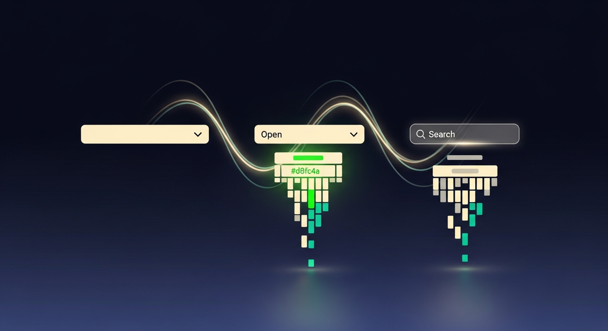
Flutter ships two native dropdown widgets, and the Flutter docs don't make it obvious which one to use. DropdownButton has been in the SDK since day one. DropdownMenu arrived with Material 3 in Flutter 3.7. They solve different problems, they look different by default, and they fail in different ways when you try to force them outside their intended use case.
Our team has shipped the GetWidget Flutter UI Kit to 23K monthly pub.dev downloads and built production Flutter apps across healthcare, fintech, legal, and ecommerce. We've dealt with every variant of dropdown confusion: duplicate value crashes, hints that won't clear, search fields that flicker on rebuild, and RTL layouts where the chevron ends up on the wrong side. This guide covers the full picture so you don't have to learn it one bug at a time.
DropdownButton vs DropdownMenu: when each flutter dropdown widget is right
The core difference is the target Material spec version. DropdownButton is a Material 2 widget. It renders a text label with a downward-pointing chevron, opens a floating menu below the trigger, and doesn't support text input. DropdownMenu is Material 3. It renders as a TextField, which means the user can type to filter options, and it integrates naturally with InputDecoration theming.
Trigger is a text + chevron row. No built-in text input. Controlled via value + onChanged. Simple theming through DropdownButtonThemeData. Stable, widely documented. Use when your app hasn't migrated to M3 or you need the lightest possible dropdown with zero dependencies.
Trigger is a TextField. Supports type-to-filter search natively. Integrates with InputDecoration and M3 color tokens. Requires a controller for programmatic state. Use when your app targets M3 (useMaterial3: true) and you want search or consistent text-field styling across forms.
One practical note: if your MaterialApp sets useMaterial3: true but you still reach for DropdownButton, you'll get a widget that looks visually out of step with your TextField and chip widgets. Flutter won't warn you. The mismatch only shows up during design review. Pick the dropdown that matches your spec version and stick with it.
DropdownButton: basic flutter dropdownbutton implementation
DropdownButton requires four things: a typed value, a list of DropdownMenuItems, an onChanged callback, and a matching type parameter across all three. The widget is generic: DropdownButton<T>. Each flutter dropdownmenuitem in the list must carry a unique value matching the widget's type, and every value must be distinct. Violating that uniqueness constraint throws a Flutter assertion at runtime. In our GetWidget projects, we always build the items list from a deduped source — usually a Dart Set converted to a List before passing it to the widget.
import 'package:flutter/material.dart';

class CountryDropdown extends StatefulWidget {
  const CountryDropdown({super.key});

  @override
  State<CountryDropdown> createState() => _CountryDropdownState();
}

class _CountryDropdownState extends State<CountryDropdown> {
  String? _selected;

  final List<String> _countries = ['India', 'USA', 'Germany', 'Japan'];

  @override
  Widget build(BuildContext context) {
    return DropdownButton<String>(
      value: _selected,
      hint: const Text('Select country'),
      isExpanded: true,
      underline: const SizedBox(), // remove default underline
      items: _countries
          .map((c) => DropdownMenuItem<String>(value: c, child: Text(c)))
          .toList(),
      onChanged: (val) => setState(() => _selected = val),
    );
  }
}DropdownMenu: the Material 3 flutter dropdown menu with built-in search
DropdownMenu works differently from DropdownButton. The trigger is a TextField, so users can type to filter the list before selecting. State is managed via a TextEditingController (for reading what the user typed) and an optional initialSelection property for pre-seeding the value. The widget handles the filtering automatically when enableFilter: true is set.
import 'package:flutter/material.dart';

enum Country { india, usa, germany, japan }

class CountryDropdownMenu extends StatefulWidget {
  const CountryDropdownMenu({super.key});

  @override
  State<CountryDropdownMenu> createState() => _CountryDropdownMenuState();
}

class _CountryDropdownMenuState extends State<CountryDropdownMenu> {
  Country? _selected;

  @override
  Widget build(BuildContext context) {
    return DropdownMenu<Country>(
      initialSelection: _selected,
      label: const Text('Country'),
      enableFilter: true,         // type-to-filter
      enableSearch: true,
      width: 280,
      requestFocusOnTap: true,
      dropdownMenuEntries: Country.values
          .map((c) => DropdownMenuEntry<Country>(
                value: c,
                label: c.name[0].toUpperCase() + c.name.substring(1),
              ))
          .toList(),
      onSelected: (val) => setState(() => _selected = val),
    );
  }
}Theming and InputDecoration for a flutter custom dropdown
DropdownButton theming goes through DropdownButtonThemeData, which you set on your ThemeData. You can control the dropdown's elevation, padding, icon color, and item text style globally. For the menu overlay itself, use the menuMaxHeight property on individual DropdownButton widgets or set it once at the theme level.
// Material 2 — theme-level DropdownButton styling
ThemeData(
  dropdownMenuTheme: DropdownMenuThemeData(
    inputDecorationTheme: InputDecorationTheme(
      border: OutlineInputBorder(
        borderRadius: BorderRadius.circular(8),
      ),
      contentPadding:
          const EdgeInsets.symmetric(horizontal: 16, vertical: 12),
    ),
    menuStyle: MenuStyle(
      elevation: WidgetStateProperty.all(4),
      shape: WidgetStateProperty.all(
        RoundedRectangleBorder(borderRadius: BorderRadius.circular(8)),
      ),
    ),
  ),
);

// Material 3 — DropdownMenu reads from InputDecorationTheme automatically
// No widget-level override needed for most styling
DropdownMenu respects InputDecoration directly, which is one of its real advantages for M3 codebases. Our team typically sets a global OutlineInputBorder in ThemeData and DropdownMenu inherits it without any per-widget override. DropdownButton doesn't share that inheritance path, so teams maintaining both M2 and M3 sections in the same app end up with two separate theming paths.
Search-enabled dropdown and multi-select patterns
DropdownMenu handles single-selection search natively with enableFilter: true. For multi-select, neither native widget supports it directly. Two community packages fill that gap well: dropdown_button2 adds a checkbox-item builder that makes multi-select straightforward, and multiselect_flutter provides a ready-made BottomSheet and dialog picker style if your list is long.
For long option lists (50+ items) where users need to browse and select several at once, we've had better results with a ModalBottomSheet containing a ListView of CheckboxListTiles than with any overlay-based dropdown. The sheet gives users scrollable space and a clear confirm button. It's a pattern that pairs naturally with other selection-heavy components like the flutter accordion for grouping categories before selection.
// Lightweight multi-select using ModalBottomSheet — no extra package needed
Future<void> _showMultiSelect(BuildContext context) async {
  final List<String> options = ['Flutter', 'Dart', 'Firebase', 'Supabase', 'GraphQL'];
  final List<String> selected = List.from(_selectedTags);

  await showModalBottomSheet(
    context: context,
    builder: (_) => StatefulBuilder(
      builder: (ctx, setInnerState) => Column(
        children: [
          const Padding(
            padding: EdgeInsets.all(16),
            child: Text('Select tags', style: TextStyle(fontWeight: FontWeight.bold, fontSize: 16)),
          ),
          Expanded(
            child: ListView(
              children: options
                  .map((opt) => CheckboxListTile(
                        title: Text(opt),
                        value: selected.contains(opt),
                        onChanged: (v) => setInnerState(() {
                          if (v == true) selected.add(opt);
                          else selected.remove(opt);
                        }),
                      ))
                  .toList(),
            ),
          ),
          Padding(
            padding: const EdgeInsets.all(16),
            child: FilledButton(
              onPressed: () {
                setState(() => _selectedTags = selected);
                Navigator.pop(ctx);
              },
              child: const Text('Confirm'),
            ),
          ),
        ],
      ),
    ),
  );
}
Custom item builders: icons, sub-labels, and leading widgets
Both DropdownButton and DropdownMenu accept fully custom item content. DropdownButton's DropdownMenuItem takes any Widget as child. DropdownMenu's DropdownMenuEntry takes a label string plus an optional leadingIcon and trailingIcon. In our builds, when we need more than an icon (for example, a two-line item with a title and sub-label), we reach for DropdownButton with a custom Row child, since DropdownMenuEntry's API is more constrained.
// DropdownButton with two-line item (title + subtitle)
DropdownButton<String>(
  value: _selected,
  isExpanded: true,
  items: _options.map((opt) {
    return DropdownMenuItem<String>(
      value: opt.id,
      child: Row(
        children: [
          CircleAvatar(
            radius: 16,
            backgroundImage: NetworkImage(opt.avatarUrl),
          ),
          const SizedBox(width: 12),
          Expanded(
            child: Column(
              crossAxisAlignment: CrossAxisAlignment.start,
              mainAxisSize: MainAxisSize.min,
              children: [
                Text(opt.name, style: const TextStyle(fontWeight: FontWeight.w600)),
                Text(opt.role,
                    style: TextStyle(
                        fontSize: 12,
                        color: Theme.of(context).colorScheme.outline)),
              ],
            ),
          ),
        ],
      ),
    );
  }).toList(),
  onChanged: (val) => setState(() => _selected = val),
);
dropdown_button2: the community package that fills the gaps
dropdown_button2 on pub.dev is a drop-in replacement for DropdownButton with significant additional controls. The package exposes menu width, menu height, menu offset, button height, custom scroll physics, item separator builders, and a selectedItemBuilder that lets the selected item render differently from the open list. It also fixes a common annoyance with the default DropdownButton: the menu width locks to the button width, which makes long option labels truncate. dropdown_button2 lets you set an independent menu width.
import 'package:dropdown_button2/dropdown_button2.dart';

DropdownButton2<String>(
  isExpanded: true,
  hint: const Text('Select option'),
  value: _selected,
  items: _options
      .map((o) => DropdownMenuItem<String>(
            value: o,
            child: Text(o),
          ))
      .toList(),
  onChanged: (val) => setState(() => _selected = val),
  buttonStyleData: const ButtonStyleData(
    height: 48,
    padding: EdgeInsets.only(left: 14, right: 14),
  ),
  dropdownStyleData: DropdownStyleData(
    maxHeight: 300,
    width: 320,          // independent of button width
    offset: const Offset(0, -4),
    decoration: BoxDecoration(
      borderRadius: BorderRadius.circular(8),
    ),
    scrollbarTheme: ScrollbarThemeData(
      radius: const Radius.circular(40),
      thickness: WidgetStateProperty.all(6),
    ),
  ),
  menuItemStyleData: const MenuItemStyleData(
    height: 48,
    padding: EdgeInsets.only(left: 14, right: 14),
  ),
);Accessibility: Semantics and keyboard navigation
Flutter's native dropdown widgets have reasonable accessibility defaults. DropdownButton announces its current value and the 'collapsed' state to screen readers. DropdownMenu, being a TextField, inherits label and hint announcements from InputDecoration. Both support keyboard navigation on desktop and web: arrow keys move through items, Enter selects, Escape closes.
Where you need to add explicit Semantics wrapping is when you use a fully custom dropdown (a GestureDetector opening an Overlay, for instance). In that case, wrap the trigger in a Semantics widget with button: true, label describing the selection context, and value showing the current selection. Without it, TalkBack and VoiceOver will report the element as unlabeled.
// Adding Semantics to a custom dropdown trigger
Semantics(
  label: 'Country selector',
  value: _selected ?? 'None selected',
  button: true,
  hint: 'Double tap to open options',
  child: GestureDetector(
    onTap: _openDropdown,
    child: _buildDropdownTrigger(),
  ),
);
Common flutter dropdown bugs and how to fix them
These are the bugs our team encounters most often in code reviews and client handoffs:
Dropdown production bug reference
Duplicate value assertion ('There should be exactly one item')
Cause: two DropdownMenuItems share the same value, or value is null and hint is also null. Fix: deduplicate the items list before passing it to the widget. For placeholder state, set value: null on the DropdownButton itself and use the hint property — don't add a null-value DropdownMenuItem to the list.
Selected value disappears after hot reload
Cause: state lives in a StatefulWidget that gets recreated on hot reload. Not a production bug, but it misleads developers into thinking there's a state-management issue. Fix: test selection persistence with actual app restarts, or move state to a provider/bloc if it needs to survive widget rebuilds.
DropdownMenu hint text reappears after selection
Cause: using initialSelection without syncing state in onSelected. The widget shows the initial value but doesn't update its internal display when the external state changes. Fix: pass a TextEditingController and update its text in onSelected, or use a key to force a rebuild when the selection changes externally.
Null safety: value not in items causes assertion
Cause: the DropdownButton's value property holds a value that is no longer in the items list (common after a backend refresh removes an option). Fix: before setting value, check that the list contains it. If not, reset to null so the hint shows instead of crashing.
RTL: chevron appears on wrong side
Cause: DropdownButton places the icon at the end of its row, which is visually correct in LTR. In RTL locales the icon position is automatically mirrored by Flutter's Directionality, but some custom wrappers override this with explicit right alignment. Fix: use Directionality.of(context) to check the text direction before applying positional overrides.
Decision matrix: which flutter dropdown widget to reach for
Use this matrix when the choice isn't obvious. Each row is a scenario you're likely to face. The cells show which option fits, and weight indicates how strongly we recommend it for that case.
| DropdownButton (M2) | DropdownMenu (M3) | dropdown_button2 | GFDropdown | |
|---|---|---|---|---|
| App uses Material 2 (useMaterial3: false) | Best fit | Visual mismatch | Good | Good |
| App uses Material 3 (useMaterial3: true) | Mismatched style | Best fit | Adequate | Adequate |
| Needs type-to-filter search | Not supported | Native support | Via searchData prop | Not built-in |
| Needs multi-select | Manual implementation | Not supported | Built-in checkboxes | Not supported |
| Needs menu width > button width | Not possible | width property | DropdownStyleData.width | Not configurable |
| Two-line custom item (title + sub-label) | Custom Row child | leadingIcon only | Custom Row child | Custom builder |
| RTL locale support | Automatic via Directionality | Automatic via Directionality | Automatic via Directionality | Test required |
| Zero dependencies, simplest code | Best fit | Best fit (M3) | One package dep | One package dep |
GFDropdown: the GetWidget flutter dropdown option
GFDropdown is part of our open-source GetWidget kit, which ships 1,000+ Flutter components to 23K monthly pub.dev downloads. GFDropdown wraps DropdownButton with a pre-wired border, consistent padding, and GetWidget's design token system. If your app already uses GFButton, GFAvatar, or the flutter rating bar components from GetWidget, GFDropdown gives you visual consistency without manual theming.
import 'package:getwidget/getwidget.dart';

String _selected = 'India';

GFDropdown<String>(
  value: _selected,
  onChanged: (val) => setState(() => _selected = val!),
  items: ['India', 'USA', 'Germany', 'Japan']
      .map((item) => DropdownMenuItem<String>(
            value: item,
            child: Text(item),
          ))
      .toList(),
  // GetWidget tokens apply automatically:
  // border, borderRadius, padding match GF design system
);
GFDropdown is M2-based. Our current recommendation: use GFDropdown when your project uses GetWidget components broadly and is on a Material 2 theme. We've shipped it successfully in fintech and HR products where we already had full GetWidget coverage. If you're migrating to M3 or need search/multi-select, pair the native DropdownMenu or dropdown_button2 with your own InputDecoration theme rather than using GFDropdown as the base.
FAQ: flutter dropdown widget questions answered
What is the difference between DropdownButton and DropdownMenu in Flutter?
DropdownButton is a Material 2 widget. It renders a label with a chevron and opens a floating menu. DropdownMenu is a Material 3 widget that renders as a TextField and supports type-to-filter search natively. Use DropdownButton for M2 apps and DropdownMenu for M3 apps (useMaterial3: true).
How do I create a flutter dropdown with search?
Use DropdownMenu with enableFilter: true and enableSearch: true. The widget handles filtering automatically as the user types. For M2 apps or more control over the search logic, use dropdown_button2 with its searchData configuration or the dropdown_search package.
How do I implement multi-select in a Flutter dropdown?
Neither native Flutter dropdown supports multi-select directly. Use dropdown_button2 with checkbox item builders, or implement a ModalBottomSheet with a ListView of CheckboxListTiles for long lists. For a quick solution without extra packages, the ModalBottomSheet approach requires no new dependencies.
Why does my DropdownButton throw 'There should be exactly one item with the DropdownButton's value'?
This assertion fires when two DropdownMenuItems share the same value, or when the widget's value property holds a value that doesn't match any item in the list. Deduplicate your items list, and if using a null initial value, use the hint property instead of adding a null-value item to the list.
What is GFDropdown and when should I use it?
GFDropdown is a wrapper from the GetWidget open-source Flutter UI Kit (4,811 stars, 23K monthly pub.dev downloads). It wraps DropdownButton with GetWidget's design tokens for consistent styling across GetWidget components. Use it when your app already uses GetWidget components and targets Material 2.
How do I set custom width for a Flutter dropdown menu?
DropdownMenu accepts a width property directly. For DropdownButton, the menu inherits the button's width by default. To set an independent menu width with DropdownButton, use the dropdown_button2 package and set DropdownStyleData.width to your desired value.
DropdownButton and DropdownMenu solve different problems. Picking the wrong one doesn't crash your app today. It slows down every theming and styling decision for the next six months.

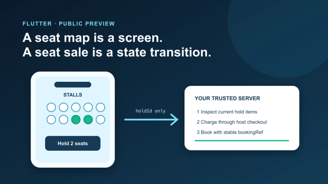
Add an Interactive Seat Map to Flutter: SDK, Holds, Checkout
Mount the public-preview SeatLayer SDK in Flutter, keep holds and payment server-side, and survive backgrounding, expiry, and 409 conflicts.
How Much Does It Cost to Hire a Flutter Developer in 2026? Rates, Salary Bands, and App Development Cost
How much does it cost to hire a Flutter developer? $15–$150/hr depending on region and seniority — breakdown by India, US, and Eastern Europe rates.
Top Flutter App Development Companies in 2026 — A Buyer's Shortlist (India + Global)
Top 10 Flutter app development companies in India (2026) — vetted by portfolio, scale, pricing, and Flutter delivery experience for production builds.

AI in Banking — Use Cases, Named Bank Precedents, and Eval Methodology (2026)
How AI is used in banking — fraud detection, credit scoring, customer service automation, RegTech, and the use cases banks are deploying right now.