How to Design Custom Flutter Buttons with 100+ Example Code
We go step by step to create all types of button-like Circular, Elevated, icon, Social, Outline, Raised, Switch, Disable button, and many more

Flutter Button Widget
The Flutter button is one of the most common components that is used to build a call-to-action in your application. Flutter button widget allows building an awesome button that helps you perform a call-to-action based on your application requirement and user's need. Flutter buttons have many variants that help you design a nice compatible button based on your Flutter app design to provide the best user experience on performing a particular action.
What is GF Flutter Button?
GFButton is a Flutter Button Widgets component that allows a submit call-to-action element in your app that performs a clickable request based on your app's call-to-action function. So if your Flutter applications have a click action then this button component will help you out to build an awesome Flutter button with a record time that will be incorporated with your application.
Buttons are the most commonly used component for MOBILE and WEB apps development. The button helps us to submit form data, used as a link, page routing, functional events & many more places wherever needed.
Keeping the multi-use of buttons in our mind, we at GetWidget have developed the GFButton component for flutter mobile/web apps. GFButton has a huge range of pre-designed buttons that can be used for Flutter app development.
GFButton can be used in your app for building a nice Flutter Button Widget that is quite easy & simple as we have developed the component for developers to use and so it must be developer-friendly to implement the component in apps. Our open-source Flutter UI library is built to make flutter app development easier & faster from the developer's point of view. Let's start playing with the GetWidget library to create beautiful flutter applications.
Let us see how to use a Button component in the flutter app using the GetWidget library
Getting Start with Flutter button design
Getting started will guide you on how to start building a beautiful flutter application with the GetWidget UI library. You have to install the package from pub.dev and import the package in your Flutter project & start building the app:
Install Package from pub.dev :
https://pub.dev/packages/getwidget
Import full package:
import 'package:getwidget/getwidget.dart';
Note: dependencies: getwidget: ^4.0.0
Add the below code into your file.
import 'package:getwidget/getwidget.dart';

GFButton(
    onPressed: (){},
    text: "Solid Button",
    blockButton: true,
  ),
Flutter fullwidth button example code with GFButton
The above code is a simple solid button that is of block button which has the fullwidth of the screen with the label of the button.
GFButtons has more variants in it to make the development easy and faster. The shapes of the buttons define its behavior and the various type make it an outstanding element in the library.
The following gives the different types of GFButtons in GetWidget Library.
Flutter Button Type with example code
Flutter Elevated Button
The Raised Button or the Elevated buttons will elevate or trigger themselves whenever the action is made on it. It is a simple solid button with a solid background color and the label of the button on it as shown in the below image
There is a number of the variant with Raised Flutter Button. Some of the following variants that have been used commonly are as follows:
Flutter Raised Solid Button
It is typically a default button. Here we have a solid background color with a slightly curve with a text or label of the button in the center.
The code below shows a simple Raised solid button
import 'package:getwidget/getwidget.dart';

GFButton(
    onPressed: (){},
    text: "Solid Button",
  ),
Flutter Solid button example code
To use the solid button you have to use GFButtonType.solid.
Read more about the Solid button in the official documentation here and check out:
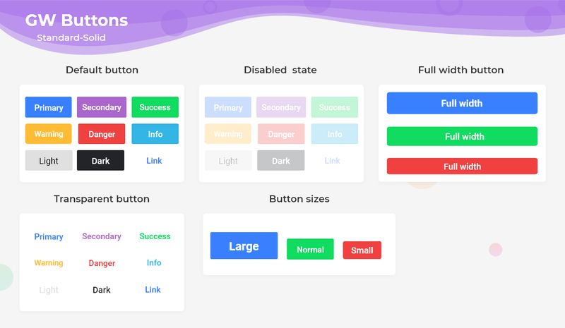
Flutter Disable Button
The Disabled Button is called when the onPressed value to null. It is used in login form submission until the credentials are entered the button will be disabled meaning the buttons can't be clicked and when clicked there won't be any action or response from the button.
The following code gives a simple example of the Flutter disabled button.
import 'package:getwidget/getwidget.dart';

GFButton(
    onPressed: null
    text: "GF Button",
  ),
Flutter disable button code
Read more about Disable Button Widget and check the official documentation for Flutter Disable button.
Flutter Circular Button
Pills Buttons are also Flutter Rounded Buttons that have a border-radius around them or in other words the shape of the button resembles a pill. It has a label of the button and solid background color with rounded corners. The below image shows the pill solid buttons.
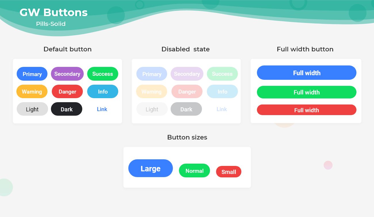
To know more customization options for the pills button head to the official documentation of Flutter Circle buttons here.
Let us see a simple and basic example of a pill button and how it's used in the code. The following will show its usage in the code. We need to add the shape parameter to achieve the pill button as shown below.
import 'package:getwidget/getwidget.dart';

GFButton(
    onPressed: (){},
    text: "Pill Button",
    shape: GFButtonShape.pills,
  ),
Flutter pill button example code
Flutter Square Button
Square Buttons are also Flutter Buttons that have no border-radius around them or in other words the shape of the button resembles a square. It has a label of the button and solid background color with no rounded corners. The below image shows the square solid buttons.
To know more customization options for the Flutter square button head to the official documentation.
Let us see a simple and basic example of a square button in flutter and how it's used in the code. The following will show its usage in the code. We need to add the shape parameter to achieve the square button as shown below.
import 'package:getwidget/getwidget.dart';

GFButton(
    onPressed: (){},
    text: "Pill Button",
    shape: GFButtonShape.square,
  ),
Flutter Icon Button
Icon Buttons are also Flutter Buttons that have slight border-radius around them and it has an icon or label or combination of icons and labels in the button. It has a solid background color with slightly rounded corners. The below image shows the icon solid buttons
To know more customization options for the Flutter icon button head to the official documentation of icon buttons here.
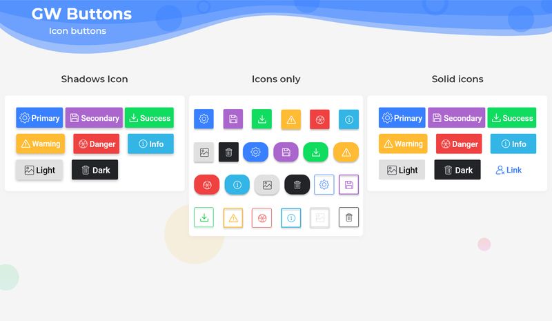
Flutter icon Button docs
Let us see a simple and basic example of a Flutter icon button and how it's used in the code. The following will show its usage with both the icon and the text combination.
import 'package:getwidget/getwidget.dart';

  GFButton(
    onPressed: (){},
    text: "Icon Text",
    icon: Icon(Icons.home),
  ),
GFButton onPressed with Icon
Now, let us see a simple and basic example of only an icon button and how it's used in the code. The following will show its usage with only the icon
import 'package:getwidget/getwidget.dart';

  GFIconButton(
    onPressed: (){},
    icon: Icon(Icons.home),
  ),
Flutter icon button with GFbutton
Flutter Social Button
Flutter Social Buttons are also Flutter Buttons that have slight border-radius or rounded ones just like pills around them and it has a social icon or label or combination of both social icons and labels in the button. It has a solid background color with rounded corners. The below image shows the social solid pill buttons
To know more customization options for the Flutter Social button with icon head to the official documentation of pills buttons here.
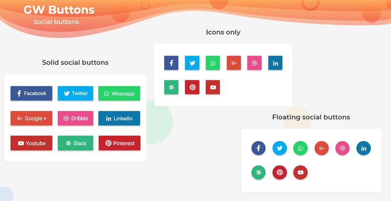
Flutter social button icon Docs
Let us see a simple and basic example of a Flutter social button and how it's used in the code. The following will show its usage with both the icon and the text combination.
import 'package:getwidget/getwidget.dart';

  GFButton(
    onPressed: (){},
    text: "Social Text",
    icon: Icon(Icons.facebook),
  ),
Flutter Facebook social icon
Now, let us see a simple and basic example of only a social button in flutter and how it's used in the code. The following will show its usage with only the social icon.
import 'package:getwidget/getwidget.dart';

  GFIconButton(
    onPressed: (){},
    icon: Icon(Icons.facebook)
  ),
Flutter Icon Button
Flutter Buttons can be customized using GFButton Custom properties which are listed below:
| Name | Description |
|---|---|
| onPressed | callback i.e, called when the button is tapped |
| onLongPressed | callback i.e, called when the button is long-pressed |
| text | describe the button's label. text will be a priority over child |
| icon | describe button's label with icon |
| child | child of type Widget alternative to text |
| textColor | the color to use for this button's text when the button is enabled |
| textStyle | defines the styling of the text |
| disabledColor | the fillcolor of the button when the button is disabled |
| disabledTextColor | the color to use for this button's text when the button is disabled |
| borderSide | defines the border side |
| bordershape | defines the shape of the border |
| buttonBoxShadow | if true, default boxShadow appears around the button. |
| boxShadow | defines the boxShadow |
| fullWidthButton | if true, defines the full width of the button. |
| blockButton | if true, defines the block button. |
| padding | defines internal padding of the button |
| focusColor | fillColor of the button when it has the input focused |
| hoverColor | fillColor of the button when the pointer is hovered over it |
| splashColor | indicates that the button has been touched |
| highlightColor | indicates that the button is actively being pressed |
Features of Buttons
Buttons in Flutter have several features that developers can use to customize their appearance and behavior. Here are some of the most important features of buttons in Flutter:
Impressed:
This is a callback function that gets executed when the button is pressed or clicked. Developers can specify what action should be taken when the button is pressed, such as navigating to a new screen or performing a specific function.
Child:
The child widget that gets displayed inside the button widget. Developers can use any widget as a child of a button widget, such as Text, Icon, Image, or Container.
Color:
The color of the button widget. Developers can specify the background color of the button using the color property.
TextColor:
The color of the text displayed inside the button widget. Developers can specify the color of the text using the textColor property.
Padding:
The padding around the button widget. Developers can specify the padding using the padding property.
How to create a Button in Flutter?
Flutter Button is a material widget that has clickable functionality and routes to the desired page. It is used for any call to action. Buttons are used for any social authentications, form submissions and that basically requires a call to action function.
Buttons in Flutter are the most used component in any application. It is widely used all over the pages. Here for the demonstration, we will be using the GetWidget library and its GFButton.
GFButton is a Flutter button that is a material widget component that is clickable and used for any cal to action function. It is a clickable component upon which will be routing to other pages or does some kind of action may be opening an alert or closing a popup etc.
GFButton has many variants in it and has a wide range of buttons. Let us see its types and simple examples for the types.
The Standard Flutter button is a solid simple button whose background color and the texts can be changed according to the need. There are many options to customize. For any properties and options head to the official documentation.
Now let us see a simple GFbutton that is a solid button. The example below shows one of the solid buttons.
import 'package:getwidget/getwidget.dart';

GFButton(
    onPressed: (){},
    text: "Solid Button",
  ),
Flutter text button
The above code gives a simple solid button that has only two parameters, one is called to action property which is used to do the action of the button and the other is the name of the button. These two will make up a simple solid GFButton.
The example above demonstrates a simple solid button. For more kinds of buttons and their uses head to the official button documentation For Elevated button GetWidget Library.
Also Read - Flutter Dropdown Button: A widget that allows users to select from a number of items
How to create a Rounded button in Flutter?
Now we will see how to achieve a rounded button in Flutter. The rounded Button is noting but the button having the border radius for it. In GetWidget we have a Pills button or so-called Rounded Button which does the same work. It has a circular type of border to indicate the shape of a button and so it is a rounded button.
Let us see the simplest code for the Rounded/Pills button using the GetWidget library and the code is shown below.
import 'package:getwidget/getwidget.dart';

GFButton(
    onPressed: (){},
    text: "Rounded Button",
    shape: GFButtonShape.pills,
  ),
Flutter Rounded Button example code
In the above code, we can see the code of a solid button that is been modified and the shape of the button is added to give the pill-shaped button. It is the advantage of using GetWidget Library that the codes are very flexible and re-usable with very few modifications.
For more types of buttons and their type and shape head to the official documentation of GetWidget Flutter docs.
How to create a Flutter Icon Button?
Buttons in Flutter is a material button that is called or tapped when the call to action function is required. It is widely used in all applications and is one of the most important components as it will be used in login forms, social forms, and other pages that require performing actions.
GFButton is also a Flutter Button that has the same properties and the functionalities of a flutter button. GFbutton has many types and shapes and it can be customized very easily according to the need.
GFButton comes in the GetWidget library that has its own types and shapes buttons. One of the simple forms is a solid standard button also called the Elevated button in the Flutter. This button type elevates or gets triggered when it is tapped and does the given action. It is the basic button in GFButton.
Now let us see a simple and basic example of the GFSolid button which is a standard button and the below code shows the one.
import 'package:getwidget/getwidget.dart';

GFIconButton(
    onPressed: null,
    text:"Solid Button"
),
Flutter Icon button
Icon Buttons in GFButton are a type of button in which icons are used. It is not restricted to only icons, even the texts or labels, and the combination of both labels and icons can be used in Icon Buttons. It is usually used as icons to show some information like addition for add icon or favorite icon for wishlist etc.
It can be used in floating action buttons also to give the name of the button using only icons.
Now let us see the example of icons in GFButton. The below example shows the icon button with a home icon in it.
import 'package:getwidget/getwidget.dart';

GFIconButton(
    onPressed: null,
    icon: Icon(Icons.home),

),
Let us now see the example of icon and text both in GFButton.
The below example shows the icon button with a home icon and text in it.
import 'package:getwidget/getwidget.dart';

GFButton(
    onPressed: null,
    text:'Icon Button'
    icon: Icon(Icons.home),

),
For more options on Button, head to the official documentation of GetWidget Flutter docs
How to create an Outline Button in Flutter?
The Outline Button is a type of button that has a border around it with a transparent background color and the label of the button. The border color of the outline button can be changed whereas the transparent background color cannot be changed and remains constant.
Now let us see a simple and basic example of the GF Outline button which is a standard button and the below code shows the one.
import 'package:getwidget/getwidget.dart';

GFIconButton(
    onPressed: (){},
    text:"Solid Button",
    type: GFButtonType.outline,
),
Flutter outline button onPressed
The above code is a simple solid button code but the type is added to it to make it an Outline button. For more types of buttons head to the official documentation of the GFButtons.
Getwidget Flutter Docs
Flutter Forum: if any Find any questions let's discuss them on Forum.
GitHub Repository: Please do appreciate our work through Github start

