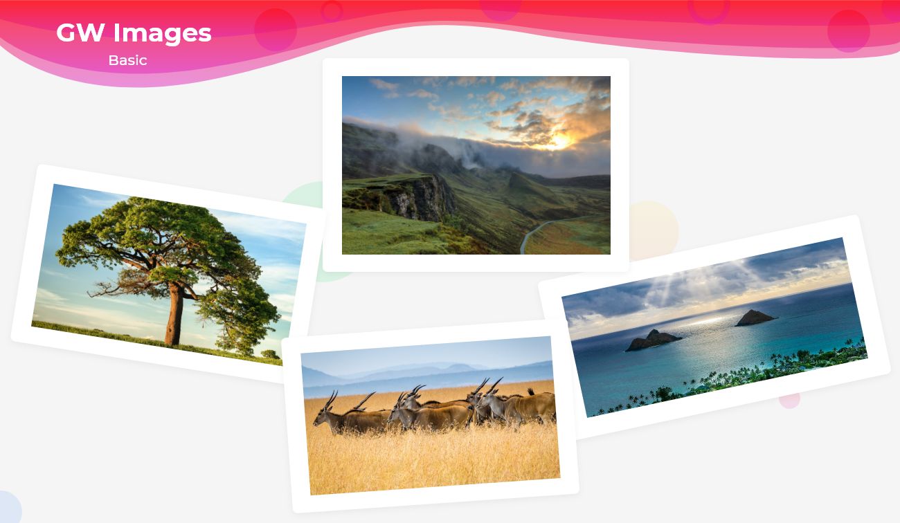
Flutter Image is generally a simple component that represents a thing or a group of things pictorially or which simply boosts the message or the text with a pictorial example to make the user understand better through the images that are displayed along with the paragraphs or the blog of data.
How to use Image in Flutter with GFimage
GFImages is a Flutter Images that also represents the data with its specific pictorial representation in a very different and more convenient way. It uses the assets folder to take the static images and to display them on the app or it even takes network images through the network image property and it also takes a special property called Image Overlay ie, Image Overlay set its picture as the background and any form of paragraph or text in its foreground and thus an overlay of any kind of colors can be applied to it which gives a blurry effect on the picture.
How to Get Started
Now here is the guide about how we should start developing Flutter Image Widget while using GetWidget UI Library.
Getting started will guide you on how to start building a beautiful flutter application with the GetWidget UI library. You have to install the package from pub.dev, import the package in your Flutter project.
Install Package from pub.dev :
https://pub.dev/packages/getwidget
Import full package:
import ‘package:getwidget/getwidget.dart’;
Note: dependencies: getwidget: ^4.0.0
Keep playing with the pre-built UI components.
GetWidget Images is basically used to display the profile pictures of the users and to make it easy it has other types that can be used. In the below section we will see them with the example codes.
Flutter Image using assetImage or Network Image
The Flutter basic Image is a simple image with a specific height and width property. It is widely used to show a banner image or to represent a product image etc.
The below shows how the image can be used with Example Code.
import 'package:getwidget/getwidget.dart';
GFImageOverlay(
  height: 200,
  width: 300,
  image: AssetImage('your asset image')
)
Flutter Circular Image using assetImage or network Image
A Flutter Circular Image is a rounded image that is mostly used as a profile picture or to show the profile of any kind of product, organization, or brand image to the users.

The below shows how the image can be used in the code structure.
import 'package:getwidget/getwidget.dart';

 GFImageOverlay(
   height: 200,
   width: 200,
   shape: BoxShape.circle,
   image:AssetImage('your asset image')
 )
 ujjwal bhardwaj
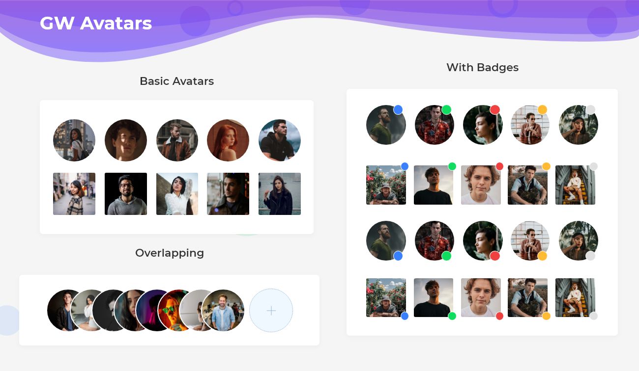
Flutter Image Overlay with colorFilter
An Image Overlay is used to set the images in the background and the text in the foreground and to give a blurry effect with the colorfilter property.

The below code shows how a blurry effect can be achieved to the images.
import 'package:getwidget/getwidget.dart';

 GFImageOverlay(
   height: 200,
   width: 300,
   child: Center(
      child: Text('Light Overlay', style:TextStyle(color:getGFColor(GFColor.white))
  ),
   colorFilter: new ColorFilter.mode(
   Colors.black.withOpacity(0.20),
   BlendMode.darken),
   image: AssetImage('your asset image')
)GF Flutter Image Custom Properties
The custom properties of GFImage are given below to customize the look and feel of the image.
| Name | Description |
|---|---|
| height | defines the height of the image |
| width | defines the width of the image |
| color | defines the background color of the image |
| margin | image’s outer container margin |
| padding | image’s outer container padding |
| alignment | to align the child within the image |
| boxFit | how to image should be inscribed into the box |
| borderRadius | the corners of the image |
| border | the border above the image |
Can we use network image in image overlay?
Yes, we can use any kind of image whether an asset image or a network image.
Can we use the circular image as an avatar image?
Yes, we can use the circular image as an avatar image by adjusting the height and width of the image.
Please do appreciate our work through Github start
Conclusion:
Here we discuss, what Flutter Image Widget is? And how we can use and implement it into our Flutter app through the GetWidget Image component. Here, there are options to customize the Image Widget.
About Our Team:
We have been working on Flutter since Flutter launched in beta version in 2017. And our team have been putting hundreds and hundreds of hour to experiment and implementation of Flutter. As well as after successful delivery of enterprise and SAAS applications that have been used by more than 500+ businesses around the 119+ countries. Now we are in love with Flutter development and we are very passionate about Flutter development. Now it is something we are trying to give a small contribution to the Flutter Dev Community.

I’m Navin Sharma, a passionate Full Stack Developer with over 20 years of experience in the tech industry. Throughout my career, I’ve had the privilege of working on a variety of exciting projects, developing everything from dynamic web applications to complex back-end systems. My expertise spans both front-end and back-end technologies, and I thrive on building solutions that are not only functional but also scalable and user-friendly.
Beyond my hands-on development work, I’ve contributed to several well-respected tech and startup blogs, where I share my insights on the latest trends, development strategies, and best practices in the world of web development. I also have a strong background in app analysis, where I’ve helped companies optimize their products for better performance and enhanced user experience.
Whether I’m working on a challenging coding problem or mentoring fellow developers, I’m always eager to learn, innovate, and push the boundaries of what’s possible with technology.