Flutter Toaster Widget
Flutter Toast is a simple widget that is displayed on the screen to show some particular messages and remains for a short period of time and then disappears on its own after a few seconds. It is useful to show some error messages or any popups to the user. In another word, Flutter Toast Widget allows building an additional action event in your application that allows users to get a specific message for a particular interval of time to get an alert with an additional message without blocking the user interaction.
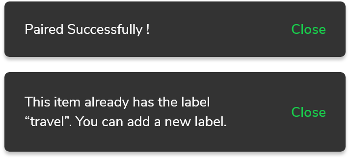
So, Are you ready to develop some awesome Flutter Toast widgets for your apps? Let’s build some Toast widget that helps to increase user experience with your application. Here I am going to use an open-source UI Library known as GetWidget to build this widget. Here is a short introduction about the GetWidget Flutter Toaster widget and why I am using this.
GF Flutter Toaster Widget:
GetWidget Toast is a Flutter Toaster widget that is used to display quick warning or error messages on the screen and it disappears on its own or stays according to the user’s requirement. It is helpful to show any kind of message with the customization options of the toasts to the user. As it is highly customizable it can be widely used throughout the application wherever needed. It can be displayed in any position throughout the screen using the position properties.
Thus GF Toast has a number of options and can be used widely.
Flutter Toast Types
Auto Dismissable Flutter Toaster
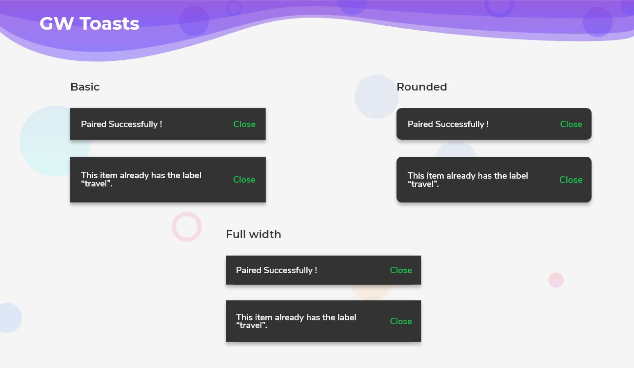
As the name says, the toast will be dismissed after a certain given number of seconds. It can be controlled by the user and depends on how much time the user gives it to stay on the screen, after the time it disappears on its own.
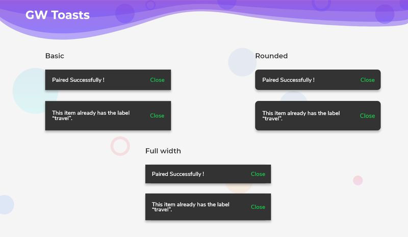
Flutter Basic Toaster
Basic toast is a simple toast that stays on the screen and with the click of a button it disappears. It can also be used as auto dismiss toast by making autoDismiss property to true.
Flutter Rounded Toaster
Rounded toast is the same as basic toast but has rounded edges around the toast and makes it look better for the user to see.
Flutter Full-Width Toaster
Full-Width Toast will take the maximum and full width of the screen to print the error messages and the toast will look in full width according to the mobile screen.
How to Start:
Now, here is the guide about how we should you can start developing Flutter Toast Widget with the help of GetWidget UI Library.
First, Let go with Getwidget Flutter Docs, It will guide you on how to start building a beautiful flutter application UI with the GetWidget UI library. Now, we have to install the GetWidget package from the pub.dev, To import the package in your Flutter project follow the below guide.
Install Package from pub.dev :
https://pub.dev/packages/getwidget – Check the details about GetWidget Package.
Import full package:
import ‘package:getwidget/getwidget.dart’;
Note: dependencies: getwidget: ^4.0.0
Keep playing with the pre-built UI components.
Example of how to start and use the GFToast Widget:
GFToast should be wrapped inside the GF Flutter Floating Widget. The child of the GFFloating Widget takes GFToast as its argument and the body takes any kind of widgets.
The simple example code for Flutter Toast
import 'package:getwidget/getwidget.dart';

 return Scaffold(
   body:GFFloatingWidget(
     child:GFToast(
     text: 'This item already has the label “travel”',
   ),
   body:Text('body or any kind of widget here..')
 )
)
Example of Auto Dismissable toast
The bool value true should be passed to autoDismiss property to make the toast, auto dismissible,
import 'package:getwidget/getwidget.dart';
GFToast(
  text: 'This item already has the label “travel”',
  autoDismiss: true,
)
Example of basic toast with a button in it
import 'package:getwidget/getwidget.dart';
GFToast(
  text:'This item already has the label “travel”',
  button: GFButton(
     onPressed: () {},
     text: 'Close',
     type: GFButtonType.transparent,
     color: GFColor.success,
   ),
   autoDismiss: false,
),
Example of rounded toast with a button in it
import 'package:getwidget/getwidget.dart';
GFToast(
   text: 'Paired Succesfully !',
   button: GFButton(
       onPressed: () {},
       text: 'OK',
       type: GFButtonType.transparent,
        color: GFColors.SUCCESS,
    ),
      type: GFToastType.rounded,
      autoDismiss: false,
       alignment: Alignment.topLeft,
  ),
Replace the type to GFToastType.fullWidth to get the fullWidth toast
How to set Position in Toaster widget
Toasts can be positioned accordingly inside the GFFloating Widget. The positioning takes two parameters ie, horizontalPosition and verticalPosition. The usage of these is shown below.
import 'package:getwidget/getwidget.dart';
body:GFFloatingWidget(
    horizontalPosition:40.0,
    verticalPosition:20.0,
    child:GFToast(
    text: 'Logged In',
  ),
 body:Text('body or any kind of widget here..')
)
The look and feel of the GFToast can be altered according to the need that has customization options shown below.
| Name | Description |
|---|---|
| text | text of type [String] display on toast |
| backgroundColor | defines the background color of the toast |
| textStyle | defines the test style of the toast text |
| toastBorderRadius | defines the border radius of the toast |
| border | defines the border of the toast |
| toastPosition | defines the position of toast over the screen |
| toastDuration | defines the duration of time toast display over screen |
| trailing | defines the trailing widget of the toast |
Check out more details about Flutter Toast Widget more details and custom properties on below:
How to create Custom Flutter Toaster with GFToast?
GF Flutter Basic Toast is the default and simple GFToast that remains on the screen for a given interval of time and with the click of the button, it leaves the screen. To make the toast disappear on its own with a certain time interval, the autoDismiss property should be used.
The example code for the GFToast is as follows.
import 'package:getwidget/getwidget.dart';

 return Scaffold(
   body:GFFloatingWidget(
     child:GFToast(
     text: 'Neque porro quisquam est qui dolorem ipsum quia dolor sit amet, consectetur, adipisci velit.',
   ),
   body:Text('body or any kind of widget here..')
 )
)
Now we will see the code with a button in it. How can the user make use of the buttons to close the toast with help of the action button?
The below example code is with the buttons for user-friendly toasts.
import 'package:getwidget/getwidget.dart';
GFToast(
  text:'Neque porro quisquam est qui dolorem ipsum quia dolor sit amet, consectetur, adipisci velit',
  button: GFButton(
     onPressed: () {},
     text: 'Close',
     type: GFButtonType.transparent,
     color: GFColor.success,
   ),
   autoDismiss: false,
),
How to Create Flutter Round Toaster with example code?
Rounded Toast is also a simple GFToast that is the same as basic toast that remains on the screen for a given amount of time and then disappears when the user performs the required action but has rounded edges around the toast and makes it look better for the user to see.
The below code gives a Flutter Rounded Toast that has rounded edges around the toast.
import 'package:getwidget/getwidget.dart';
GFToast(
   text: 'Neque porro quisquam est qui dolorem ipsum quia dolor sit amet, consectetur, adipisci velit',
   button: GFButton(
       onPressed: () {},
       text: 'OK',
       type: GFButtonType.transparent,
        color: GFColors.DANGER,
    ),
      type: GFToastType.rounded,
      autoDismiss: false,
       alignment: Alignment.topLeft,
  ),
How to Create Fullwidth Flutter Toaster with Example code
Full-Width Toast is one kind of GFToast and it does the same work as basic and rounded toasts but the difference is that it will take the maximum and full width of the screen to print the error messages and the toast will look in full width according to the mobile screen.
The below code gives a Fullwidth Toast that takes the maximum and full width of the screen.
import 'package:getwidget/getwidget.dart';
GFToast(
   text: 'Neque porro quisquam est qui dolorem ipsum quia dolor sit amet, consectetur, adipisci velit',
   button: GFButton(
       onPressed: () {},
       text: 'OK',
       type: GFButtonType.transparent,
        color: GFColors.WARNING,
    ),
      type: GFToastType.fullWidth,
      autoDismiss: false,
       alignment: Alignment.topLeft,
  ),
GFToast has more customization options and properties. To view them and use them in your application head to the official GFToast documentation.
Without using autoDismiss property can we dismiss the toast?
Yes, by default autoDismiss property is set to true, if autoDismiss is not required then set it to false.
Can we change the width of the toast accordingly?
Yes, we can change the width by using the width property.
Does Flutter Toast Widget support for Web?
Yes, But for the web, it is in the beta phase I suggest you not use it in production until Flutter does not release the stable version for Flutter Web.
Is This Flutter Toast Widget customizable?
Yes, It is fully customizable, So you can customize it as per your Flutter application requirements.
GFToast has more customization options and properties. To view them and use them in your application head to the official Getwidget Flutter Docs.
GitHub Repository: Please do appreciate our work through Github start
Also Read: Top 10 Best Flutter Toast Widgets List
Conclusion:
Here we discuss, what Flutter Toast Widget is? And how we can use and implement it into our Flutter app through the GetWidget Toast component. Here, there are options to customize and use other types of toasts and to position the toast wherever needed on the screen.
About Our Team:
We have been working on Flutter since Flutter launched in beta version in 2017. And our team have been putting hundreds and hundreds of hour to experiment and implementation of Flutter. As well as After successfully delivering enterprise and SAAS applications that have been used by more than 500+ businesses around 119+ countries. Now we are in love with Flutter app development and we are very passionate about Flutter development. Now it is something we trying to give a small contribution to the Flutter Dev Community.

I’m Navin Sharma, a passionate Full Stack Developer with over 20 years of experience in the tech industry. Throughout my career, I’ve had the privilege of working on a variety of exciting projects, developing everything from dynamic web applications to complex back-end systems. My expertise spans both front-end and back-end technologies, and I thrive on building solutions that are not only functional but also scalable and user-friendly.
Beyond my hands-on development work, I’ve contributed to several well-respected tech and startup blogs, where I share my insights on the latest trends, development strategies, and best practices in the world of web development. I also have a strong background in app analysis, where I’ve helped companies optimize their products for better performance and enhanced user experience.
Whether I’m working on a challenging coding problem or mentoring fellow developers, I’m always eager to learn, innovate, and push the boundaries of what’s possible with technology.

