
Flutter Card is a material component that is used to show information about the brand or a product. It has a slight border radius and box-shadow to give a clean and neat look and is user-friendly.
GFCard is a GetWidget Flutter Card Widget component that allows you to use multiple elements inside one component (GFCard) to build Flutter Card Widgets. GFCard is designed and developed in such a way that allows you to use this component to build multiple Flutter Card design layouts for your flutter mobile and/or web app. It has a broad range of pre-built designs used for user’s profiles, cart items, news, blogs, social media & many more.
Being a flutter developer it is very time-consuming to write each & every property of an element & so GetWidget comes here with a number of pre-designed UI components that help us to create a complex design just in a piece of time.
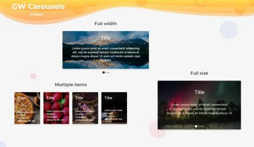
Flutter card Widget Design
Cards are the most commonly used component for mobile apps. GetWidget gives you a variety of ready-to-use Flutter card Widgets, just a little modification you have to do if needed otherwise the cards are created for multiple purposes & are ready to use.
Let’s connect together and build your idea into a real-time app with GetWidget UI Library. Now you could start with our documentation from how to getting the start and go with each component.
Getting started will guide you on how to start building a beautiful flutter application with the GetWidget UI Kit library. You have to install the package from pub.dev, import the package in your Flutter project & start building the app:
Install Package from pub.dev :
Note: dependencies: getwidget: ^ 4.0.0
Import full package:
import ‘package:getwidget/getwidget.dart’;
Call the name of the component with its properties:
Keep playing with the pre-built UI components.
GFCard has many types and it can be used with any other widgets to make it look more user-friendly. The following are its types.
Also Read: How to Build Flutter Loader Widget with Example Code
Flutter Card with image and text example
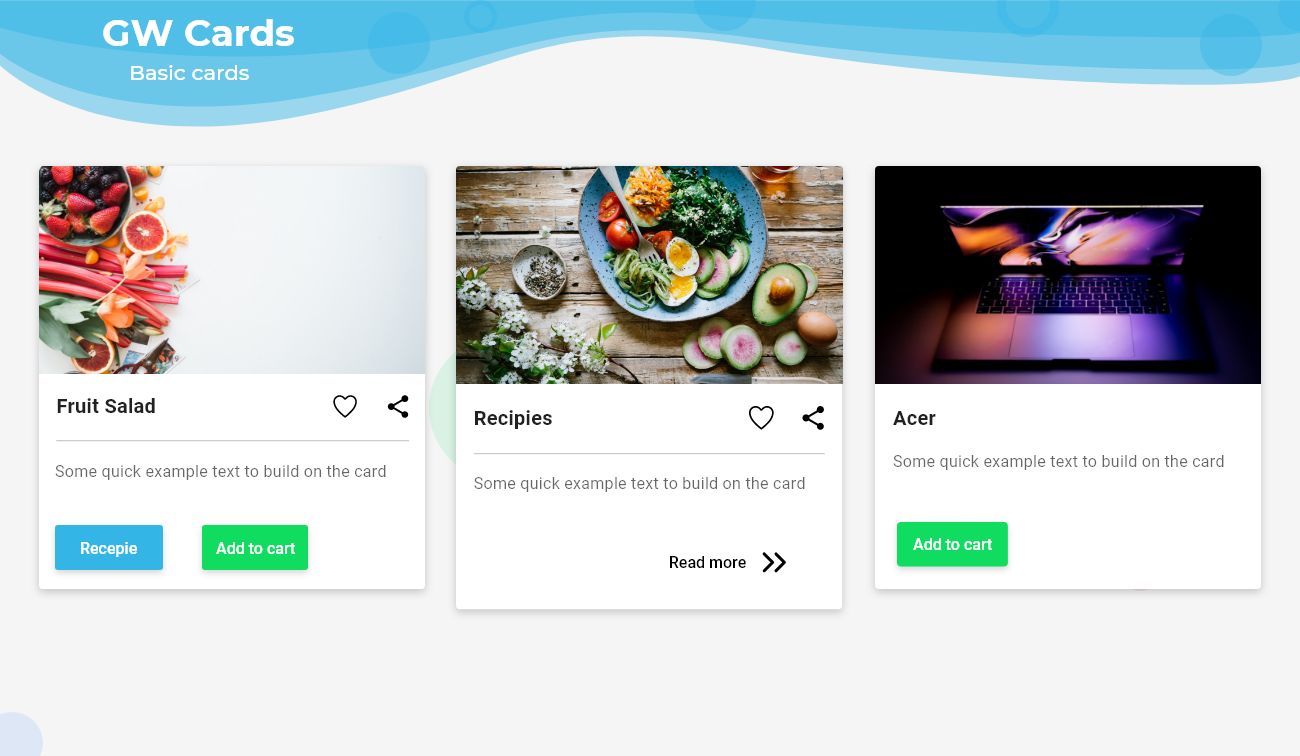
The basic card in GFCard has a title, content, and a few action buttons to perform the actions given.
The Example code of a Flutter card with image and text is shown below.
import 'package:getwidget/getwidget.dart';
GFCard(
 boxFit: BoxFit.cover,
 image: Image.asset('your asset image'),
 title: GFListTile(
   avatar: GFAvatar(
     backgroundImage: AssetImage('your asset image'),
   ),
   title: Text('Title'),
   subTitle: Text('Sub Title'),
),
content: Text("Some quick example text to build on the card"),
buttonBar: GFButtonBar(
 children: [
   GFButton(
    onPressed: () {},
    text: 'OK',
   ),
   GFButton(
    onPressed: () {},
    text: 'Cancel',
   ),
 ],
 ),
),
Flutter Card with Avatar image widget
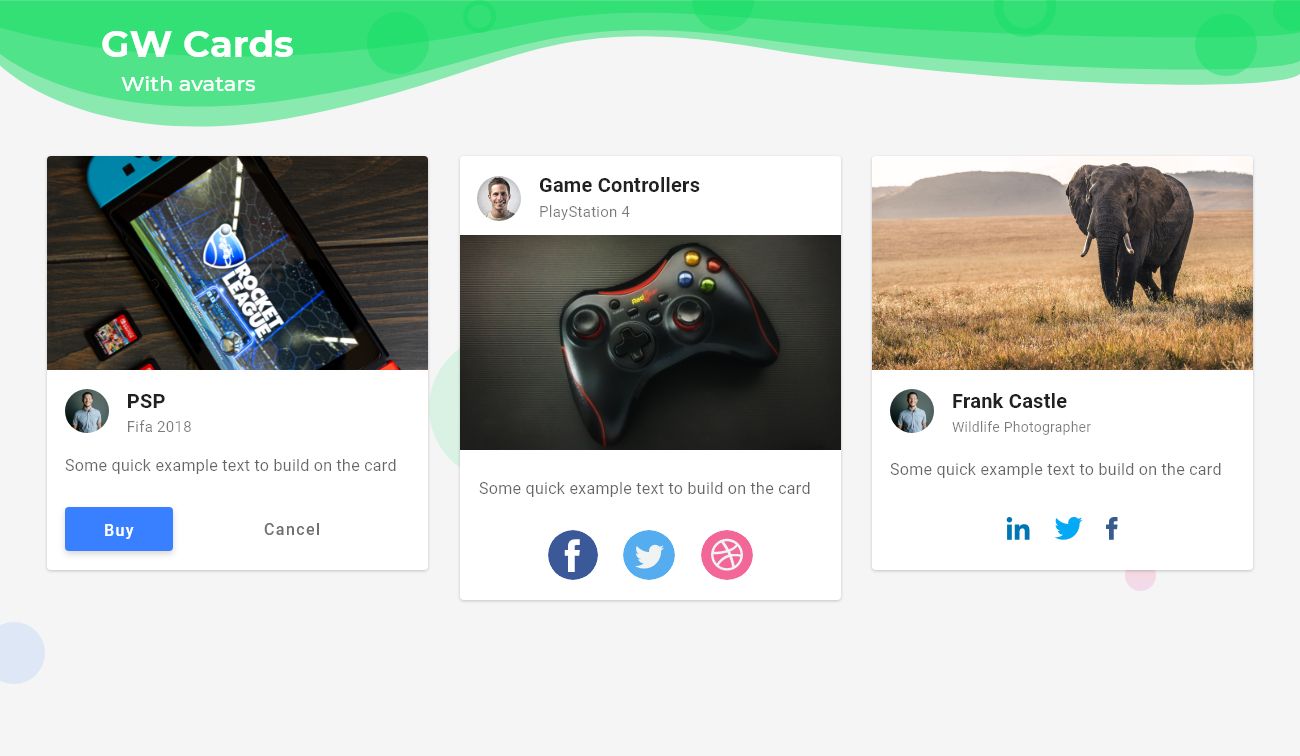
The Avatar card in GFCard has an avatar that shows basically the profile picture of the user or it can be a picture of the product or brand depending on the requirement, title, content, and a few action buttons to perform the actions given. The simple code of a Flutter Avatar card is shown below.
import 'package:getwidget/getwidget.dart';
 GFCard(
            boxFit: BoxFit.cover,
            titlePosition: GFPosition.start,
            image: Image.asset(
              'lib/assets/cup.jpg',
              height: MediaQuery.of(context).size.height * 0.2,
              width: MediaQuery.of(context).size.width,
              fit: BoxFit.cover,
            ),
            showImage: true,
            title: GFListTile(
              avatar: GFAvatar(
                backgroundImage: AssetImage('your asset image'),
              ),
              titleText: 'Title',
              subTitleText: 'Sub Title',
            ),
            content: Text("Some quick example text to build on the card"),
            buttonBar: GFButtonBar(
              children: [
                GFAvatar(
                  child: Icon(
                    Icons.settings,
                    color: Colors.white,
                  ),
                ),
                GFAvatar(
                  backgroundColor: GFColors.DARK,
                  child: Icon(
                    Icons.home,
                    color: Colors.white,
                  ),
                ),
                GFAvatar(
                  backgroundColor: GFColors.DANGER,
                  child: Icon(
                    Icons.help,
                    color: Colors.white,
                  ),
                ),
              ],
            ),
          ),
Flutter Card with OverlayImage and Text
GFCards can be used in overlaying the images and placing the text or any other widget on the background image. The widget like Text, buttons to overlay on the image as shown in the image below.
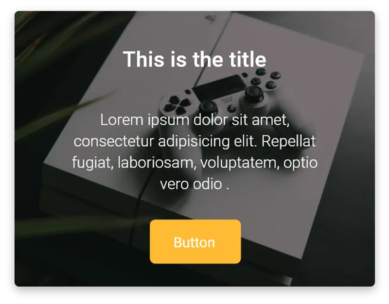
Below Example Source code shows a simple example code for GFCard with Card OverlayImage:
import 'package:getwidget/getwidget.dart';
  GFCard(
            boxFit: BoxFit.cover,
            titlePosition: GFPosition.start,
            showOverlayImage: true,
            imageOverlay: AssetImage(
              'your asset image',
            ),
            title: GFListTile(
              avatar: GFAvatar(),
              titleText: 'Hi',
              subTitleText: 'How do you do?',
            ),
            content: Text("lorem ipsun so ento"),
            buttonBar: GFButtonBar(
              children: [
                GFAvatar(
                  backgroundColor: GFColors.WARNING,
                  child: Icon(
                    Icons.home,
                    color: Colors.white,
                  ),
                ),
              ],
            ),
),GF Flutter Card Properties:
| titlePosition | helps to set the title at top of the card |
| color | sets the background color of the card |
| elevation | controls the size of the shadow below the card |
| shape | shape of the card |
| borderOnForeground | whether to paint the shape of the border in front of the child, defaults to true |
| clipBehaviour | defines the clipping of the child |
| margin | defines the card’s outer container margin |
| padding | defines the card’s outer container padding |
| semanticContainer | represents a single semantic container, if false a collection of semantic nodes |
| border | to draw border above the card |
| borderRadius | represents the rounded corners of the card |
| colorFilter | applies to the image before painting it |
| boxFit | how the image should be inscribed into the box |
| imageOverlay | display images as background with shaded overlay |
How to create a simple Flutter Material Card?
Cards are basically used to show any piece of information with title, description, or subtitle and some call to action buttons in it. Cards are not restricted to any kind of widget, it can have all sorts of widgets and to feel nice and clean look cards are widely used in any application.
Cards in a grid system are used to display a group of information that can be an album, location, or even contact details. It is used as a group that will be identical throughout the application that makes the apps look clean and neat.
To create a card we will be using the GetWidget library and its Card component. To see the components in the GetWidget library head to the official Flutter docs for getwidget.
Also Read: Flutter Tabbar Widget
GFCard is a Flutter Card that is used to show some information about the product or the brand with action buttons or without them. It mainly contains image, texts, descriptions on it. GFCard has some of the general variants in it that can be used in any application and can be customized according to the need.
Now let us see how to use the GFCard in flutter and its variants one by one with the examples for each.
Example code for Flutter with Title, Subtitle, and call to action
import 'package:getwidget/getwidget.dart';
GFCard(
 boxFit: BoxFit.cover,
 image: Image.asset('your asset image'),
 title: GFListTile(
   avatar: GFAvatar(
     backgroundImage: AssetImage('your asset image'),
   ),
   title: Text(' Title'),
   subTitle: Text(' Sub Title'),
),
content: Text("Some quick example text to build on the card"),
buttonBar: GFButtonBar(
 children: [
   GFButton(
    onPressed: () {},
    text: 'Save',
   ),
   GFButton(
    onPressed: () {},
    text: 'Cancel',
   ),
 ],
 ),
),
GFCards can be used to achieve any type of card and the variants can be customized according to the requirement. The above examples show the basic codes of each variant. They all are highly customized according to the need. For more options head to the official Getwidget Flutter documentation.
How to create a Flutter Card with image and button
Let us see a simple example with title, Image, and the buttons in the card with the below example.
import 'package:getwidget/getwidget.dart';
GFCard(
 boxFit: BoxFit.cover,
 image: Image.asset('your asset image'),
 title: GFListTile(
   avatar: GFAvatar(
     backgroundImage: AssetImage('your asset image'),
   ),
   title: Text('Title'),
   subTitle: Text('Sub Title'),
),
content: Text("Some quick example text to build on the card"),
buttonBar: GFButtonBar(
 children: [
   GFButton(
    onPressed: () {},
    text: 'save',
   ),
   GFButton(
    onPressed: () {},
    text: 'ok',
   ),
   GFButton(
    onPressed: () {},
    text: 'Cancel',
   ),
 ],
 ),
),
There are more customization options in GFCard and its properties are explained in the official documentation of the GetWidget Flutter UI library

GitHub Repository: Please do appreciate our work through Github start
What is a card in flutter?
It is a panel with slightly rounded corners and an elevation shadow that provide an additional look for users to get focus on that and even it is used for the call to action properties. It used to represent some related information, for example, an album, a geographical location, a meal, contact details, etc
How do you make cards in flutter?
You can make cards using the Class Card in the Dart package. You can call Cart Class and start building. Or you can import our Getwidget package in your code and start calling components and building the card in your flutter app.
How do you make a card with an image on flutter?
You can build a card with an image on flutter through with our package. Just import import ‘package:getwidget/getwidget.dart’; and call this imageOverlay: AssetImage(‘your asset image’), and make your own flutter card. Read more.
How to Build a Flutter card with image and text?
In order to build a Flutter card with images and text, you can use the Overlay Image class. Or you can use our OverlayImage component.
About Our Getwidget:
GetWidget is a Flutter library that helps you create applications that are more user-friendly with the help of Flutter Widgets. Widgets are the core components that are used to display information or perform any operation.
This library helps you in reusing any widget at any time with just a single line of code. This library also allows you to create complex widgets with just a single line of code. You can even create widgets with just a single code line.
We have been working on Flutter since Flutter launched in beta version in 2017. And our team have been putting hundreds and hundreds of hour to experiment and implementation of Flutter. As well as After successfully delivering enterprise and SAAS applications that have been used by more than 500+ businesses around 119+ countries. Now we are in love with Flutter development and we are very passionate about Flutter development. Now it is something we trying to give a small contribution to the Flutter Dev Community. If you need assistance for your next app development project you can hire flutter developer from the GetWidget team

I’m Navin Sharma, a passionate Full Stack Developer with over 20 years of experience in the tech industry. Throughout my career, I’ve had the privilege of working on a variety of exciting projects, developing everything from dynamic web applications to complex back-end systems. My expertise spans both front-end and back-end technologies, and I thrive on building solutions that are not only functional but also scalable and user-friendly.
Beyond my hands-on development work, I’ve contributed to several well-respected tech and startup blogs, where I share my insights on the latest trends, development strategies, and best practices in the world of web development. I also have a strong background in app analysis, where I’ve helped companies optimize their products for better performance and enhanced user experience.
Whether I’m working on a challenging coding problem or mentoring fellow developers, I’m always eager to learn, innovate, and push the boundaries of what’s possible with technology.