Flutter Accordion Widget:
A Flutter Accordion is a widget which collapses and expands upon tapping. It shows it children when expanded and hides them when it is collapsed. Basically Accordion is used when a given information is hidden and only shown whenever a user wants to read them out. Accordion saves a lot of space indeed by hiding its children inside them and only shows the content or its children when and only it is tapped over. Accordion can be used to show up a single list or a multi level list as its children. It is widely used in many applications wherein hiding the information of certain things is required and this widget does that required job with ease.
So, are you ready to make use of this widget where ever needed in your Flutter app development? If so, then let’s quickly jump into the usage and the ways an accordion can be modified and used to make use friendly apps. Here i am going to use an open-source UI Library known as GetWidget to build this widget.
GetWidget Flutter Accordion Widget:
GetWidget Accordion Component is a simple component which basically hides or reveals its children upon tapping the accordion. The children can be any kind of other component, single level list or multi level lists. It is widely used in many applications in faq’s sections where in the children or the content is hidden under the title or the heading and the children can be viewed only upon tapping the title or the heading given. So in almost all real time applications accordion is in wide use because of its simple and yet useful functionality.
GetWidget Accordion is not only a basic one but has different ways to make the accordion look more user friendly and attractive to the user. So, let’s dive deep into the types of accordions and make the most use of it.
Also Read – Is Flutter Worth Learning? Top 7 Reasons to Learn Flutter
Basic Fluter Accordion Widget:
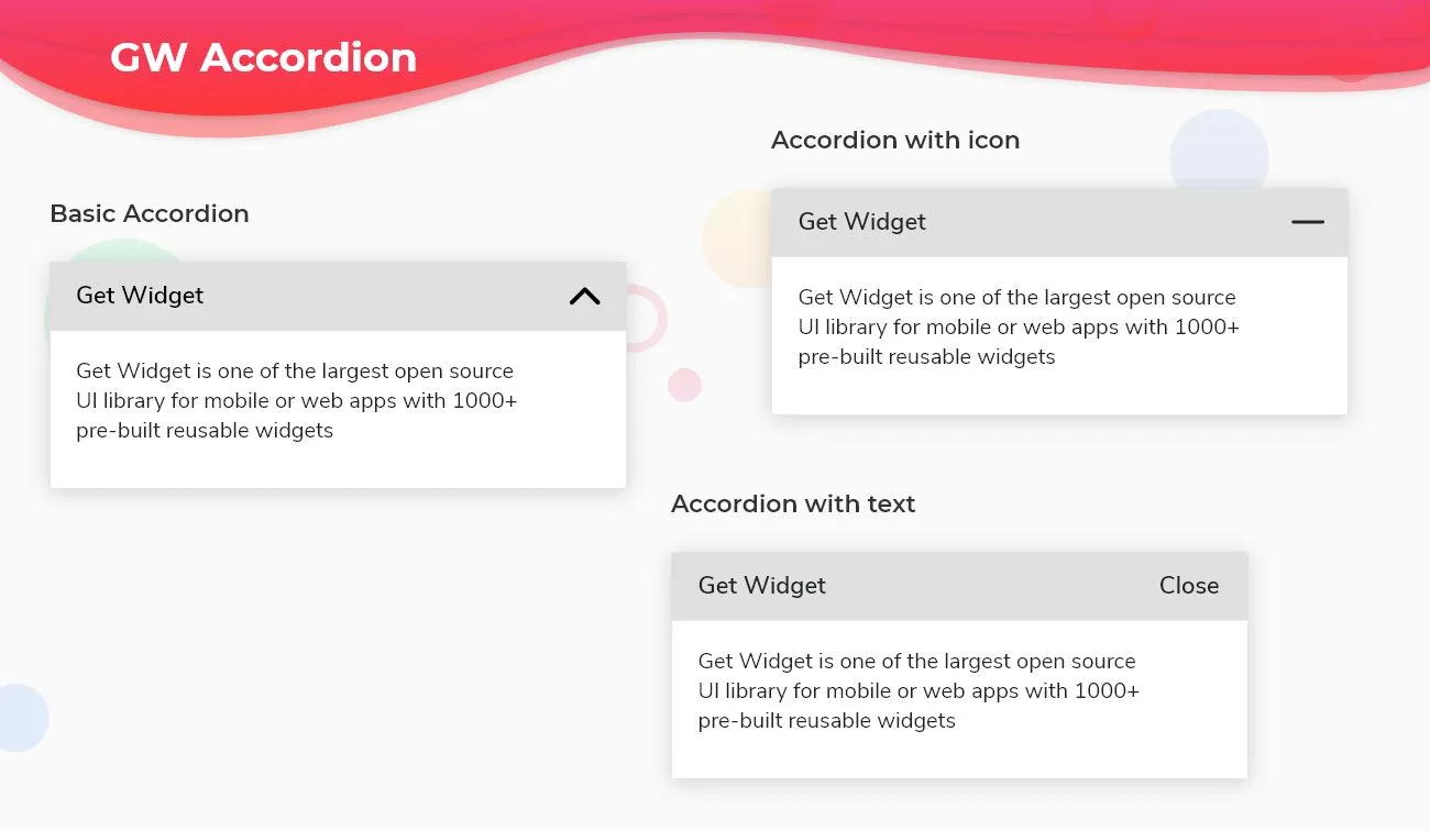
Basic Accordion is just a title with a trailing up and down arrow and its children hidden and its revealed when needed.

Flutter Accordion Widget with trailing icon:
Accordion can be used with icons which can be replaced in the trailing part which gives flexibility to the user to use any icon of his/her choice.

Flutter Accordion Widget with trailing text:
Accordion can also be used with text in the trailing part which gives flexibility to the user to choose his.her kind of words based on the application and use them in their accordion.

How to Start:
Now, here is the guide about how we should you can start developing Flutter Toast Widget with the help of GetWidget UI Library.
First, Let go with Getting Started, It will guide you how to start building a beautiful flutter application UI with the GetWidget UI library. Now, we have to install the GetWidget package from pub.dev, To import the package in your Flutter project follow the below guide.
Install Package from pub.dev :
https://pub.dev/packages/getwidget – Check the details about GetWidget Package.
Import full package:
import ‘package:getwidget/getwidget.dart’;
Note: dependencies: getwidget: ^4.0.0
Keep playing with the pre-built UI components.
Example of a simple accordion:
 import 'package:getwidget/getwidget.dart';
 GFAccordion(
    title: 'GF Accordion',
    content: 'GetWidget is an open source library that comes with pre-build 1000+ UI components.'
     )
Example of accordion with trailing icons:
import 'package:getwidget/getwidget.dart';
GFAccordion(
    title: 'GF Accordion',
    content: 'GetWidget is an open source library that comes with pre-build 1000+ UI components.',
    collapsedIcon: Icon(Icons.add),
    expandedIcon: Icon(Icons.minimize)
),
Example of accordion with trailing text:
import 'package:getwidget/getwidget.dart';
 GFAccordion(
     title: 'GF Accordion',
     content: 'GetWidget is an open source library that comes with pre-build 1000+ UI components.',
     collapsedIcon: Text('Show'),
     expandedIcon: Text('Hide')
),
Alaas!! That was simple and great! Now let’s see all three of them in one code as shown below:
Flutter Accordion List custom properties
| showAccordion | controls if the accordion should be collapsed or not making it possible to be controlled from outside |
| titleChild | child of type [Widget]is alternative to title key. title will get priority over titleChild |
| content | content of type[String] which shows the messages after the [GFAccordion] is expanded |
| contentChild | contentChild of type [Widget]is alternative to content key. content will get priority over contentChild |
| collapsedTitleBackgroundColor | type of [Color] or [GFColors] which is used to change the background color of the [GFAccordion] title when it is collapsed |
| expandedTitleBackgroundColor | type of [Color] or [GFColors] which is used to change the background color of the [GFAccordion] title when it is expanded |
| collapsedIcon | collapsedIcon of type [Widget] which is used to show when the [GFAccordion] is collapsed |
| expandedIcon | expandedIcon of type[Widget] which is used when the [GFAccordion] is expanded |
| title | text of type [String] is alternative to child. text will get priority over titleChild |
| textStyle | textStyle of type [textStyle] will be applicable to text only and not for the child |
| titlePadding | titlePadding of type [EdgeInsets] which is used to set the padding of the [GFAccordion] title |
| contentPadding | descriptionPadding of type [EdgeInsets] which is used to set the padding of the [GFAccordion] description |
| contentBackgroundColor | type of [Color] or [GFColors] which is used to change the background color of the [GFAccordion] description |
| margin | margin of type [EdgeInsets] which is used to set the margin of the [GFAccordion] |
| titleBorder | titleBorderColor of type [Color] or [GFColors] which is used to change the border color of title |
| contentBorder | contentBorderColor of type [Color] or [GFColors] which is used to change the border color of content |
| titleBorderRadius | titleBorderRadius of type [Radius] which is used to change the border radius of title |
| contentBorderRadius | contentBorderRadius of type [Radius] which is used to change the border radius of content |
| onToggleCollapsed | function called when the content body collapsed |
Check out the more details on our Flutter Accordion:
Also Read : Top 10 Best Flutter Accordion Widgets List
Conclusion:
Here we discussed, what Flutter Accordion Widget is? And how it is easy and powerful to use in any application through GetWidget Accordion component. Here, there are options to customize and use other types of Accordion and make the application an eye catchy one.
FAQ’s:
Q: Is Accordion supported by the web?
Ans: Yes, the web also supports the accordion and its type.
Q. Can we change the background color of the accordion?
Ans: Yes, the background color of the accordion and its children can be changed. For the custom options go through the documentation


